



What Makes a Coffee Ad Sell Beyond a Nice Photo?
A coffee ad sells when it gives the viewer one clear reason to choose it: either the ritual of making the drink, or the function it delivers. Coffee is a daily habit, not a one-time purchase, so the ad has to compete with the cup the buyer already reaches for every morning.
Taste and aroma can't be photographed, so the ritual ads in this library use visual stand-ins for them. A slow pour over grounds, syrup running over chocolate squares and a quiet kitchen in warm light all stand in for what the drink smells like. The pairing that works is that sensory cue with one specific line, such as a promo code, a menu with prices or a launch.
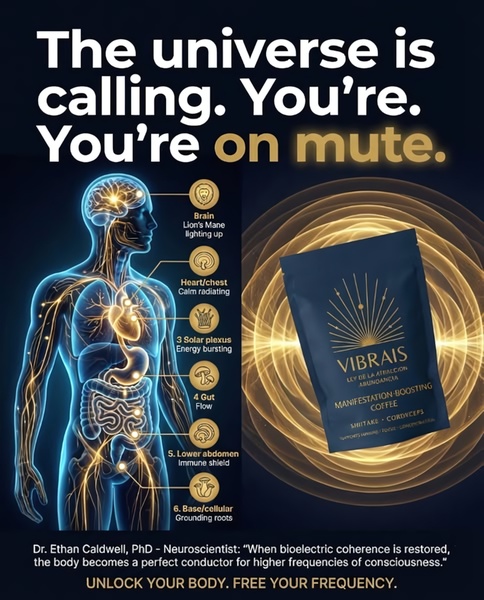
The function ads work the other way round. Mushroom coffee, shilajit coffee and coffee alternatives lead with a problem or a benefit - energy, calm focus, hormones, inflammation - and back it with a comparison, an icon row or an offer. These carry health claims, so the wording and the proof need to be accurate. Pick the route first, because it decides which of the ads below you should copy.
Top Creative Coffee Ads to Learn From
Here are 8 coffee advertising examples from the library, starting with sensory and ritual ads and ending with function-led offers. Each one shows what the ad does and what you can borrow.
Example 1: Coffee Syrup Poured Over Chocolate (Product Hero, 2:3)
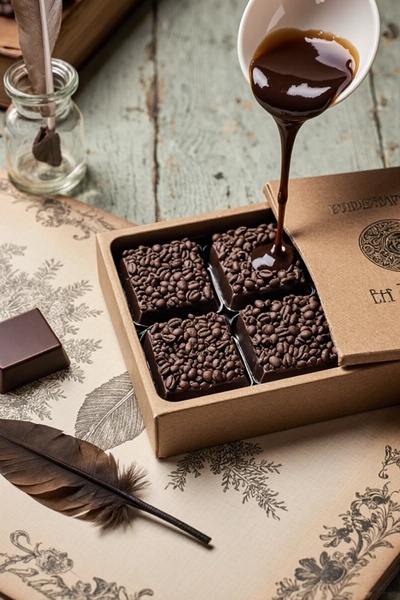
Liquid coffee syrup runs over coffee-infused chocolate squares in a tight, high-contrast close-up. Coffee beans and vintage-style paper surround the pour in brown, tan and cream, so the motion carries the whole sensory story.
Borrow: freeze the moment of the pour and frame it in macro, so the viewer can almost taste it before reading a word.
Example 2: Pour-Over Morning Ritual (Product Hero, 9:16)
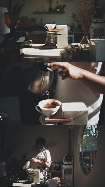
A slow-drip pour-over is brewed in a quiet home kitchen, lit by warm, directional light. The tight focus is on the water meeting the grounds, in brown, cream and charcoal.
Borrow: sell the ritual instead of the product, with a calm mood and no hard sell, then use the same shot to retarget people who have seen more direct ads.
Example 3: "Barista-Level Coffee at Home" With 10% Off (Offer & Sale, 9:16)
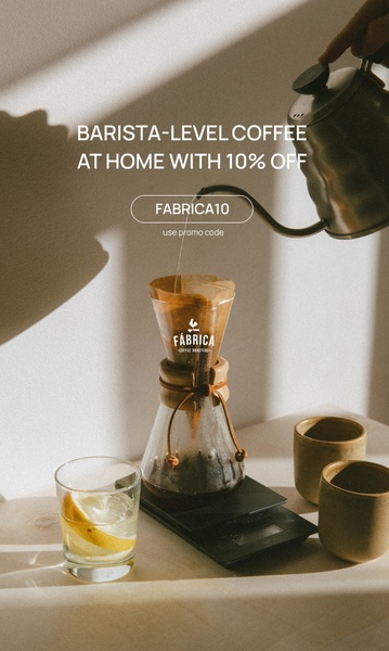
A top-down shot of a pour-over setup in soft natural light, in beige, warm white and dark brown. A promo code sits in a clean, outlined bubble, so the offer is legible against the busy texture of the equipment.
Borrow: keep the lifestyle mood, but put the offer in one outlined shape so the call to action stays subtle.
Example 4: Coffee Mocktail Menu Launch (Offer & Sale, 9:16)
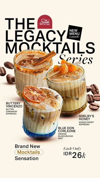
Three coffee mocktails are grouped in one vertical frame with a name, an ingredient subtitle and a price for each. Garnishes such as an orange slice and cinnamon sticks make each drink look distinct, on a cream, black and brown layout.
Borrow: a three-item menu grid for a launch, with ingredients under every drink and a visibly different garnish on each.
Example 5: "Is Coffee Wrecking Your Hormones?" (Problem & Solution, 9:16)
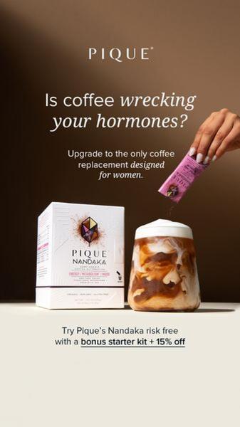
A question headline - "Is coffee wrecking your hormones?" - opens an ad for a coffee alternative. A cream, brown and purple layout holds a risk-free trial and a bonus kit, so the offer sits right under the worry.
Borrow: a pain-point question that filters the audience, followed at once by the solution and a low-risk trial. Make sure the claim is one you can support.
Example 6: Coffee vs. Coffee With Shilajit (Us and Them, 1:1)
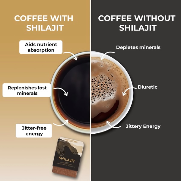
A square frame is split down the middle, with regular coffee on one side and coffee with shilajit on the other. Short labels and arrows name the downsides, such as jittery energy and mineral depletion, in gold, black and white. The product pack sits at the bottom center as the last thing the eye reaches.
Borrow: a split-screen comparison against the habit people already have, with the pack as the final anchor.
Example 7: Mushroom Coffee Easter Sale (Offer & Sale, 4:5)
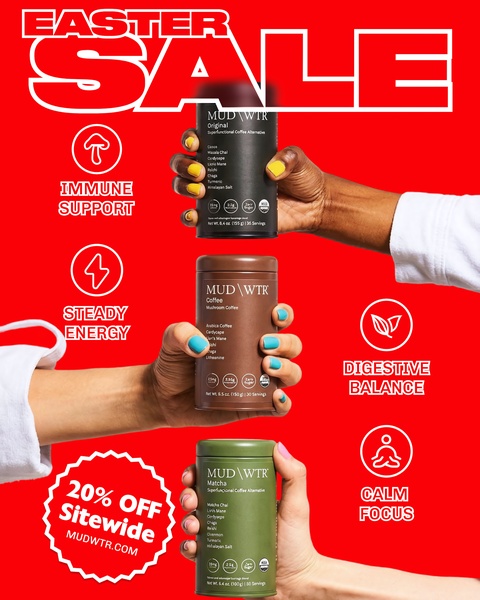
Several hands hold different mushroom coffee products against a bold red background, with white type for the sale. Four line icons mark the benefits - immune support, energy, digestion and focus - so each product reads as a different use.
Borrow: hands holding a range, plus a row of same-weight icons, so variety and benefits can be scanned at a glance.
Example 8: Mushroom Coffee "Reduced Inflammation" Offer (Offer & Sale, 1:1)
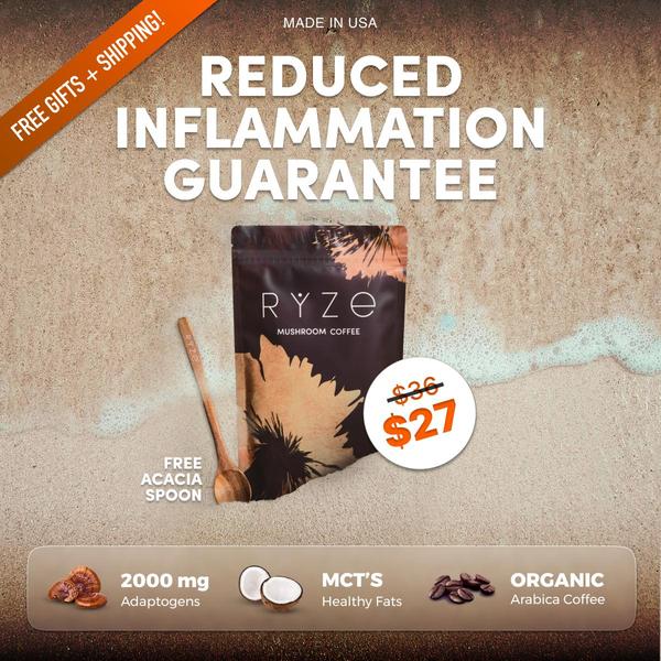
A benefit headline sits above the product pack on a sandy, neutral background. A crossed-out $36 next to a $27 sale price shows the saving, and a bottom row lists attributes such as adaptogens and organic arabica coffee.
Borrow: lead with the benefit, show the sale beside the original price, and ground the claim in specific ingredients along the bottom edge.
Coffee Advertisement Ideas to Borrow From These Examples
- Freeze the pour - a pour, a drip or a melt carries aroma and taste for you (Examples 1 and 2).
- Sell the ritual first - a calm morning scene suits retargeting and brand building (Examples 2 and 3).
- Keep the offer in one shape - a code in an outlined bubble leaves the mood intact (Example 3).
- Use a menu grid for launches - three items, ingredients and prices read in one glance (Example 4).
- Open with the problem - a question headline filters the audience (Example 5).
- Compare against the habit - a split screen shows the upgrade over plain coffee (Example 6).
- Make benefits scannable - icons, ingredient rows and a visible original price (Examples 7 and 8).
How Does Promer AI Turn Your Coffee Product Page Into an Ad?
A winning structure still leaves someone to decide what the ad says, who it speaks to and what it proves. Promer AI handles that step from your product page, and you can create your first ad free, no credit card required.
Paste your product URL and AI Ad Concept reads your page, pulling the product highlights - the roast, the origin, the seasonal drink, the adaptogens, the loyalty offer - along with your ideal customer, their pain point and their need. It then builds several concepts from that context, such as a ritual angle for home brewers and a function angle for people cutting back on caffeine.
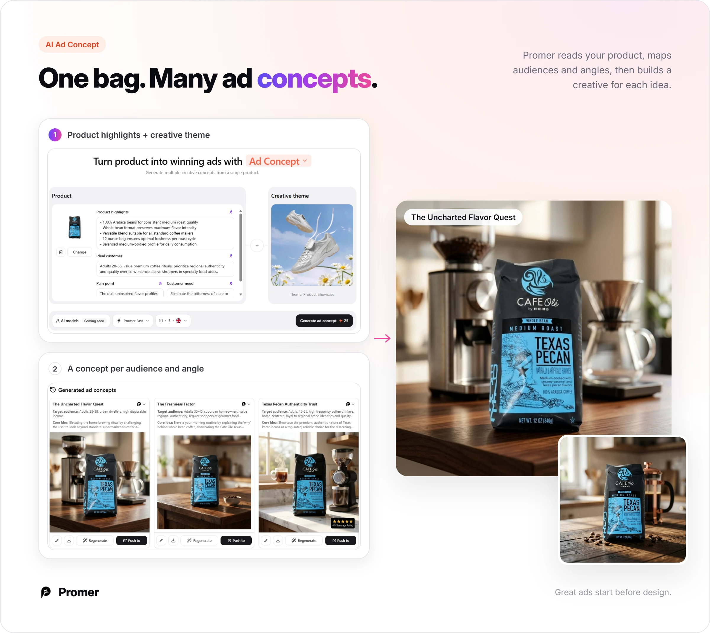
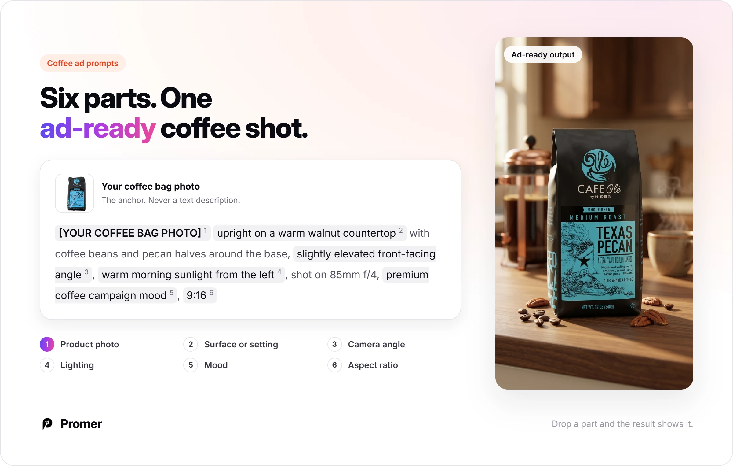
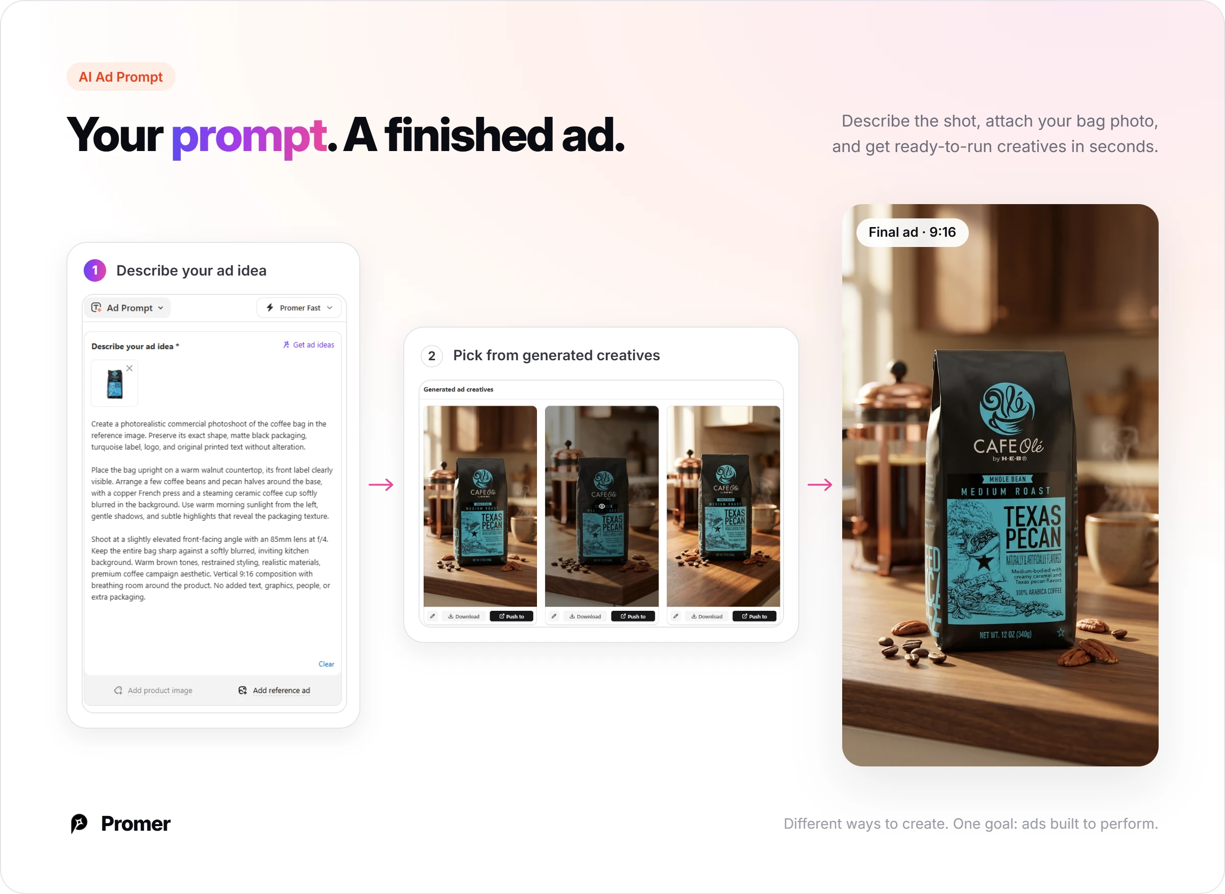
If you already know the shot, AI Ad Prompt is the direct route. Attach your bag or cup photo, describe the scene, and Promer AI generates creatives to pick from, or suggests 5 ad ideas from the product image. A strong prompt names six parts: the product photo, a surface or setting, a camera angle, the lighting, a mood and the aspect ratio.
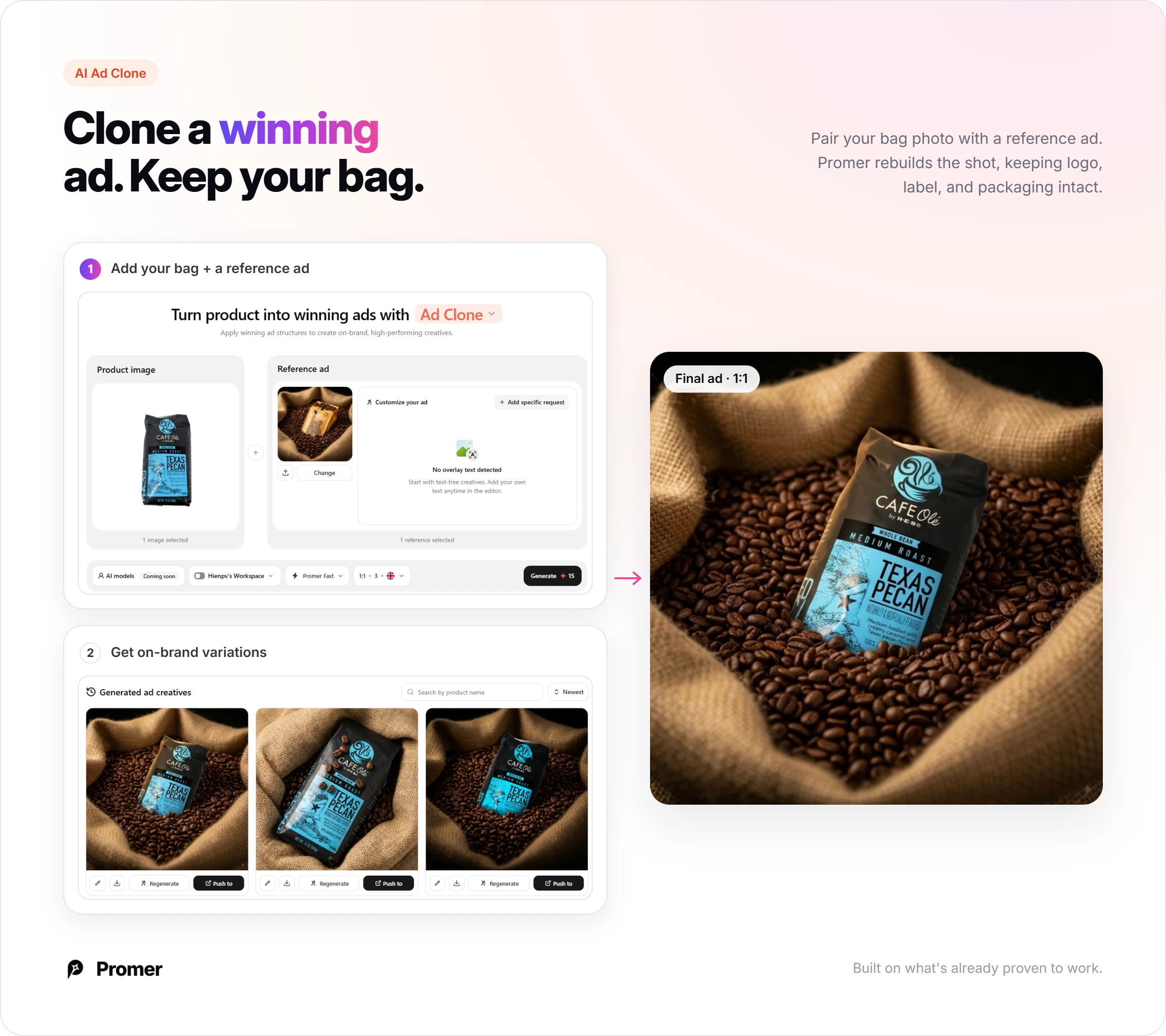
AI Ad Clone rebuilds a reference from the library around your product, such as the menu grid or the split-screen comparison, and suggests the headline, body and CTA, each editable. It keeps your bag, label and packaging while the scene changes around them.
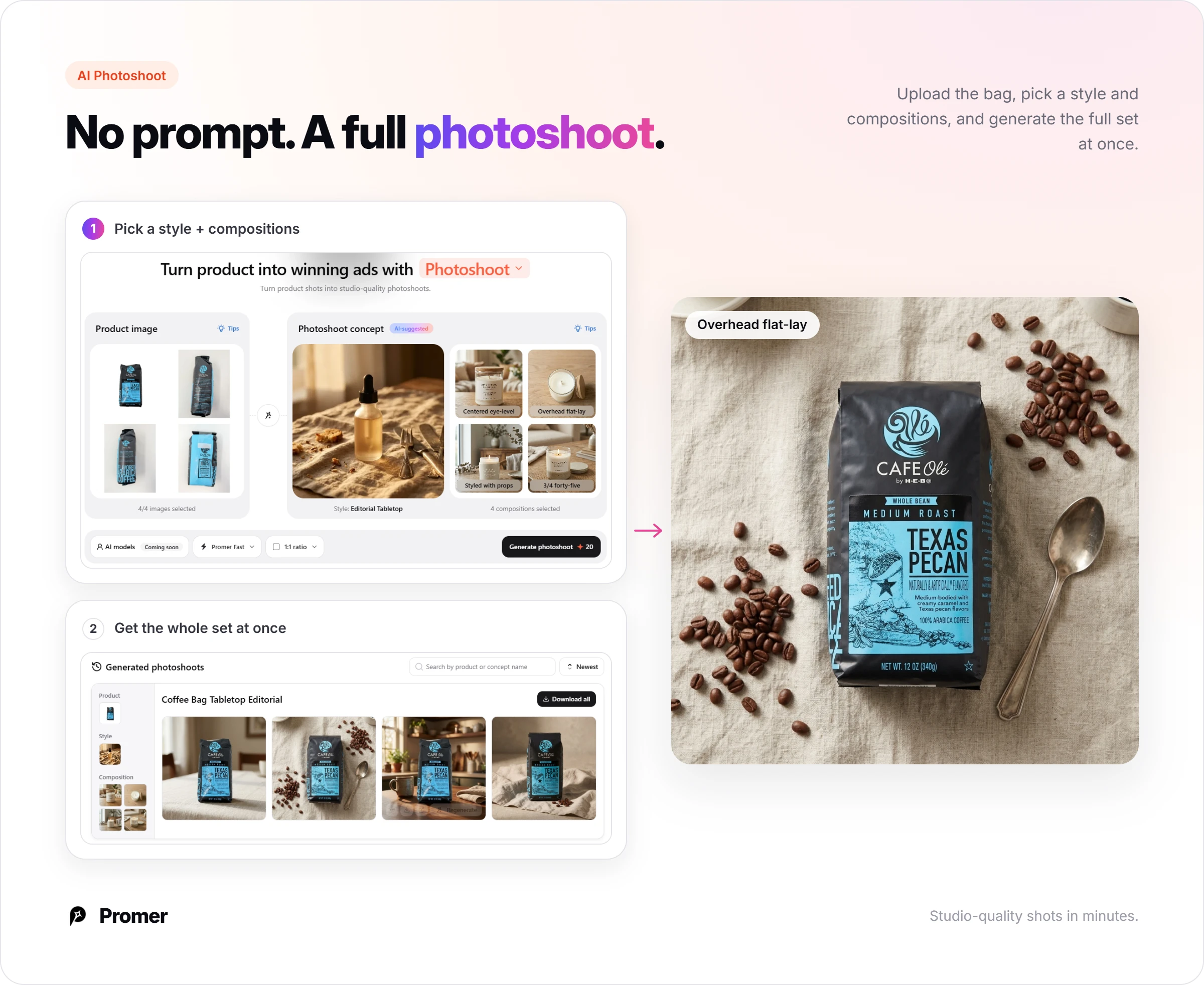
AI Photoshoot needs no prompt: upload the product, pick a style and a few compositions, such as an overhead flat lay or a styled tabletop, and it generates the full set at once. AI Ad Animation then turns a static creative into an 8-second video, which suits steam and pour shots.
Ratios cover 1:1 and 4:5 for Meta feeds and 9:16 for Stories, Reels and TikTok. Promer AI creates the creative, while campaign setup and bidding stay in your ad platform.
Review everything before it runs. AI-generated creatives can have mistakes, so check every price, promo code, ingredient and dose on the image. Claims such as "reduced inflammation," "hormone balance," "organic" or "fair-trade" need support from your own evidence or certification, and any crossed-out price should reflect a real earlier price. This is not legal advice - confirm current platform ad policies before launch.





