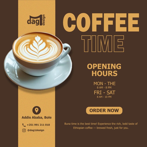
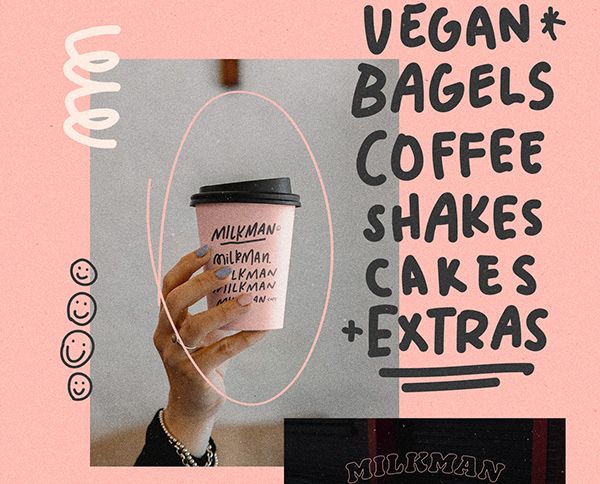
A clean, high-contrast promotional graphic for a local cafe featuring coffee photography, operating hours, and location details.
Free credits included. No card required
This coffee promotional graphic relies on a clean, high-contrast color palette and direct information hierarchy to capture attention. By placing the core product photography front and center against a warm, earthy background, the creative creates an immediate, inviting association with freshness and quality.
For most local brands, this structured approach helps communicate critical business details without cluttering the viewer's feed. You can replicate this professional aesthetic using Promer AI to maintain consistent branding across all your promotional materials while experimenting with different layouts.
Great ads start from a clear structure that balances visual appeal with essential business information.
Pro tip
For local businesses, keeping your visual style consistent with your physical store interior helps build trust. Use your primary brand colors for the text backgrounds to ensure your online creative feels like an extension of your shop front.


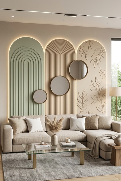
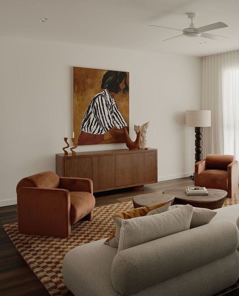
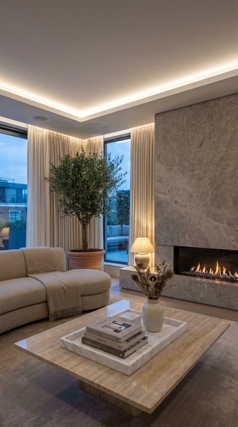
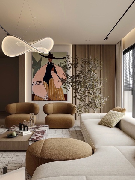


Promer helps you find the pattern, adapt it to your product, and create your own version in minutes.






