These 13 Cyber Monday ad examples each put one offer idea in front and let the layout carry it. The idea might be a discount number, a free gift, a 24-hour clock, or the name of the sale window itself.
A Cyber Monday ad tends to be easier to read in a fast scroll when it isolates one offer and gives that offer the most space in the frame. A "50% off" headline with nothing competing for attention is a quicker read than the same number surrounded by three other callouts.
The examples come from Promer AI's AI Ad Library: creatives tagged for Cyber Monday across fashion, jewelry, home, sports, beauty, and electronics. We don't have spend or results for any of them, so this article describes structure and layout choices and makes no claims about performance.
At the end, you'll find how to rebuild any of these structures with your own product instead of starting from a blank canvas.
Key takeaways
- Of the 18 Cyber Monday creatives we reviewed, 13 lead with a numeric discount, and 50% was the most common figure among the 11 that state a percentage (4 of 11).
- The other ads lead with something else: a free gift, a 24-hour deadline, a bundle, or a price.
- Two examples name the sale window "Cyber Weekend" and "Cyber Tuesday" instead of "Cyber Monday", which lets one structure run outside the Monday itself.
- 13 of the 18 are 1:1. That reflects the library's mix, so match the ratio to your placement instead of copying it.
- High-energy neon and bright color blocks show up mainly on electronics, while jewelry, bedding, and tailoring use calmer palettes and fewer elements.
How we chose these 13 creatives?
We pulled 21 creatives tagged for Cyber Monday from AI Ad Library and removed three: a Singles' Day (11.11) ad that isn't a Cyber Monday ad, an ad with no product in it, and an infographic that explains the event instead of selling anything. That left 18.
The 13 below were picked to cover different hooks and categories, and eight of them sit outside electronics. The counts in these Cyber Monday ad examples come from those 18 creatives. They are not market benchmarks, because AI Ad Library is not a random sample of Cyber Monday advertising and no performance data comes with the creatives.
Cyber Monday ad examples: 13 creatives and the idea behind each
Each example lists its platform, ratio, and hook type first, so you can match it to your own product before you look at the image. A "Try AI Ad Clone" button sits under every creative if you want to jump straight into rebuilding that structure.
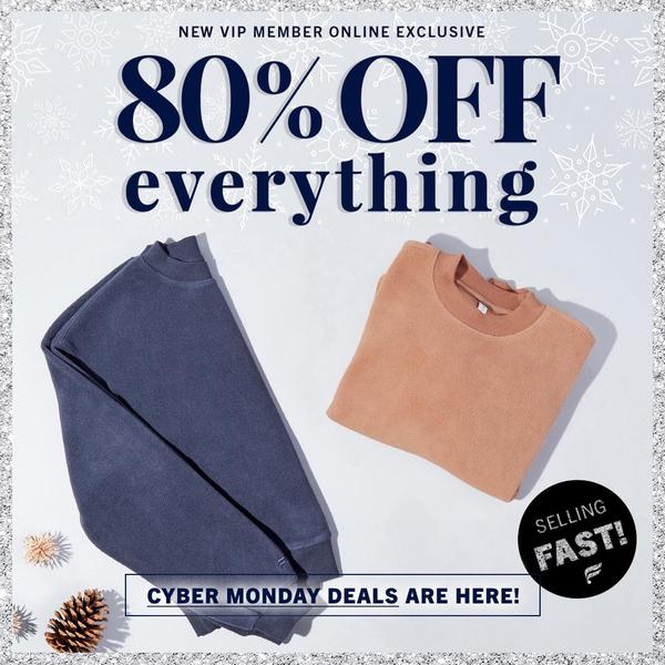
1. 80% Off Flat Lay (Sweater)
Platform: Facebook, Instagram | Ratio: 1:1 | Hook type: Direct discount offer
Two folded sweaters sit on a white background with snowflake motifs, and a very large "80% off" headline in dark navy takes most of the frame. A small "Selling Fast" badge adds a second, quieter reason to act.
What to borrow:
- Dark navy type on white, so the number reads instantly
- A flat lay with no lifestyle elements, so the product category is clear at a glance
- A secondary badge sized well below the headline
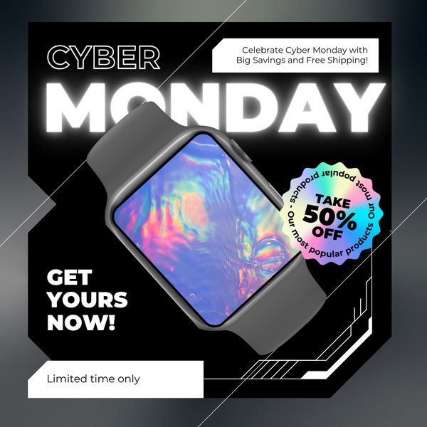
2. Holographic Badge (Smartwatch)
Platform: Facebook, Instagram, X | Ratio: 1:1 | Hook type: Direct offer with event urgency
A smartwatch sits on a black background, with a holographic-gradient badge carrying "50% off" and white text naming the event. "Get Yours Now" closes the layout as the call to action.
What to borrow:
- A black background that lets white text and the product stand out
- A gradient badge that makes the discount the brightest element in the frame
- One short call to action instead of several
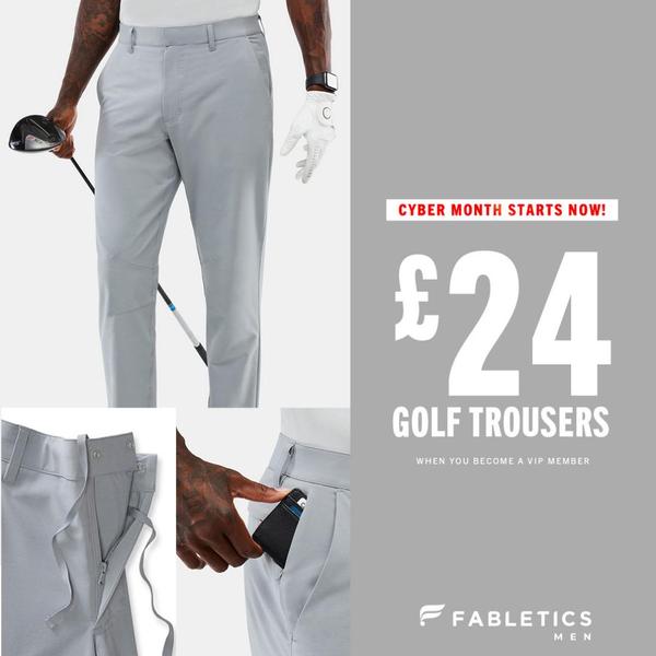
3. Price-Led Offer (Golf Trousers)
Platform: Facebook, Instagram | Ratio: 1:1 | Hook type: Price-led offer
This ad skips the percentage and leads with a large price. A main product shot sits beside a close-up detail view, on a grey and white palette with plenty of empty space.
What to borrow:
- The price as the largest text element in the frame
- A second, close-up image of one product detail
- Empty space around the price so nothing competes with it
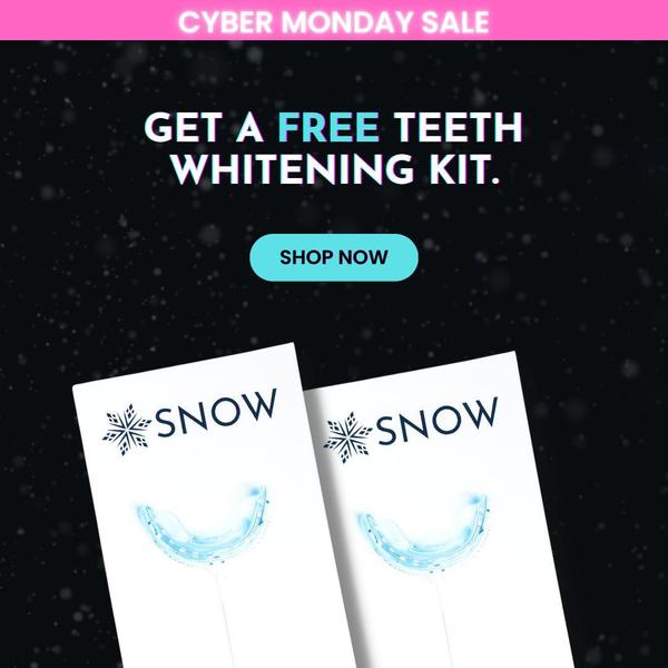
4. Free Gift Offer (Teeth Whitening Kit)
Platform: Instagram, Facebook | Ratio: 1:1 | Hook type: Incentive-based value proposition
A black background with white type and cyan and pink accents puts the word "Free" at the center of the offer. The kit is positioned as a free reward, and a clear shop action sits below it.
What to borrow:
- A one-word hook that replaces the discount number
- A high-contrast black and white base with one cyan accent
- Very little other copy, so the free offer is the only message
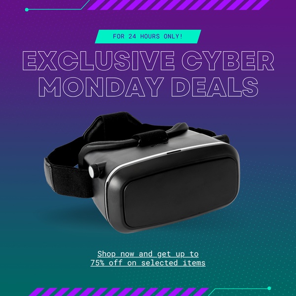
5. 24-Hour Deadline (VR Headset)
Platform: Facebook, Instagram | Ratio: 1:1 | Hook type: Scarcity and time-limited offer
The headline opens with "For 24 Hours Only" over a purple and teal palette, with the headset centered in the frame. A strong discount sits alongside the deadline.
What to borrow:
- The deadline stated in the first words of the headline
- A product centered in the frame so it keeps visual weight next to the text
- A simple, modern layout with two colors doing the work
6. Last-Chance Wording in German (Portable Power Station)
Platform: Facebook, Instagram | Ratio: 1:1 | Hook type: Direct offer with urgency
Black backgrounds with yellow, cyan, and orange highlights frame portable power stations, with a large "50%" and "Letzte Chance" (German for "last chance") as the deadline line. The same structure works in another language once the copy is swapped.

What to borrow:
- The percentage at the top of the text hierarchy
- A short deadline phrase you can translate for each market
- A hero product shot with depth, so the product still reads against the black
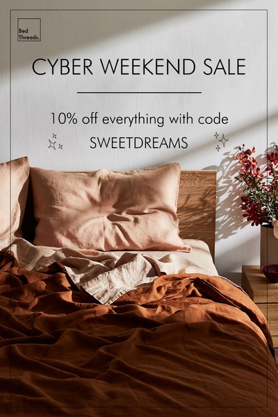
7. Cyber Weekend Window (Linen Bedding)
Platform: Instagram, Pinterest | Ratio: 2:3 | Hook type: Direct offer
Layered linen bedding in warm brown and cream fills a clean, bright photograph. The headline reads "Cyber Weekend Sale", with a percentage discount and a specific code below it.
What to borrow:
- A window name, so the ad isn't tied to a single day
- Warm neutral photography that fits a comfort-driven category
- A discount and a code together, giving shoppers one clear next step
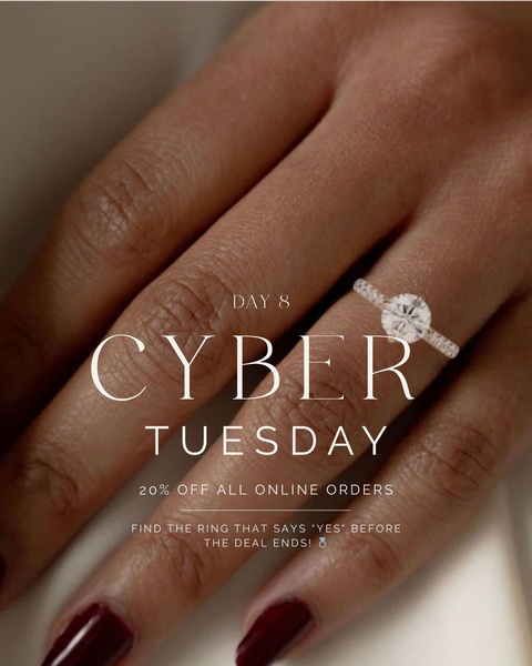
8. Cyber Tuesday Window (Engagement Ring)
Platform: Instagram, Facebook | Ratio: 4:5 | Hook type: Seasonal urgency
A close-up of a hand wearing an engagement ring takes up the frame. The text offers 20% off all online orders and refers to Cyber Tuesday and the deal ending.
What to borrow:
- The product as the hero image, with the offer text kept small and clean
- Thin sans-serif type that matches how delicate the product is
- A day name that extends the sale beyond Monday
9. Pedestal Bundle (Electronics Bundle)
Platform: Instagram Stories, TikTok | Ratio: 9:16 | Hook type: Discount urgency
A smartphone, smartwatch, and earbuds sit on a clean white pedestal against a yellow radial background. A circular badge carries the extra discount, and the layout fills a vertical screen.
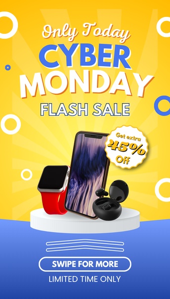
What to borrow:
- A pedestal that groups several products into one object
- A yellow, blue, and white palette with strong contrast
- A round badge for the discount, separate from the headline
10. Product Grid with Button (Jeans)
Platform: Facebook, Instagram | Ratio: 1:1 | Hook type: Direct offer discount
A grid shows several distressed and styled jeans in one frame, with a large "70% off" as the dominant text. A centered blue button sits below it as the click target.
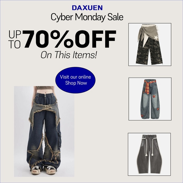
What to borrow:
- A grid that shows the range of washes and fits in one frame
- A percentage large enough to read on a small screen
- A centered button that tells the viewer where to click
11. Neon Grid Gadgets (Electronics)
Platform: Facebook, Instagram | Ratio: 1:1 | Hook type: Seasonal promotional offer
A purple, pink, and cyan neon grid fills the background behind a range of gadgets. A "70% off" claim sits next to the event name in high-contrast type.
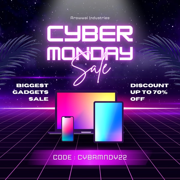
What to borrow:
- A synthwave background that signals "tech" before any text is read
- Products centered so they stay recognizable against a busy backdrop
- The event name and the discount number paired in one line of type
12. Monochrome Editorial (Blazer)
Platform: Facebook, Instagram | Ratio: 16:9 | Hook type: Minimalist high-fashion aesthetic
A black-and-white image shows a model in a blazer with accessories. Smaller stacked images show more angles, and a "50% off" callout sits in the clean white space.
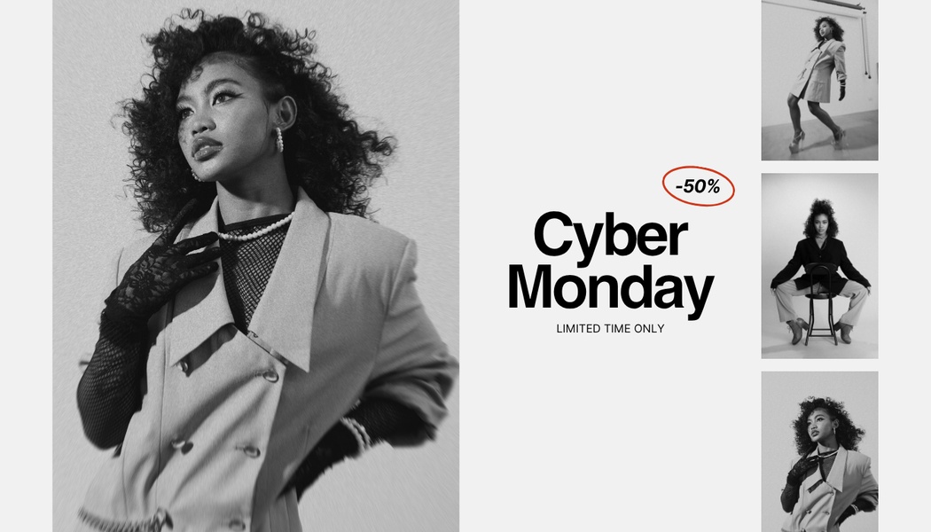
What to borrow:
- No color, so texture and silhouette carry the product
- One large hero image with smaller supporting angles
- Sparse typography that keeps the sale from looking cluttered
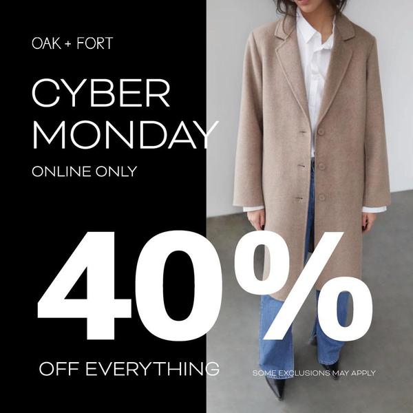
13. Split-Screen Offer (Wool Coat)
Platform: Instagram, Facebook | Ratio: 1:1 | Hook type: Direct offer
The frame splits 50/50. A model in a wool coat fills the right half, and the left half is a solid black panel with white sans-serif type reading "40% Off".
What to borrow:
- A literal split between the photo and the offer
- White type on a solid black panel, legible on a small screen
- Editorial photography that keeps the coat looking premium next to the discount
Cyber Monday ad ideas to borrow from these examples
The 13 ads reduce to eight ideas. Each suits a different kind of offer, so pick based on what you actually sell and what you are willing to discount.
Lead with the discount number (examples 1 and 2). This is the most common structure in the set, with 13 of 18 creatives using it. It fits an offer deep enough to be the whole story, and the number should be the largest element in the frame.
Lead with the price (example 3). A price can make sense when the price itself is the draw, or when a percentage would sound smaller than the dollar amount looks.
Offer a free gift (example 4). Swapping the discount for a free item keeps the headline to one word and changes what the shopper is being offered.
Put a clock on the offer (examples 5 and 6). A deadline stated in the first words of the headline gives the offer an end point, and the German example shows the phrase can be translated per market.
Name the window (examples 7 and 8). "Cyber Weekend" and "Cyber Tuesday" let one structure run outside the Monday itself. Make sure the dates in your copy match the dates your offer is actually live.
Group several products (examples 9 and 10). A pedestal or a grid turns a catalog into one image, which helps when the offer applies to a range instead of a single item.
Go loud when the category allows it (example 11). Neon and saturated color blocks fit electronics and gaming, where a high-energy look matches how buyers expect the category to feel.
Go quiet for premium categories (examples 12 and 13, plus 7 and 8). Monochrome, split frames, and warm neutral photography keep a discount from changing how jewelry, tailoring, or bedding looks.
Because these Cyber Monday ad ideas are structurally different, they make better test cells than eight colorways of one layout, which is the logic behind ad creative testing.
What these Cyber Monday ads have in common?
Across the 18 creatives we reviewed, a few patterns repeat. Treat them as observations about this set, since the library is not a random sample.
- Ratio: 13 are 1:1, 2 are 9:16, and one each is 16:9, 2:3, and 4:5.
- Offer: 13 lead with a numeric discount, 1 leads with a price, and 4 lead with something else (a free gift, a deadline, a bundle, or the event name).
- Percentage: among the 11 that state one, 50% appears most often (4 times), and the range runs from 20% to 80%.
- Urgency: at least 4 carry a deadline or scarcity cue, such as a 24-hour limit, a German "last chance" line, a "Selling Fast" badge, or a line about the deal ending.
- Category: 9 of the 18 are electronics, and the loudest palettes cluster there.
Promer AI's breakdown of what makes a winning ad covers the single-offer principle in more depth, if you want the framework behind these patterns.
How to turn one of these Cyber Monday ads into your own?
The Cyber Monday ad examples above share a structure, and the structure carries over to a different product. Promer AI, an AI ad maker, gives you two ways to build from it, depending on whether you start from a reference ad or from an idea.
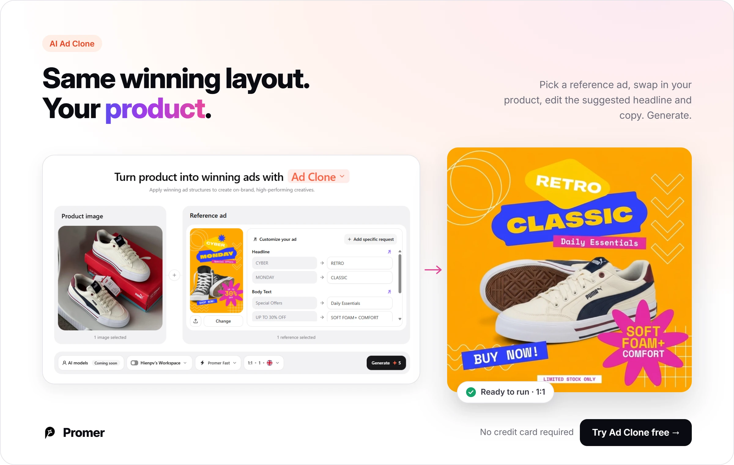
Promer AI's AI Ad Clone recreates a reference ad's structure with your own product. You select your product, pick a reference ad from AI Ad Library, AI Ad Spy, your own library, or an upload, and the AI suggests a headline, body text, and call to action that you can edit one by one before generating. An optional request field lets you steer the background, tone, layout, and style.
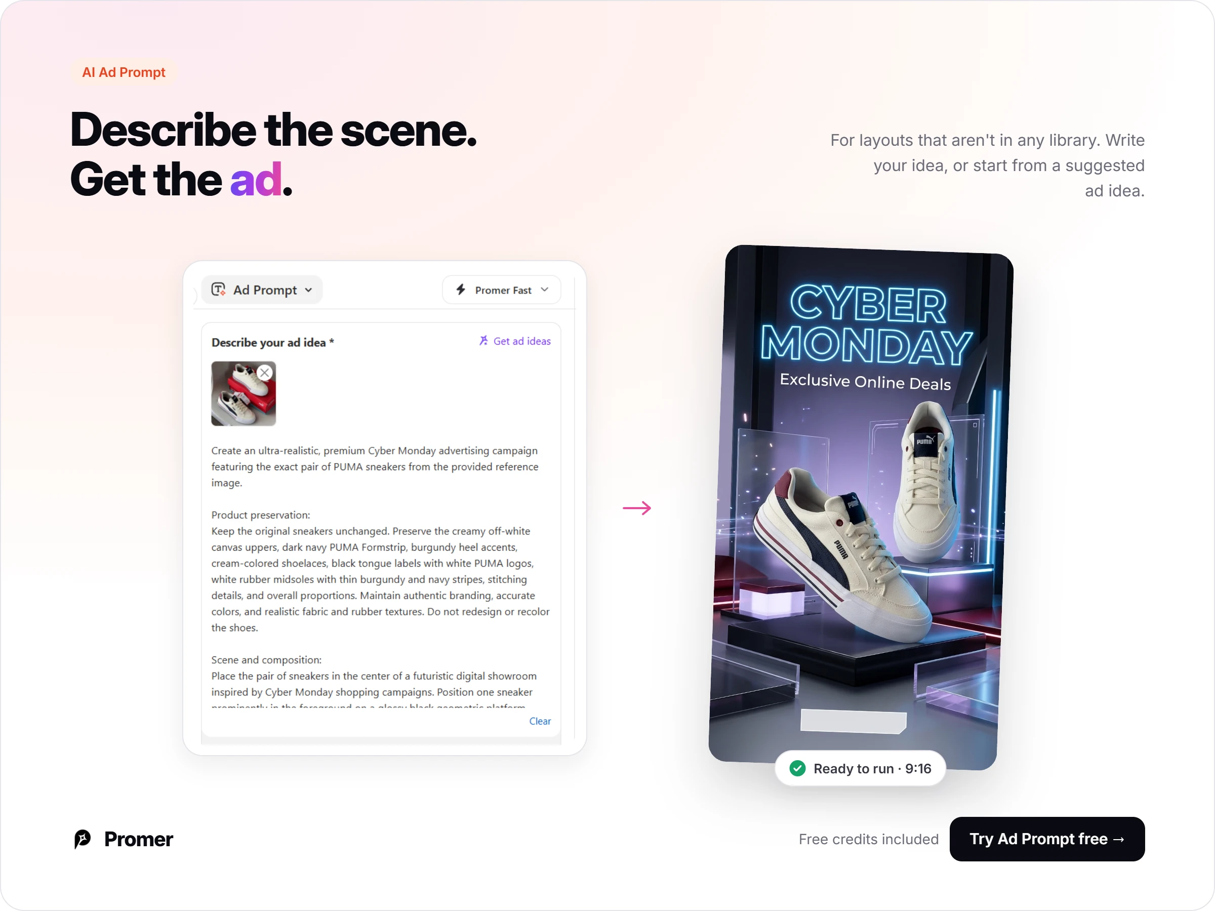
When none of the 13 structures fits, Promer AI's AI Ad Prompt lets you describe the scene and message yourself. With a product image added, "Get ad ideas" returns five suggestions, each with a tag, a message, and a visual description, and "Create prompt" turns one of them into a ready-to-use prompt. A reference ad is optional.
Review every generated creative before it runs. Check that the percentage, code, and dates shown in the image match what is live in your store, since an ad that shows the wrong offer sends shoppers to a page that doesn't match.
Common mistakes brands make with Cyber Monday ads
Using one ratio for every placement. A 1:1 square built for feed gets letterboxed in Stories, Reels, and TikTok, where 9:16 fills the screen. Build the layout for the placement it will run in.
Stacking several callouts. A discount, a code, a deadline, and a badge in one frame compete with each other. Most of the examples above keep one dominant element and let the rest stay small.
Naming a window your offer doesn't cover. If the copy says "Cyber Weekend" or "Cyber Tuesday", the offer should be live for exactly those dates.
Copying the image instead of the structure. The useful part of an example is its hierarchy, contrast, and hook placement. Rebuild those with your own product and colors instead of reproducing the original picture.
Testing colorways instead of ideas. Three color variations of one layout tell you little about which offer idea your audience responds to. Test structurally different hooks.
FAQs about Cyber Monday ad examples
These are the questions ecommerce teams ask most before building their own Cyber Monday creative from examples like the ones above.
What makes a good Cyber Monday ad
A good Cyber Monday ad usually isolates one offer and gives it the most space in the frame. The 13 examples above each do this with a different idea: a discount number, a price, a free gift, a deadline, a bundle, or a window name. Without results data, treat "good" here as readable and focused, and confirm with your own testing.
What aspect ratio should I use for Cyber Monday ads
Use 9:16 for Stories, Reels, and TikTok, and 1:1 or 4:5 for Instagram and Facebook feed. Matching the ratio to the placement typically keeps your headline and product from being cropped or shrunk.
Does a Cyber Monday ad have to show a discount percentage
No. In the set above, 13 of 18 lead with a numeric discount, and the rest lead with a price, a free gift, a deadline, a bundle, or the event name. A percentage is the common choice, and the other structures are worth testing against it.
Can I reuse a Black Friday ad for Cyber Monday
Often, if the offer is the same. Keep the layout, then change the event name, the dates, and any code that doesn't apply. Check that the creative states the offer that is actually live on each day.
How many Cyber Monday ad variations should I test
A practical starting point is two or three structurally different hooks per offer, such as a discount-number ad, a deadline ad, and a bundle ad. That tells you more than three colorways of one layout. Adjust to your budget and traffic.
When should I have Cyber Monday ads ready
Cyber Monday 2026 falls on November 30. Build and review the creatives before the sale starts, so the percentages, codes, and dates in each image are checked against your store.
Where can I find more Cyber Monday ad examples
Promer AI's AI Ad Library groups ad creatives by niche, theme, and platform, and AI Ad Spy shows live Meta and TikTok ads by keyword or brand. Both give you more references to shortlist before you rebuild one with your own product.
Summary
The 13 Cyber Monday ad examples above share one habit: a single offer idea, with a layout that gives it room. Whether that idea is a number, a free gift, a clock, or a window name depends on what you sell and what you can afford to discount.
Pick the structure closest to your product, choose the Promer AI tool that matches where you are starting from (a reference ad or a blank idea), and put your own product, copy, and dates into it.