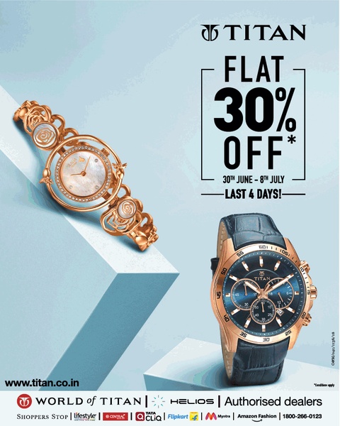
A high-contrast promotional graphic featuring two luxury watches on a split-level geometric display with bold offer text.
Free credits included. No card required
This wristwatch ad creative leverages a minimalist, product-first strategy to maintain a premium feel while communicating an urgent promotional offer. By using a clean light-blue background and structured geometric staging, the brand effectively draws the eye directly to the luxury items before highlighting the discount value. The strength of this layout lies in its clear hierarchy, where the visual weight of the watches balances against the bold, sans-serif typography to create a sense of refined urgency.
For most ecommerce brands selling high-ticket accessories, this layout proves effective because it prevents visual clutter from overshadowing the product details. Using Promer AI, teams can replicate this clean, high-contrast aesthetic to ensure their promotional offers don't sacrifice brand equity. The use of limited, intentional colors keeps the focus strictly on the conversion goal without appearing overly aggressive.
Great ads start from an idea, a feeling, or a structure, not a blank design.
Pro tip
When using a direct-offer hook for high-end goods, ensure your typography size directly correlates to the value of the promotion. Keep the background desaturated and consistent to ensure your product photos remain the undisputed hero of the frame.




















Promer helps you find the pattern, adapt it to your product, and create your own version in minutes.






