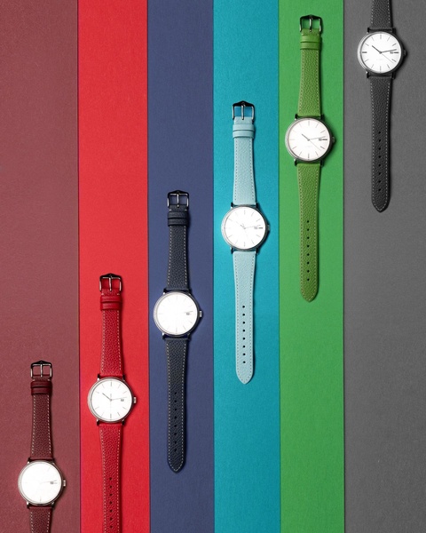
A top-down, structured product photography layout showcasing a variety of wristwatch colors aligned against vibrant, distinct vertical background panels.
Free credits included. No card required
This wristwatch ad creative utilizes a vertical, high-contrast grid to organize multiple product variants within a single frame. The central strategy here is the use of color-blocked symmetry to create visual order, which effectively draws the eye across the entire image and highlights product variety without cluttering the composition. By anchoring each watch to a distinct, saturated background, the design communicates a premium, clean aesthetic that suggests versatility and style options to the viewer. This organized presentation is a proven pattern for accessory brands to demonstrate color selection efficiently. Using Promer AI, you can replicate this structured visual hierarchy for your own product inventory by focusing on a clean, top-down perspective that allows your catalog to shine in a single, high-converting frame.
Great ads start from a structured visual language that prioritizes clarity and product variety over complex graphics.
Pro tip
To make this style work for products other than watches, ensure the background color blocks match your brand's color theory or the dominant colors of the item itself. Maintaining a consistent angle for each product item in your grid is essential to achieving this premium, high-end feel.




















Promer helps you find the pattern, adapt it to your product, and create your own version in minutes.






