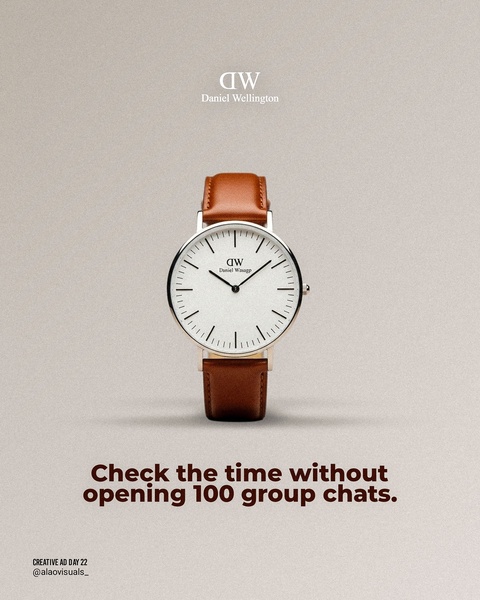
A clean, studio-lit image of a wristwatch centered on a neutral background with a punchy, relatable headline addressing digital overload.
Free credits included. No card required
This wristwatch ad creative leverages a minimalist, high-contrast visual composition to immediately isolate the product from the noise of a crowded social feed. The core of this strategy is using a relatable, non-product-focused pain point as a psychological hook to draw users into a simple product benefit. By speaking to a common digital friction point, the ad creates an instant, empathetic connection with the viewer before shifting focus to the physical object.
Such a structured pattern for this product category typically performs well by stripping away unnecessary background elements to let the watch design breathe, which you can easily replicate with Promer AI. In most cases, centering the product on a neutral background prevents visual fatigue and directs all attention toward the brand's aesthetic, a tactic highly effective for premium accessories.
Great ads are built on a foundation of relatable friction points that make the product feel like a natural, elevated solution.
Pro tip
Pair minimalist photography with a headline that calls out a specific, non-obvious annoyance caused by smartphones. For watches, this highlights the product's role as a tool for digital disconnection, which increases engagement among professional target audiences.




















Promer helps you find the pattern, adapt it to your product, and create your own version in minutes.






