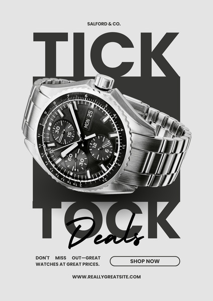
A clean, high-contrast promotional ad for a wristwatch, using bold typography and a central product cutout to highlight a sale event.
Free credits included. No card required
This wristwatch ad creative leverages a high-contrast, text-heavy approach that anchors the viewer’s eye directly on the product. By placing the watch between two massive words, the design immediately communicates the theme of time while utilizing the negative space to keep the layout feeling premium and uncluttered.
The core strength of this layout is the simplified information hierarchy that forces the user to focus on the product and the deal simultaneously. For most wristwatch brands, performance drops when the visual is too busy; using Promer AI to maintain this level of clarity ensures your promotions remain effective without overwhelming the potential customer.
Great ads start from an idea, a feeling, or a structure, not a blank design.
Pro tip
To increase urgency, consider testing a countdown overlay near the CTA button. When using bold, large-scale typography, ensure your product photography has enough crisp detail to stand out against the heavy text elements.




















Promer helps you find the pattern, adapt it to your product, and create your own version in minutes.






