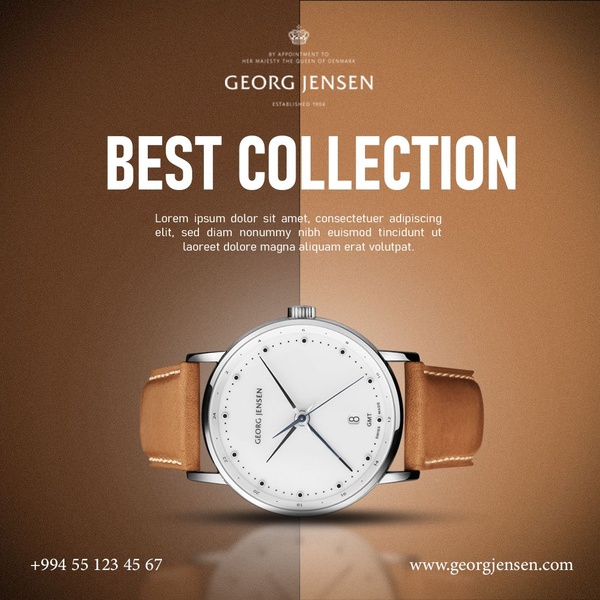
This creative showcases a luxury wristwatch centered against a split-tone brown background, emphasizing a clean, premium visual hierarchy.
Free credits included. No card required
This wristwatch ad creative leverages a stark split-tone background to force the viewer's eye directly onto the product. By utilizing a symmetrical layout and negative space, the brand avoids visual clutter, allowing the high-quality watch face to function as the primary hook. The deliberate use of minimal design elements communicates a sense of high-end value and timelessness, which is essential for luxury accessories. Design patterns like this are effective because they reduce cognitive load, helping the user quickly identify the subject matter. When you use Promer AI to analyze these structures, you can see how pairing a neutral, professional color palette with a single, sharp product image often yields higher engagement in saturated social feeds, though performance results will vary based on your specific audience.
A clean visual composition tells the customer that your product is premium before they even read the headline.
Pro tip
When adopting a minimalist design, ensure your product photography has high-contrast lighting to prevent it from looking flat against the solid background. Proper shadows, like those beneath the watch in this example, are crucial for adding depth to a simple creative.




















Promer helps you find the pattern, adapt it to your product, and create your own version in minutes.






