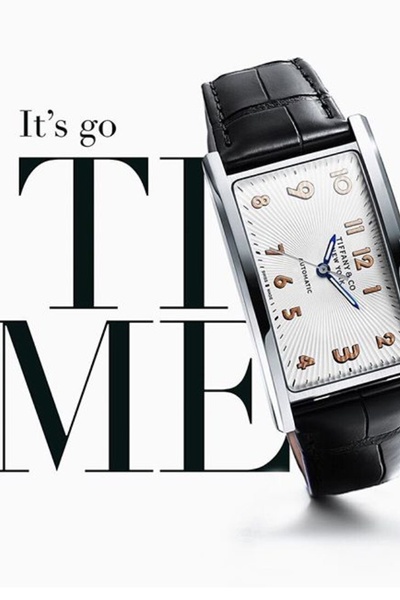
This ad creative highlights a luxury wrist watch using clean, high-contrast typography and a macro product shot to evoke a premium feel.
Free credits included. No card required
The wrist watch ad creative employs a sophisticated typographic hook that forces the viewer to mentally complete the phrase while centering the product as the primary focal point. By stripping away background clutter and relying on stark high-contrast imagery, the ad positions the product as an aspirational, premium item rather than a commodity. This combination of minimalist visual weight and intelligent use of negative space is a proven method to capture attention in a high-speed scroll environment.
For most performance teams, this design structure works because it removes cognitive load, allowing the consumer to immediately associate the brand with quality. You can use Promer AI to analyze the structural composition of this ad and adapt it to your own product photography. When using this layout, ensure your product is well-lit and high-resolution to avoid losing the luxury feel inherent to this minimalist aesthetic.
Great ads start from a singular, focused idea, a deliberate feeling, or a rigid structure rather than a crowded design.
Pro tip
When experimenting with text-heavy ads, ensure your font choices are legible across both mobile and desktop sizes. For a luxury watch or similar product, prioritize thin, high-end serif typefaces to maintain a premium brand image that complements the high-resolution imagery.




















Promer helps you find the pattern, adapt it to your product, and create your own version in minutes.






