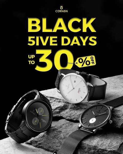
A seasonal promotion for wristwatches featuring a dark, moody background with high-contrast yellow typography and a professional product showcase.
Free credits included. No card required
This watch ad succeeds by pairing a clean, high-end studio aesthetic with a bold, urgency-driven seasonal message. By isolating the product against a rugged, neutral stone texture, the brand creates a sophisticated visual foundation that makes the bright yellow promotional text pop immediately for the viewer. Using high-contrast typography against a dark, monochromatic background is a reliable way to ensure your offer remains the focal point while maintaining a premium feel.
For most ecommerce teams looking to scale, Promer AI provides the tools needed to replicate this professional look with your own product inventory. This pattern works because it respects the viewer's visual hierarchy: they first see the brand, then the value proposition, and finally the product itself. Maintaining this balance typically prevents the ad from feeling overly cluttered or desperate during high-traffic sale periods.
Effective advertising starts from a deliberate structure that balances a premium brand aesthetic with a clear, time-sensitive offer.
Pro tip
When running seasonal sale ads, test minor adjustments to your CTA text to see if specific urgency drivers like 'Ending Soon' perform better than standard discount banners. Ensure that your product photography remains consistent with the studio lighting demonstrated here to maintain a cohesive brand identity.




















Promer helps you find the pattern, adapt it to your product, and create your own version in minutes.






