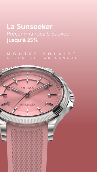
A 9:16 vertical creative featuring a pink-dial solar watch with a clear pre-order discount offer set against a soft gradient background.
Free credits included. No card required
This solar watch ad creative succeeds by pairing a clean, studio-lit hero image with a low-friction financial incentive. By focusing the viewer's attention on the product's aesthetic value, the creative builds desire before presenting the discount, making the call to action feel like a logical next step for the consumer. The core strength of this strategy lies in its visual simplicity, which allows the product design to serve as the primary hook while the text provides necessary context.
For performance marketers looking to emulate this success, Promer AI offers a structured way to test similar layouts without manual design cycles. By maintaining a consistent color palette across the background and the product, the brand ensures visual cohesion that typically increases recall and trust for high-ticket items like watches. Such an approach effectively removes distractions, focusing the user exclusively on the value proposition during high-intent scroll moments.
A minimalist design does not mean less effort; it means making every visual element serve the purpose of highlighting your product's most desirable features.
Pro tip
When using a monochromatic color palette, ensure your product has enough texture or metallic detail to avoid looking flat. A watch with a metallic bezel, like in this example, adds depth that draws the eye inward, preventing the viewer from scrolling past the minimalist background.




















Promer helps you find the pattern, adapt it to your product, and create your own version in minutes.






