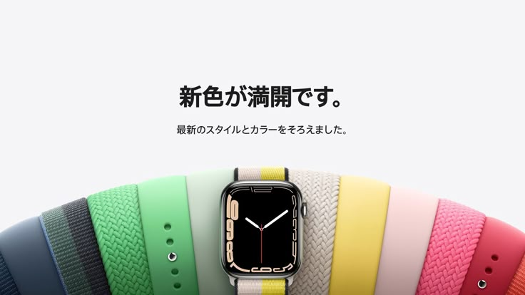
This ad creative displays a primary smartwatch centered against an expansive, fan-shaped spread of colorful replacement bands to emphasize variety and style.
Free credits included. No card required
This smartwatch band ad creative succeeds by using a high-contrast, fan-like arrangement of accessories to create an immediate, organized visual hook. By placing the core product at the center of a vibrant, symmetrical color palette, the creative draws the viewer's eye directly to the watch face before guiding them through the breadth of the collection.
This pattern works because it solves the paradox of choice by organizing numerous color options into a single, cohesive view, which is a common challenge for accessory brands. When using Promer AI to iterate on this approach, teams can maintain this structural clarity while quickly adapting the layout to highlight different seasonal colors or material textures for their own products.
Great ads start from an idea, a feeling, or a structure, not a blank design.
Pro tip
When showcasing multiple variants, keep your primary product in the center and vary the surrounding options to tell a story about versatility or seasonality. This keeps the ad from looking like a simple catalog sheet and instead presents it as a curated lifestyle choice.




















Promer helps you find the pattern, adapt it to your product, and create your own version in minutes.






