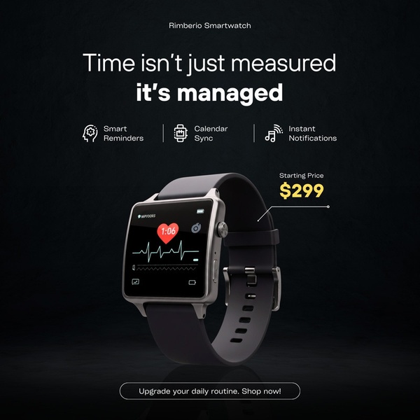
A clean, dark-themed ad creative showcasing a smartwatch's key features like calendar sync and smart reminders with a clear, direct value proposition.
Free credits included. No card required
This smartwatch ad creative utilizes a minimalist, high-contrast aesthetic to position the product as an essential productivity tool rather than just another wearable device. By using a value-based headline that challenges the user's perception of time management, the ad immediately shifts the focus from specs to life-improving benefits. The strategic use of white space and a singular, clean product render creates a focused visual hierarchy that prevents user distraction during the scroll.
For most brands, this clear-cut approach to communicating product utility works because it respects the user's limited attention span while clearly stating the 'why' behind the purchase. Leveraging the Promer AI platform allows marketers to maintain this level of visual consistency, ensuring that product renders remain the hero element while copy is tailored to specific audience pain points.
Great ads start from a clear value proposition and a focused visual structure, effectively turning a utility product into a lifestyle necessity.
Pro tip
When using high-contrast product shots, ensure your call-to-action button or price tag stands out with a single accent color, like the yellow used in this example. This creates a psychological 'eye-path' that guides the user from the feature benefits directly to the purchase information.




















Promer helps you find the pattern, adapt it to your product, and create your own version in minutes.






