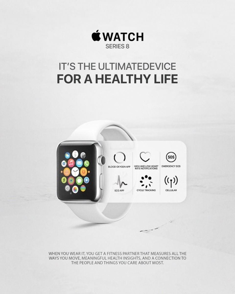
A clean, monochromatic ad layout for a smart watch that highlights six key health features through intuitive icons and concise, benefit-driven text.
Free credits included. No card required
This smart watch ad creative uses a high-key, minimalist visual style to strip away noise and focus entirely on utility. By pairing a clean hero image of the product with a structured grid of iconography, the ad signals reliability and ease of use, which effectively communicates complex health data to a broad audience.
This approach works for technical products because it avoids overwhelming the consumer with too many specs at once, a core capability of Promer AI. In most cases, distilling a product down to its core benefits using simple, recognizable symbols increases cognitive ease, allowing the user to quickly grasp the value proposition of the hardware.
Effective product ads succeed by aligning clear visual hierarchy with the specific benefits that solve a user's primary daily pain points.
Pro tip
When showcasing multiple features, prioritize the one that provides the most immediate relief to your target customer's pain point. Use the remaining icons to build a hierarchy of secondary benefits that support your primary claim.




















Promer helps you find the pattern, adapt it to your product, and create your own version in minutes.






