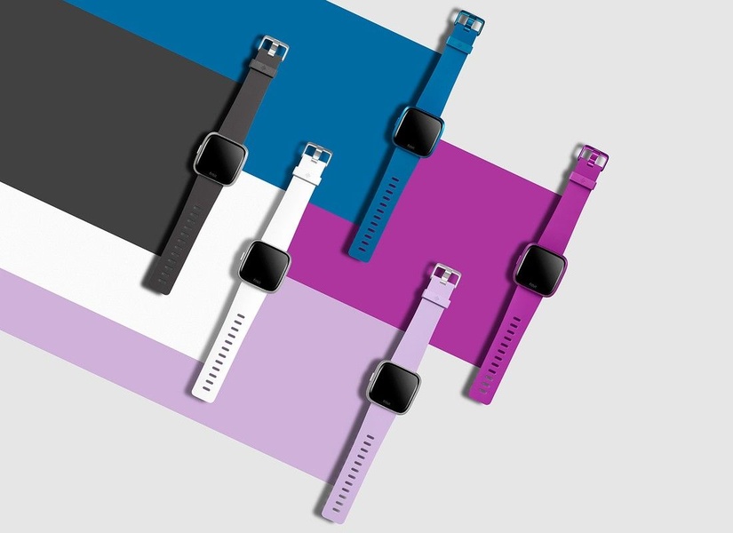
A high-angle, minimalist flat lay showcasing five different smart watch colors arranged in a precise, non-overlapping geometric pattern.
Free credits included. No card required
This smart watch ad creative uses a high-contrast, minimalist grid layout to immediately communicate variety and design elegance to the viewer. By utilizing a structured, geometric arrangement of product units, the brand eliminates visual clutter, allowing the consumer to digest the available color options in a single glance.
This approach works because it mimics an organized, premium catalog feel that builds instant trust, especially for tech accessories where aesthetics are a primary driver. Performance marketers at Promer AI often see this pattern outperform busy lifestyle shots when the goal is to drive quick product exploration and color preference, though success typically depends on your audience's affinity for minimalist design.
A perfectly structured layout turns a simple product display into a compelling, high-converting invitation to explore your collection.
Pro tip
To maximize engagement with a grid layout, ensure the background colors directly complement or contrast with the color of the product displayed on that specific block. This creates a balanced visual rhythm that keeps the user's eye moving across your entire product range.




















Promer helps you find the pattern, adapt it to your product, and create your own version in minutes.






