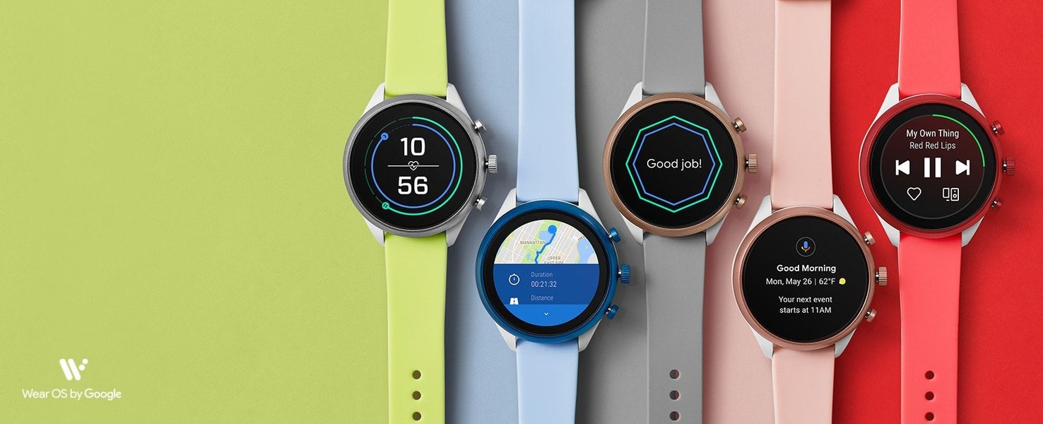
A horizontal 21:9 layout displaying a row of smart watches in varying colors and face configurations against distinct solid-color backgrounds.
Free credits included. No card required
This smart watch ad creative utilizes a high-contrast, flat-lay grid strategy that immediately organizes visual information for the viewer. By aligning multiple color variations of the product in a single horizontal sequence, the ad removes decision friction and showcases the full range of the collection at a glance.
For most ecommerce teams, this pattern is effective because it leverages visual symmetry to hold user attention without requiring complex motion. You can replicate this structural precision with Promer AI to ensure your product photography maintains a consistent, professional aesthetic across all variants.
A strong product grid removes the need for excessive copy by letting the variety and design of the product speak for itself.
Pro tip
Use high-saturation background colors that complement your product straps or accents to create a cohesive brand look. This method works best for accessories where aesthetics are a primary driver of purchase intent, but ensure your text overlays remain legible against the bold colors.




















Promer helps you find the pattern, adapt it to your product, and create your own version in minutes.






