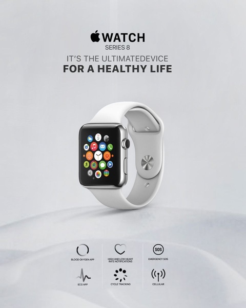
A clean, studio-lit smart watch ad using a minimalist white background to highlight core health-tracking features through distinct iconography.
Free credits included. No card required
This smart watch ad creative utilizes a minimalist, high-contrast design to center the product as the primary focal point. By pairing a simple, aspirational headline with clear icons for features like heart rate and SOS, the creative eliminates visual clutter, allowing the consumer to immediately grasp the utility of the device. The core effectiveness of this ad stems from its direct alignment of product features with emotional well-being benefits.
For most ecommerce brands selling technical devices, this stripped-back approach provides clarity that prevents user fatigue during scrolling. Using Promer AI to analyze such successful design patterns allows you to replicate this structured hierarchy, ensuring your product imagery serves as the anchor while benefits are communicated with minimal friction. This approach is typically most effective when your target demographic prioritizes ease-of-use and health clarity over excessive technical specifications.
Great ads start from a clear promise of value that resonates with the user's needs, not just a high-quality product photo.
Pro tip
When promoting health tech, group your icons by lifestyle benefit rather than just technical specs. This creates a stronger emotional narrative that helps the consumer visualize the watch as an essential companion rather than just a wearable device.




















Promer helps you find the pattern, adapt it to your product, and create your own version in minutes.






