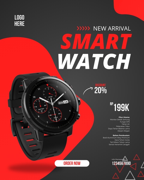
A high-contrast, product-focused static ad displaying a new smart watch model with a 20% discount offer and a bulleted list of technical specifications.
Free credits included. No card required
This smart watch ad creative succeeds because it pairs a high-contrast color palette with a direct, offer-driven hook. By placing the product in the center and surrounding it with legible, structured information, the design ensures that a potential customer can digest the value proposition in under three seconds. Using a bold, red-and-black aesthetic creates a sense of professional urgency and technical sophistication.
For most ecommerce brands selling consumer electronics, this layout pattern is highly repeatable. By leveraging Promer AI to maintain this level of visual hierarchy, teams can quickly iterate on different product shots while keeping the core discount messaging consistent. This strategy is effective because it avoids clutter, focusing entirely on the visual appeal of the hardware and the attractiveness of the deal.
A high-converting ad starts from a disciplined structure that prioritizes clear communication over excessive design elements.
Pro tip
To increase the effectiveness of this layout, ensure your product image is rendered with high-quality lighting that highlights the material texture of the watch. When using this 4:5 ratio, keep your most critical information, like the 20% discount badge, above the fold so it is never obscured by interface elements.




















Promer helps you find the pattern, adapt it to your product, and create your own version in minutes.






