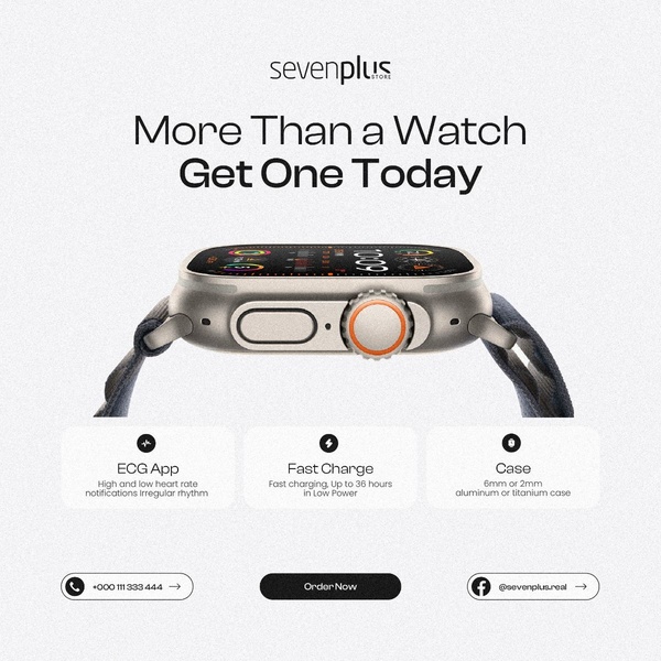
A clean, square-format ad showcasing a smart watch's key features with icons and clear typography.
Free credits included. No card required
This smart watch ad creative succeeds because it prioritizes clarity and feature accessibility over clutter. By using a minimalist, centered layout and high-contrast icons to highlight key benefits like ECG and fast charging, it immediately answers the user's implicit question about what the product does for them. The strategy relies on a clean, benefit-first visual architecture to stop the scroll while maintaining a premium aesthetic.
For most ecommerce teams, this pattern is effective because it reduces cognitive load, allowing the potential buyer to quickly digest core value propositions. Using Promer AI, you can replicate this structured, icon-heavy approach for your own product line to ensure your key features are the primary point of interest in your next campaign.
Great ads start from an idea, a feeling, or a structure, rather than a blank design canvas.
Pro tip
When using a direct, icon-heavy hook like this, ensure your primary call-to-action button color has the highest visual contrast against your background. This directs the user's eye from the feature list directly to the conversion point, typically increasing the click-through rate in most smart watch ad creative experiments.




















Promer helps you find the pattern, adapt it to your product, and create your own version in minutes.






