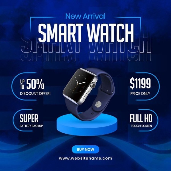
A high-contrast, clean promotional graphic for a new smart watch featuring price, discount, and key feature callouts in a grid layout.
Free credits included. No card required
This Smart Watch ad creative leverages a classic grid layout to balance product imagery with critical purchasing information. By placing the discount and core product features in distinct, symmetrical modules, the design forces the viewer to process the value proposition immediately without clutter. This approach effectively anchors the viewer's gaze, making the offer legible even on small mobile screens.
Performance teams frequently use this structural pattern for electronics to communicate technical superiority alongside price sensitivity. With Promer AI, you can isolate this specific layout, allowing the AI to analyze the spacing and hierarchy to help you recreate the same balance for your own product. In most cases, keeping the visual signal focused on the product silhouette while peripheral text blocks describe the benefits is a proven way to reduce cognitive load.
Great ads start from a repeatable structure that separates product emotion from functional value, ensuring every pixel serves a specific conversion intent.
Pro tip
For tech products, experiment with swapping the background color to match your product's primary accent. When using a grid layout, ensure the product image is centered and large enough to maintain its visual weight against the surrounding text blocks.




















Promer helps you find the pattern, adapt it to your product, and create your own version in minutes.






