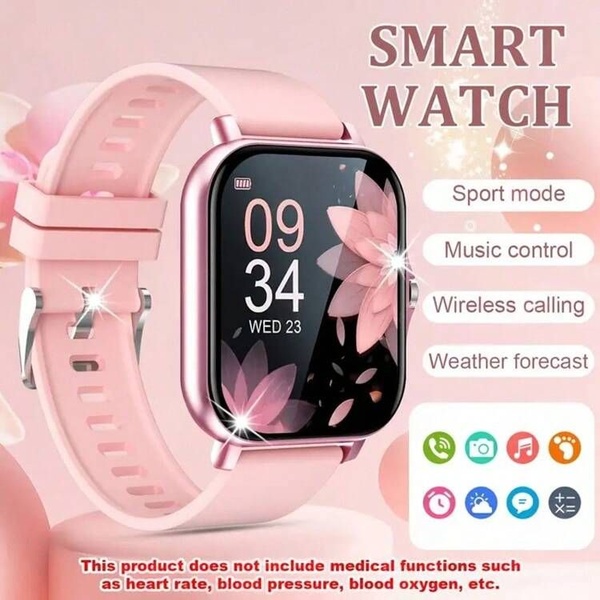
A clean, list-driven static graphic highlighting essential smart watch capabilities with a soft, consistent color palette.
Free credits included. No card required
This smart watch ad creative uses a high-contrast list format to instantly communicate product utility without overwhelming the user. By pairing a clear, product-centric image with specific, benefit-oriented bullet points, the creative keeps the focus entirely on what the user gets rather than abstract brand concepts.
This pattern works because it respects the short attention span of scrollers while providing the critical details needed for a conversion. You can easily replicate this structured layout using Promer AI to ensure your product photography and feature callouts maintain this same professional, organized appeal for your own target audience.
Great ads start from a structured feature-benefit layout that anticipates user needs before they even click.
Pro tip
For feature-focused lists, ensure the icons and text align perfectly with your product's primary selling point. Don't be afraid to test different background color variations that complement your product's finish while maintaining high contrast for the text.




















Promer helps you find the pattern, adapt it to your product, and create your own version in minutes.






