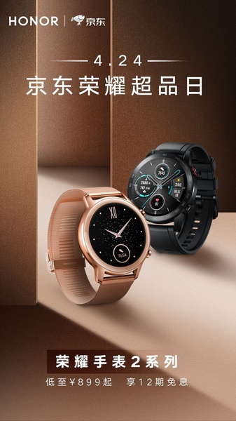
A split-screen minimalist studio composition showing two variants of a smart watch with promotional date and pricing text overlaid.
Free credits included. No card required
This smart watch ad creative uses a sophisticated minimalist composition to establish immediate product authority. By leveraging a high-contrast split-tone background and centered, clean typography, the creative directs focus entirely onto the product features while clearly presenting the seasonal sales event details. The strategy relies on visual balance and premium color grading to communicate quality and trust before the viewer even reads the promotional offer.
Adopting this clean, structured aesthetic allows for seamless product integration when using Promer AI to scale your ad library. For most ecommerce teams, stripping away clutter helps highlight the core hardware, which typically increases engagement by reducing the cognitive load required to understand the value proposition of a new device.
Great ads start from an idea, a feeling, or a structure, not a blank design.
Pro tip
When running hardware ads, maintain a strict 2:1 ratio between empty space and product focus to convey a sense of luxury. Avoid overlaying text on the watch face itself to ensure the interface details remain legible even on smaller mobile screens.




















Promer helps you find the pattern, adapt it to your product, and create your own version in minutes.






