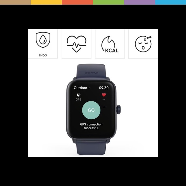
A clean, minimalist advertisement for a smart watch that uses icons to display core tracking capabilities like GPS, heart rate, and sleep quality.
Free credits included. No card required
This smart watch ad creative leverages a clean, grid-based layout to clearly communicate multiple product utilities without overwhelming the viewer. By isolating specific features using high-contrast icons, the design helps potential customers instantly grasp the device's value proposition. This structure is effective for wearable technology because it focuses on the "what" before introducing the "how," reducing cognitive load during the initial scroll.
For most ecommerce brands, this pattern works because it prioritizes clarity over clutter, allowing the Promer AI platform to easily adapt the modular layout to different product variants. Typically, keeping icon designs consistent and uncluttered allows the brand to highlight several use cases at once, which can lead to higher engagement rates depending on your product category and audience maturity.
A high-performing ad starts from a clear structural idea that translates complex features into simple, digestible visual cues.
Pro tip
When using icon-based feature grids, ensure the line weight of your icons matches the stroke of your product interface text. This visual consistency improves brand perception and makes the ad appear more polished and intentional to the user.




















Promer helps you find the pattern, adapt it to your product, and create your own version in minutes.






