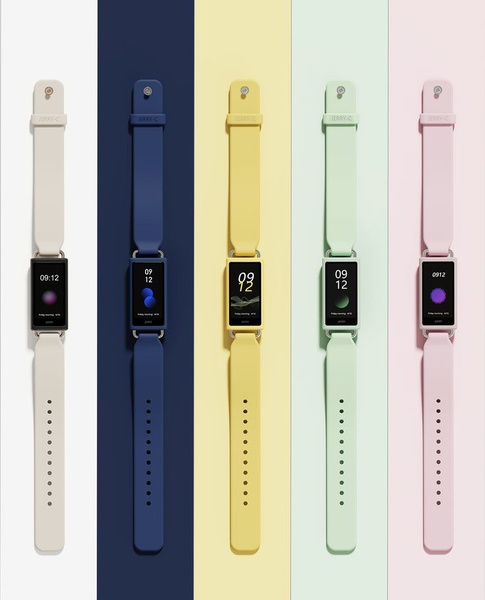
A high-contrast, vertical 4:5 image featuring five smart watches in different band colors arranged in a clean, minimalist column structure.
Free credits included. No card required
This smart watch ad creative utilizes a high-contrast, color-blocked layout to establish immediate visual order for the viewer. By aligning five distinct product variations in a clean, symmetrical column format, the ad removes cognitive load and allows the viewer to instantly perceive the available color options, making this a powerful strategy for product-focused brands on social platforms. The effectiveness of this design lies in its use of negative space and rhythmic repetition to guide the eye across the entire product line without needing distracting text.
For most ecommerce teams, displaying multiple variations simultaneously can create clutter, but this approach maintains clarity through strict geometric organization. You can use Promer AI to analyze similar high-performing layouts for your own inventory, ensuring your brand colors and product imagery are optimized for similar impact across feed placements.
A perfectly balanced layout is often more persuasive than a complex graphic because it respects the viewer's desire for immediate visual clarity.
Pro tip
To boost engagement on this style of ad, use a motion-based hook that reveals the colors one-by-one rather than showing them all at once. This creates a satisfying, incremental reveal that keeps users watching longer than a static image would.




















Promer helps you find the pattern, adapt it to your product, and create your own version in minutes.






