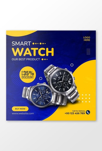
A square ad featuring two metallic smart watches centered against a blue and yellow gradient background, highlighting a 35% discount.
Free credits included. No card required
This smart watch ad creative succeeds by leveraging high-contrast color psychology to draw the eye immediately toward the promotional offer. By pairing a deep professional blue with an energetic yellow, the design establishes a visual hierarchy that forces the user to scan from the headline to the discount percentage before viewing the product images. This aggressive discount-led strategy effectively stops the scroll by creating an immediate value proposition for the viewer. This pattern is a foundational element in Promer AI and works because it reduces the cognitive load on the user; instead of needing to understand complex watch features, the customer sees exactly what they get and how much they save. For most ecommerce teams, this direct approach is a repeatable way to test price sensitivity in a crowded market.
Great ads start from an idea, a feeling, or a structure, not a blank design.
Pro tip
When running discount-heavy creative, experiment with 'anchoring' the price by showing the original vs. sale price directly below the discount circle. This small addition can often increase conversion by providing the necessary context for the deal's value, which is especially effective for smart watches where customers are price-conscious.




















Promer helps you find the pattern, adapt it to your product, and create your own version in minutes.






