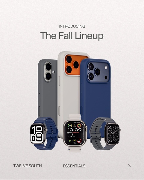
A clean, minimalist product showcase featuring a range of phone cases and smart watch bands arranged in a professional, studio-style composition.
Free credits included. No card required
This phone case and watch band ad creative leverages a clean, high-contrast visual hierarchy to make the products the clear hero of the frame. By grouping multiple accessory items into a single, cohesive "fall lineup" graphic, the brand creates an aspirational sense of completeness that encourages viewers to view the collection as a system rather than individual items. The core strategy here is to pair a direct, professional product reveal with a lifestyle-centric collection announcement to anchor consumer interest immediately.
For most ecommerce teams, this approach works because it eliminates visual clutter and focuses strictly on product variety. When scaling, Promer AI allows you to swap your own product variations into this same high-conversion layout. Depending on your product category, maintaining this level of negative space is typically a reliable way to ensure that mobile shoppers can process your full offering without being distracted by secondary text or busy backgrounds.
A collection reveal works best when the visual hierarchy is stripped back to let your products speak for themselves.
Pro tip
When launching a new collection, ensure your background color temperature matches the mood of your products. Use lighter backgrounds for pastel or bright accessories, and darker, more matte finishes for metallic or premium tech products to maximize the perceived value.




















Promer helps you find the pattern, adapt it to your product, and create your own version in minutes.






