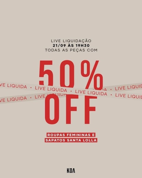
A minimalist, high-contrast promotional ad for a clothing brand's liquidation sale, using typography as the central visual anchor.
Free credits included. No card required
This Women's Clothing ad creative captures attention by stripping away visual clutter to highlight the 50% off offer directly. By combining a clean beige background with bold red typography and a 'tape' overlay, the design creates an immediate, high-contrast focal point that stops the scroll through sheer clarity and directness. Prioritizing legibility over complex imagery ensures the primary value proposition is communicated instantly to the user.
Adopting this stripped-back approach allows your Promer AI managed campaigns to focus entirely on the offer, which is often the most critical factor for repeat customers. In most cases, relying on strong, clear typographic hierarchy performs well when the audience is already familiar with the brand or when the discount is aggressive enough to require no secondary explanation.
Great ads start from an idea, a feeling, or a structure, not a blank design.
Pro tip
When using direct typography hooks, ensure the hierarchy is logical; place the most urgent information, like your event date, in the smallest font and the primary value proposition in the largest. This creates a psychological 'scanning path' that guides the user from awareness to the main offer instantly.
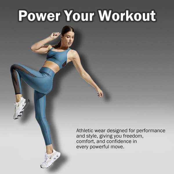
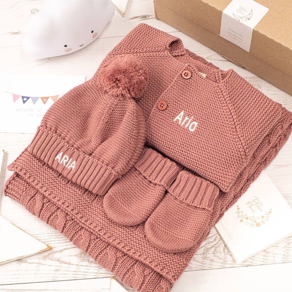
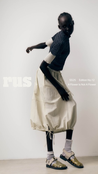




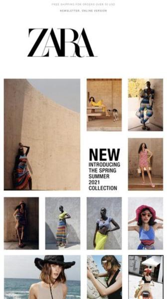
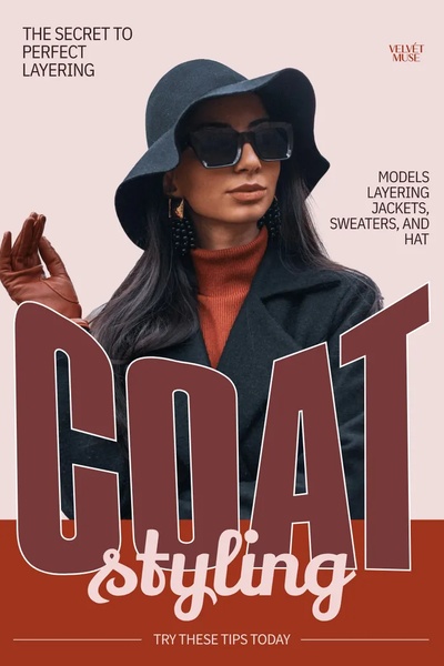
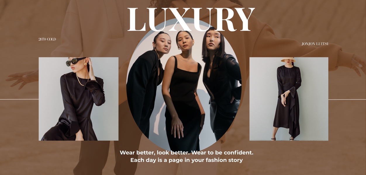







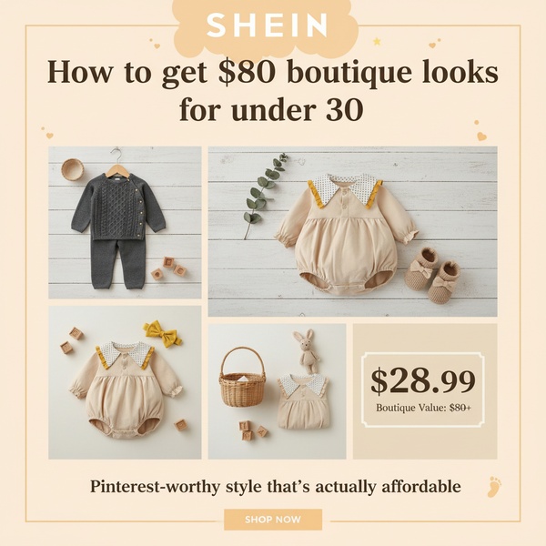

Promer helps you find the pattern, adapt it to your product, and create your own version in minutes.






