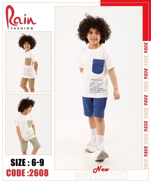
A clean, high-contrast product-centric layout for a boys' t-shirt, featuring a primary model shot flanked by two color variations and essential product data.
Free credits included. No card required
This children's t-shirt ad creative succeeds by leveraging a clear, utility-focused layout that places the product at the center of the frame. By stripping away distracting background noise, the ad allows the viewer to focus on the clothing quality, while the grid-based structural hierarchy makes the critical information—like sizing and collection codes—instantly legible for the busy parent persona.
Visual clarity acts as a trust signal for high-intent shoppers, and by using Promer AI to standardize these layouts, you can ensure your brand aesthetic remains consistent across different product lines. For most e-commerce teams, this pattern-based approach to creative development helps reduce fatigue by allowing you to iterate on the background and styling while keeping the proven functional layout untouched.
Effective product ads operate like a well-labeled shelf, guiding the customer through visual discovery without the need for excessive copy.
Pro tip
To increase relevance, match the t-shirt text color to the accent colors in the product photo, as seen in the blue and tan pocket details. This creates a cohesive visual rhythm that keeps the viewer's eye moving through the essential product features.














Promer helps you find the pattern, adapt it to your product, and create your own version in minutes.






