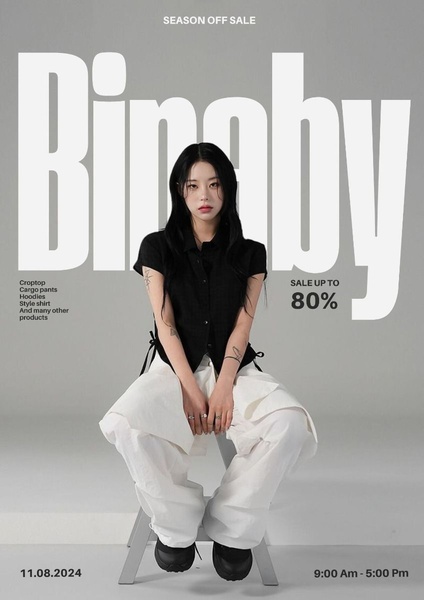
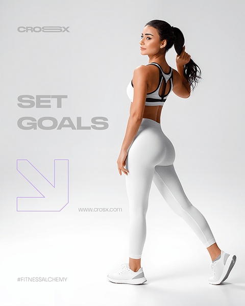
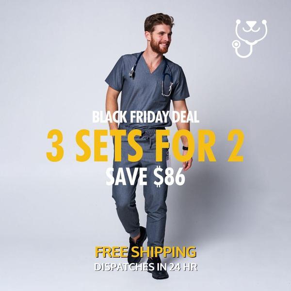
This static 3:4 ad uses high-contrast typography and a clean studio backdrop to highlight a seasonal sale for apparel products.
Free credits included. No card required
The effectiveness of this apparel ad creative relies on a minimalist aesthetic that uses high-contrast typography to emphasize the sale offer. By stripping away background noise and focusing on a singular product-focused image paired with bold text, the ad ensures the discount is the primary hook for the viewer. This approach prevents visual clutter, allowing the 80% discount to demand immediate attention while maintaining a high-fashion brand perception. Most ecommerce teams struggle to balance sale announcements with brand identity, but this layout succeeds by treating the offer as a design element rather than an afterthought. Using Promer AI, you can replicate this clean, authoritative structure for your own products to test how minimalist design impacts your click-through rates.
Design is the silent salesman; when you declutter your ad layout, the value of your offer becomes the loudest element on the screen.
Pro tip
To maximize performance with this layout, ensure your product subject is centered and clearly lit to maintain the professional studio aesthetic shown here. In most cases, changing the background shade slightly to complement your specific clothing collection can boost engagement without sacrificing the minimalist feel.
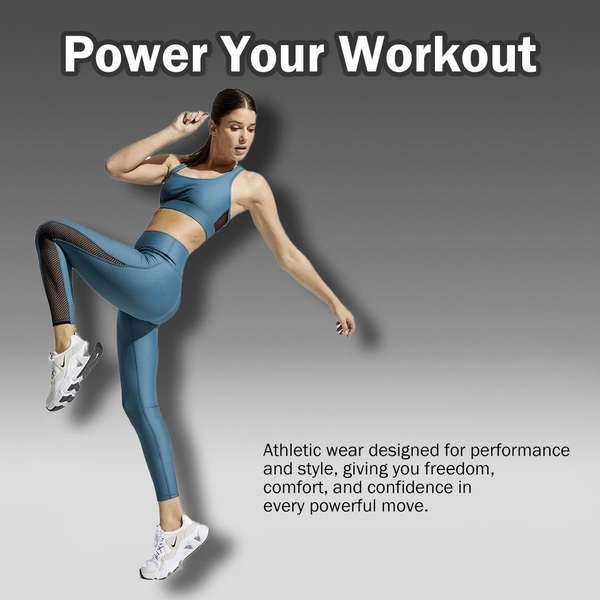
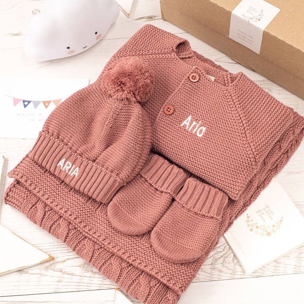
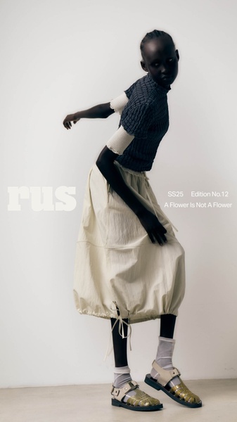







Promer helps you find the pattern, adapt it to your product, and create your own version in minutes.






