
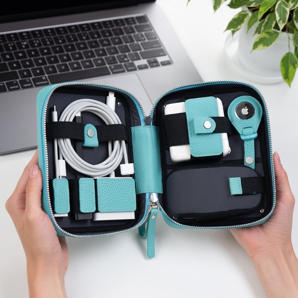
A split-screen comparison showing a messy pile of disorganized cables versus a neatly packed electronics organizer bag.
Free credits included. No card required
This visual contrast strategy uses a clear 'before and after' layout to position the cable organizer bag as the definitive solution for clutter. By juxtaposing a chaotic, hand-drawn 'Knotty' side with a clean, organized 'Nice' side, the ad immediately signals the emotional benefit of order to the viewer. The simplicity of this visual framing effectively communicates the value proposition without requiring heavy text copy, making it highly effective for scroll-heavy environments.
For most ecommerce teams, this pattern of showing a tangible 'problem' versus a 'solution' provides an immediate hook that requires no explanation. You can leverage the Promer AI platform to build similar comparison-based concepts, focusing on how your specific product removes friction or adds order to the user's daily life, which typically helps increase engagement rates by providing an instant, satisfying payoff.
Great ads start from an idea, a feeling, or a structure, rather than just a product shot.
Pro tip
Focus on the 'pain' side of the comparison to make your solution more desirable. If your product solves a common mess or struggle, ensure the 'Knotty' side of your creative feels relatable enough that the viewer wants to escape it immediately.












Promer helps you find the pattern, adapt it to your product, and create your own version in minutes.






