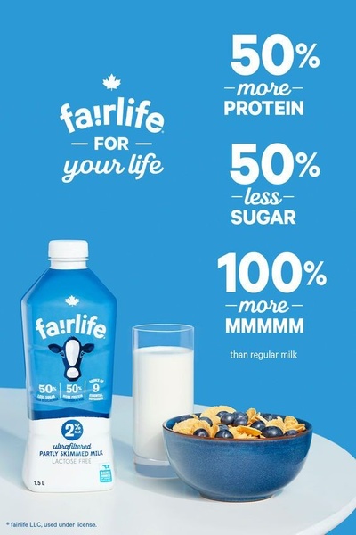
A clean, minimalist 2:3 ratio ad showcasing the nutritional benefits of ultrafiltered milk through bold typography and product photography.
Free credits included. No card required
This ultrafiltered milk ad creative leverages a clean, high-contrast visual hierarchy to communicate value propositions instantly. By placing hard data points like 50% more protein and 50% less sugar alongside a standard 2:3 aspect ratio, the design ensures mobile users digest the core benefits before scrolling past.
This pattern works because it prioritizes product truth over lifestyle imagery, allowing the audience to compare the brand against regular alternatives. Using Promer AI, advertisers can replicate this direct-comparison layout to clearly articulate their own product's competitive advantage in crowded food categories.
Great ads start from a clear structure that forces the viewer to confront the product's primary value proposition within one second.
Pro tip
When running direct-comparison ads, ensure your baseline (the 'regular milk' reference) is universally understood to avoid confusing the viewer. Test different variations where the percentages are swapped for emotional benefits like 'more energy' or 'less bloating' to see which framing resonates most with your audience.










Promer helps you find the pattern, adapt it to your product, and create your own version in minutes.






