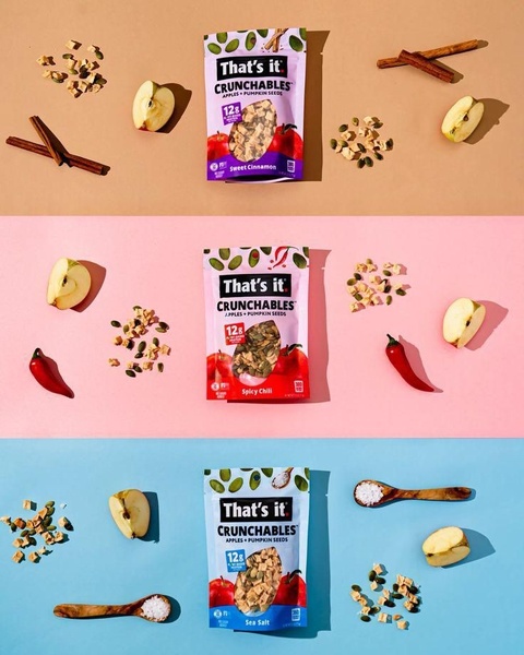
A clean, color-blocked grid display showcasing different Crunchables snack flavors alongside their key ingredients.
Free credits included. No card required
The Crunchables ad creative excels by utilizing a color-blocked grid layout that creates immediate visual order for the viewer. By pairing the product with its specific raw ingredients in a balanced, symmetrical composition, the brand successfully anchors the health-conscious promise of the snack in a clean, high-contrast aesthetic.
This approach works because it reduces cognitive load, allowing the potential customer to identify flavors and ingredients in under a second. Using Promer AI, teams can replicate this structured, product-centric approach for their own offerings to ensure visual consistency across different flavor variations.
Great ads start from a repeatable visual structure that allows the product's quality to do the heavy lifting.
Pro tip
When creating a grid-based snack ad, ensure the lighting remains consistent across all sections to prevent the creative from feeling disjointed. Use high-resolution shots of your hero ingredients to create a tactile sense of freshness that complements the packaged product.




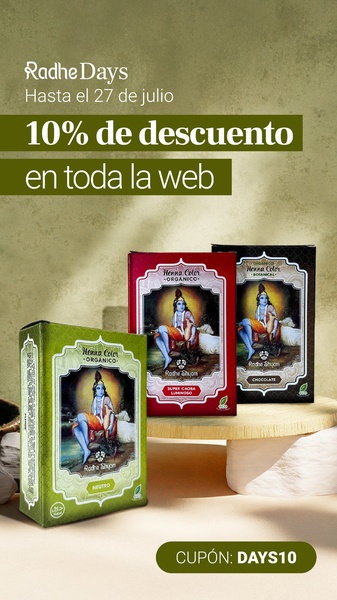
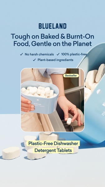
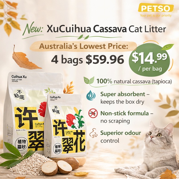
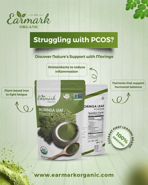

Promer helps you find the pattern, adapt it to your product, and create your own version in minutes.






