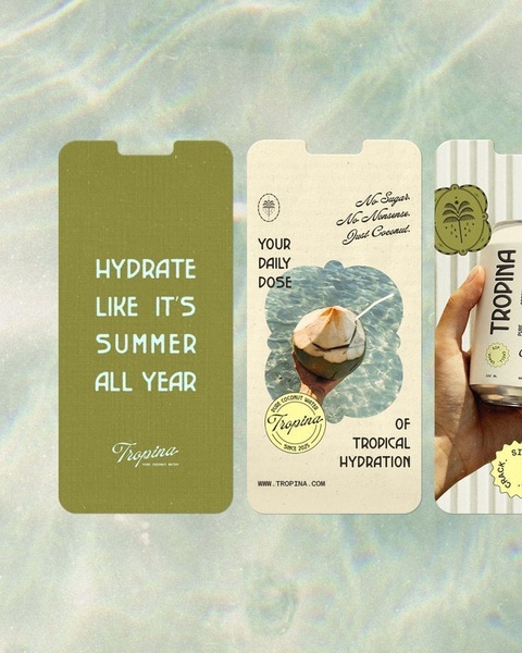
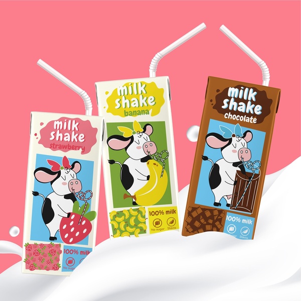
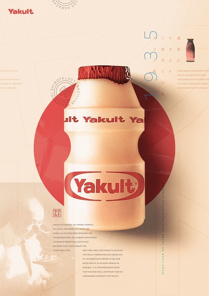
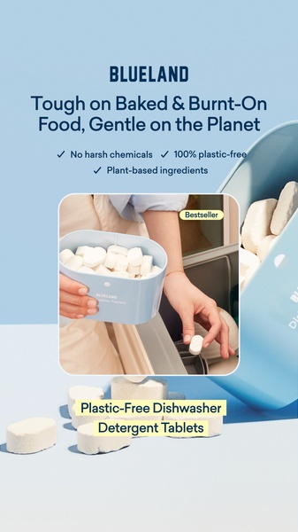
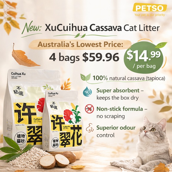
A clean, minimalist 4:5 ad creative series for coconut water featuring earth-tone typography and product-focused lifestyle imagery.
Free credits included. No card required
This coconut water ad creative succeeds by using a direct benefit statement paired with high-contrast, minimalist visual design to stop the user's scroll. The strategy relies on connecting the physical product with a specific emotional state—summer hydration—using negative space to keep the focus entirely on the brand’s promise. By stripping away complex imagery in favor of clean, earthy tones, the ad feels premium and intentional rather than cluttered or salesy.
In most cases, this aesthetic approach works for food and beverage brands because it quickly communicates the core value proposition without needing extensive copy. Using Promer AI to analyze the structure of this ad helps you identify exactly how to swap your own product into a high-converting layout while maintaining the specific visual hierarchy that makes this creative effective.
Great ads are built on a clear, singular promise delivered through a structure that respects the user's need for instant clarity.
Pro tip
When using minimalist typography, ensure your primary font choice has enough character to stand alone without background distraction. Test variations where the text color is inverted to maintain readability against changing lifestyle background imagery.

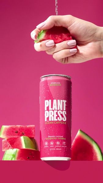

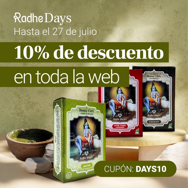

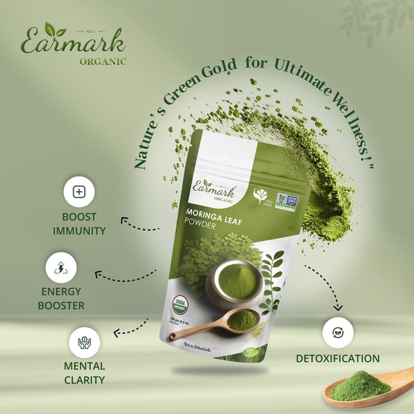
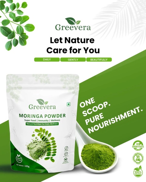




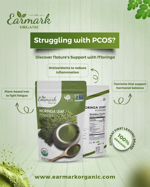
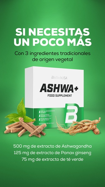
Promer helps you find the pattern, adapt it to your product, and create your own version in minutes.






