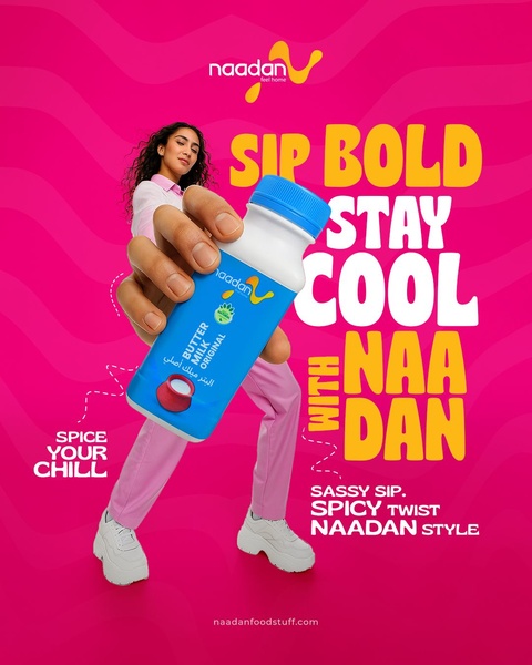
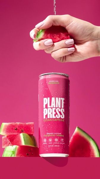
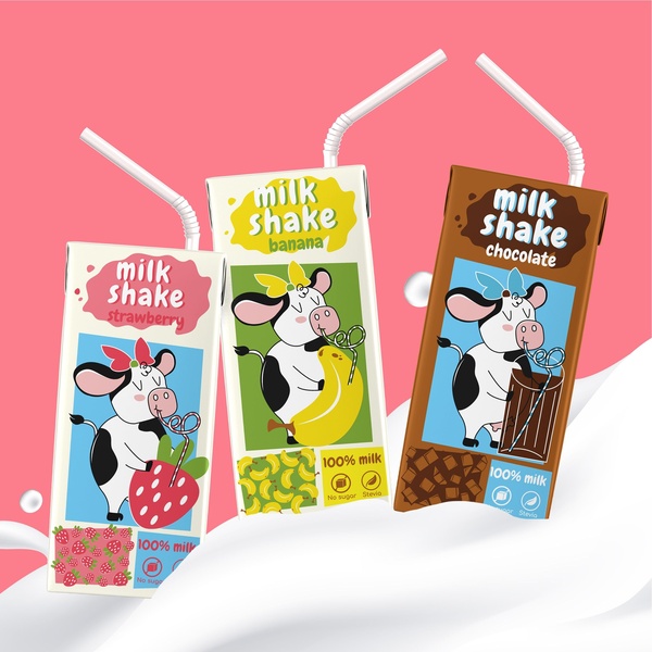
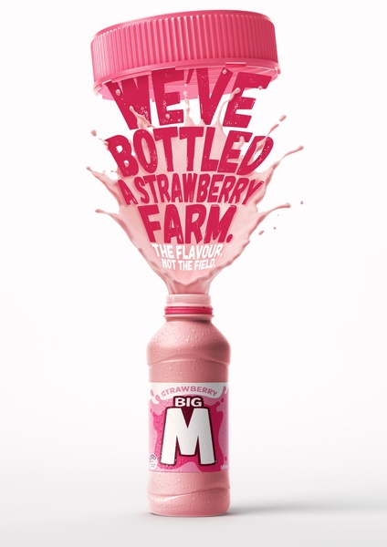
A high-energy, vibrant advertisement for butter milk featuring a bold, playful, and sassy brand voice with a bright pink color palette.
Free credits included. No card required
This butter milk creative captures attention by anchoring its personality in a bold and sassy tone that differentiates the brand from standard beverage messaging. By combining a high-contrast pink background with aggressive typography and a direct-to-camera interaction, the design forces the viewer to engage with the energy of the product rather than just its functional benefits.
Effective performance campaigns for this product_subject typically rely on balancing product clarity with emotional appeal. By using Promer AI to analyze these layout patterns, you can isolate which elements are driving engagement and reapply them to your own assets to maintain consistent brand authority while testing new visual hooks.
A great brand ad starts from an intentional feeling or a specific brand structure rather than a blank design.
Pro tip
When using a bold, high-contrast palette, ensure that the typography remains readable against the background by using thick, white outlines or drop shadows. This keeps the message clear while the vibrant colors handle the heavy lifting for scroll-stopping power.
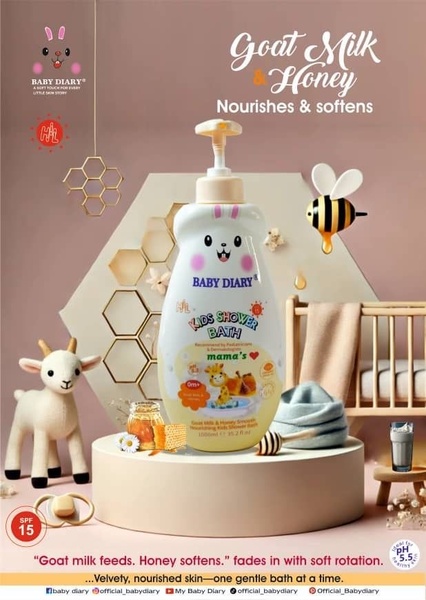
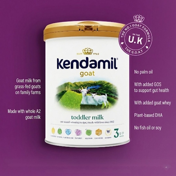
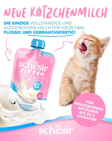
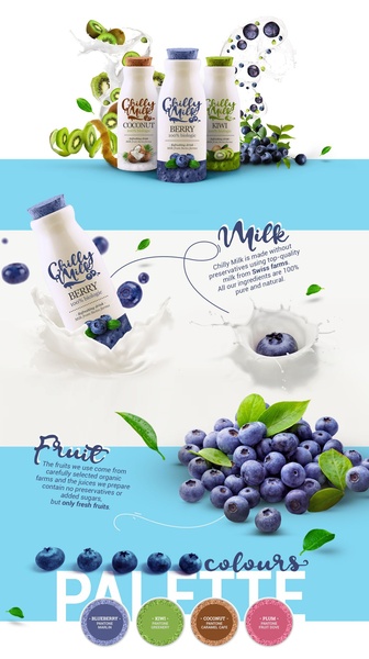


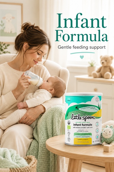
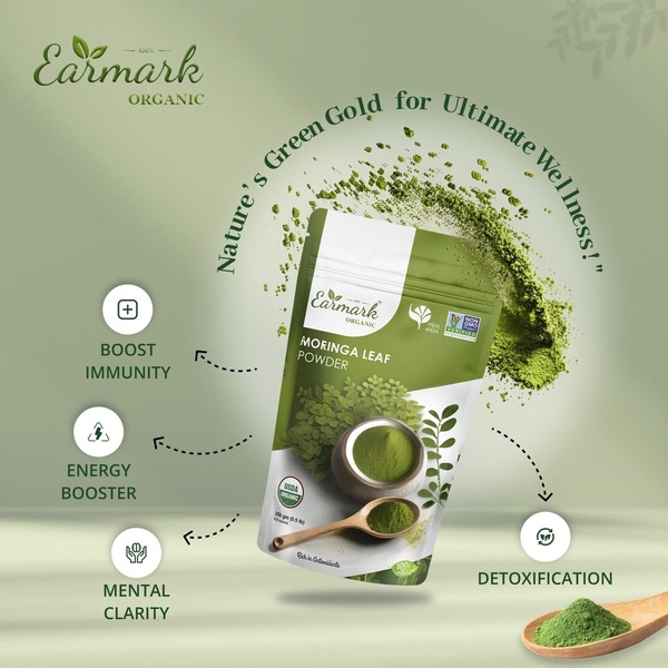



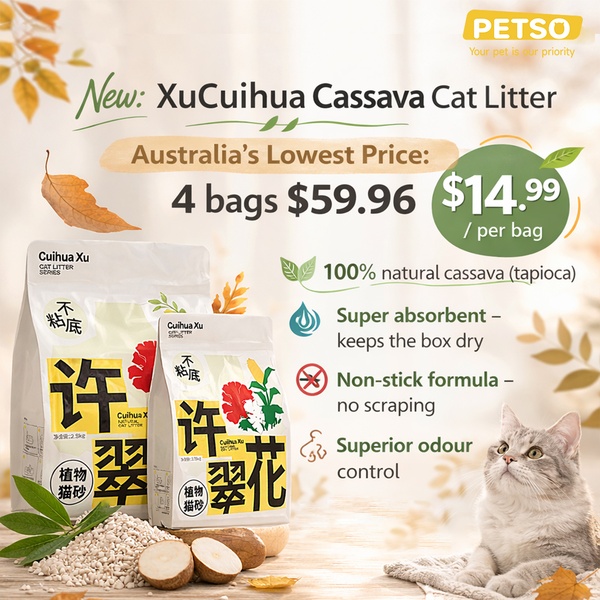
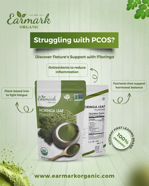
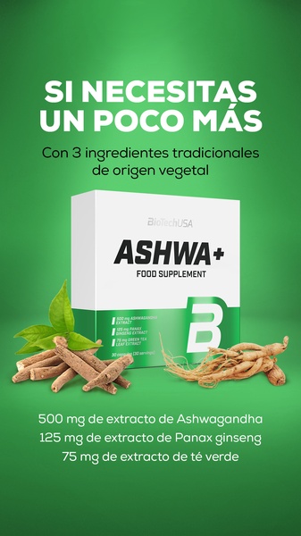
Promer helps you find the pattern, adapt it to your product, and create your own version in minutes.






