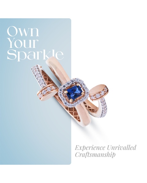
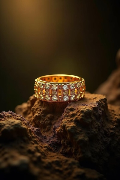
A minimalist, split-tone jewelry ad featuring a sapphire and diamond ring with elegant typography.
Free credits included. No card required
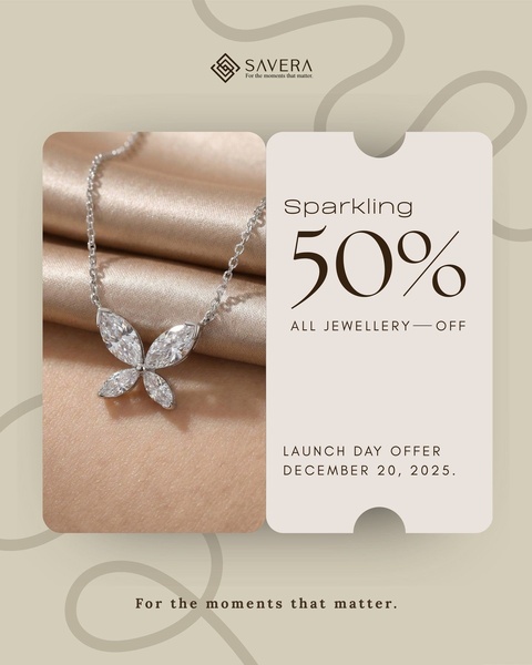
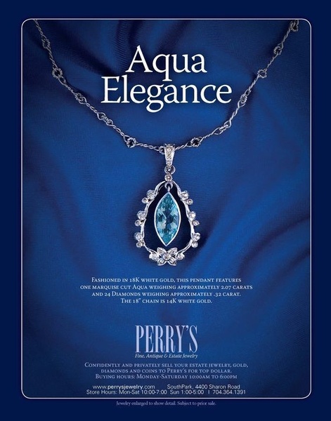
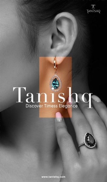
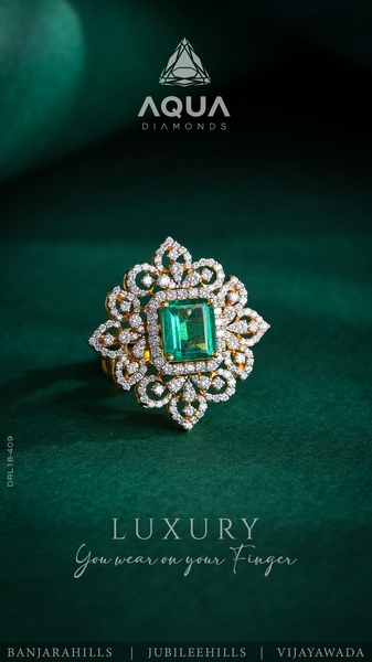
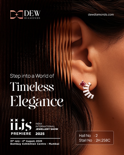
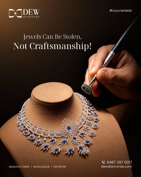
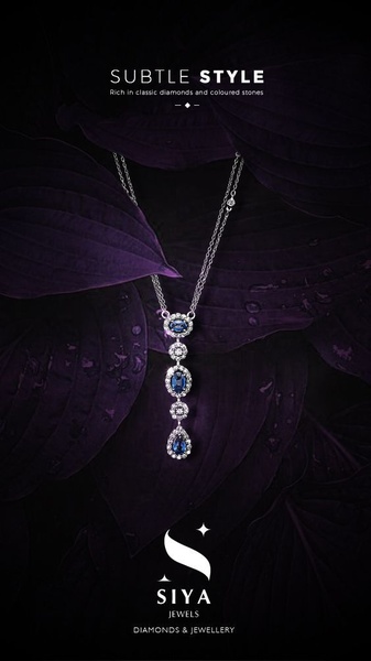
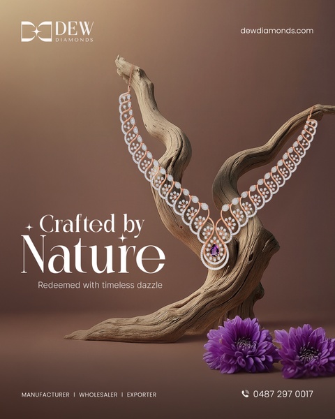
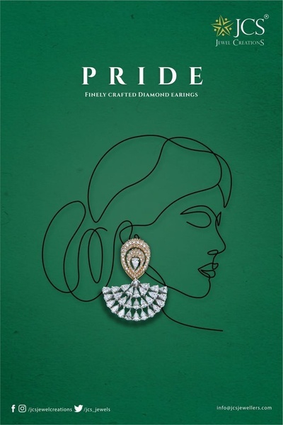
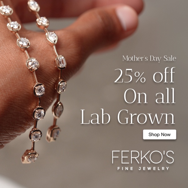
This ring advertisement utilizes a clean, split-tone visual structure to isolate the product against a calming background. By combining minimalist typography with a high-contrast hero shot of the jewelry, the layout creates a premium feel that directs immediate attention to the craftsmanship of the piece. The primary strength of this approach is the use of white space to ground the product in luxury while allowing the core headline to anchor the viewer's focus without distraction. For teams working with fine jewelry, this structure provides a repeatable framework for visual storytelling. By leveraging Promer AI to maintain this balance of clean, aspirational design and product-focused imagery, brands can ensure their creative remains consistent across seasonal collections. In most cases, this style performs best when the photography highlights textures or intricate gemstone details against a soft, complementary color palette.
Great ads start from a clear structure that elevates the product above the noise of a crowded feed.
Pro tip
When using this split-tone layout, ensure your product photo features a natural drop shadow to ground it within the white space. This provides a sense of depth that prevents the ring from looking like a flat sticker on the background.
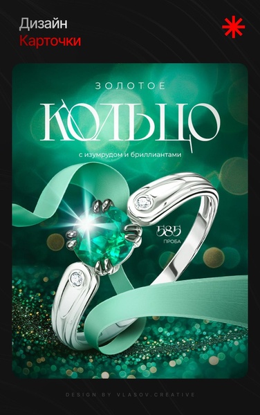
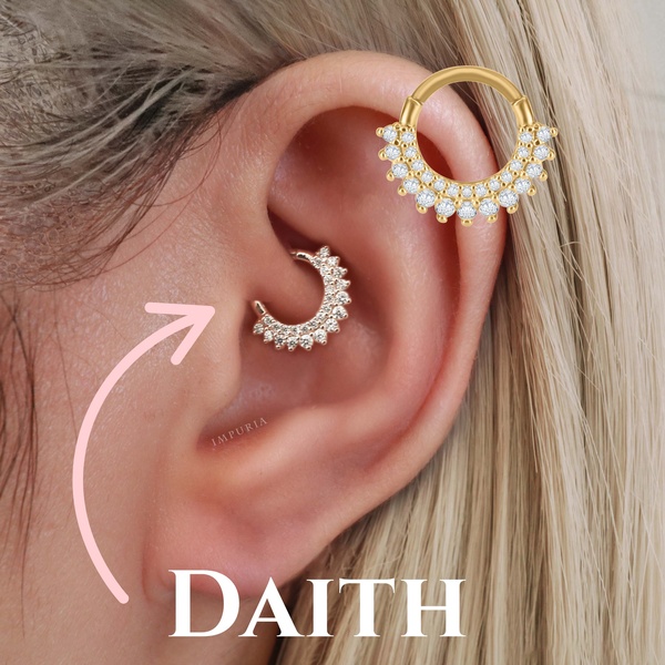
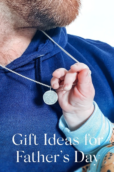

Promer helps you find the pattern, adapt it to your product, and create your own version in minutes.






