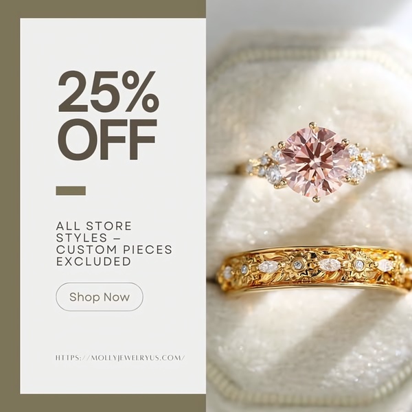
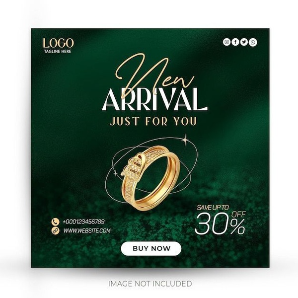
A square-format ad showcasing two gold rings with a high-contrast text overlay for a 25 percent off sale.
Free credits included. No card required
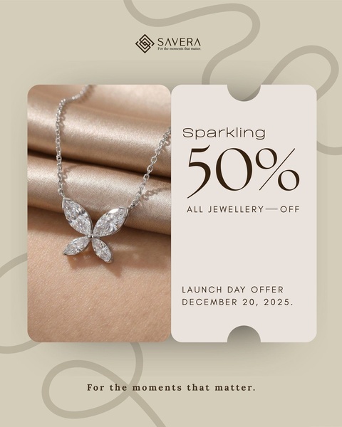
The creative strategy for this ring ad hinges on high-contrast negative space and a clear, unmissable incentive. By partitioning the frame into a soft, tonal product display and a clean typography panel, the brand creates a visually balanced hierarchy that prioritizes the offer without sacrificing premium product aesthetic. This direct, uncluttered approach works well for luxury items where price point sensitivity typically demands a clear and elegant announcement of savings.
For most ecommerce teams, adapting this structure via Promer AI allows for rapid testing of different product photography while maintaining brand consistency. By utilizing a split-screen layout, advertisers can quickly swap their hero image to gauge interest across various collections while keeping the core discount-driven message constant to prevent viewer fatigue.
Great ads start from a clear structure that lets your product own the spotlight while your offer does the heavy lifting.
Pro tip
When running discount-focused ads for luxury goods like rings, ensure your product photo is captured in high-key lighting to match the 'clean' look of the background. Use the text overlay for the offer and reserve the product side purely for the visual, as cluttering the jewelry image can reduce the perceived value.

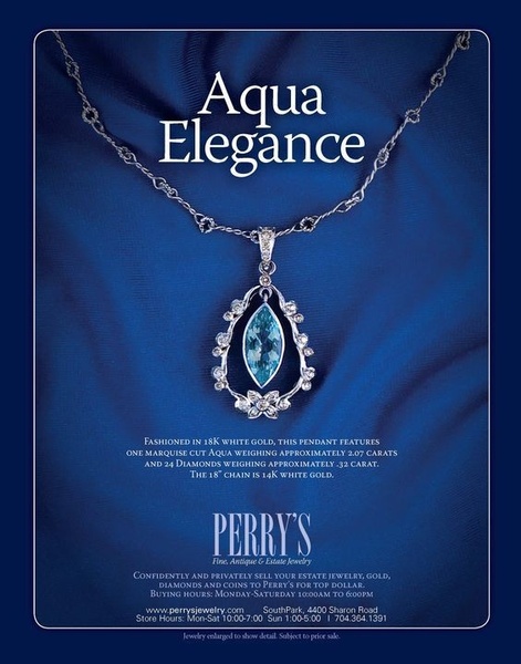
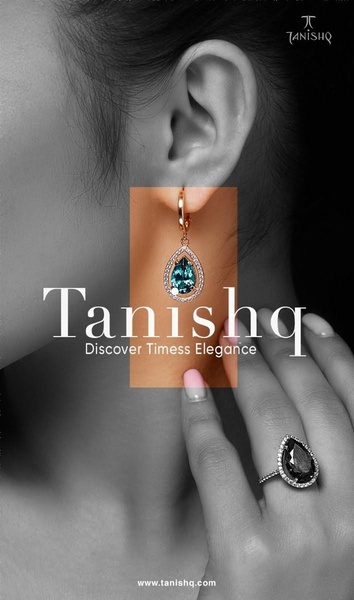
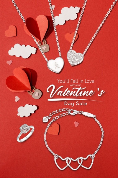
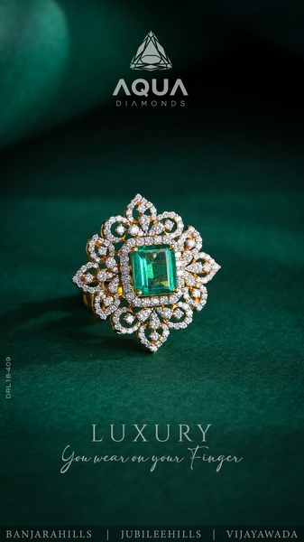
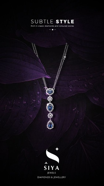
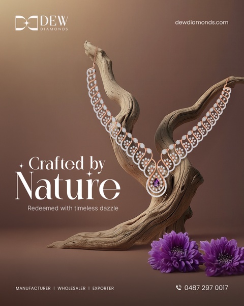
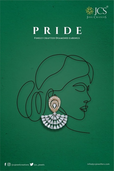
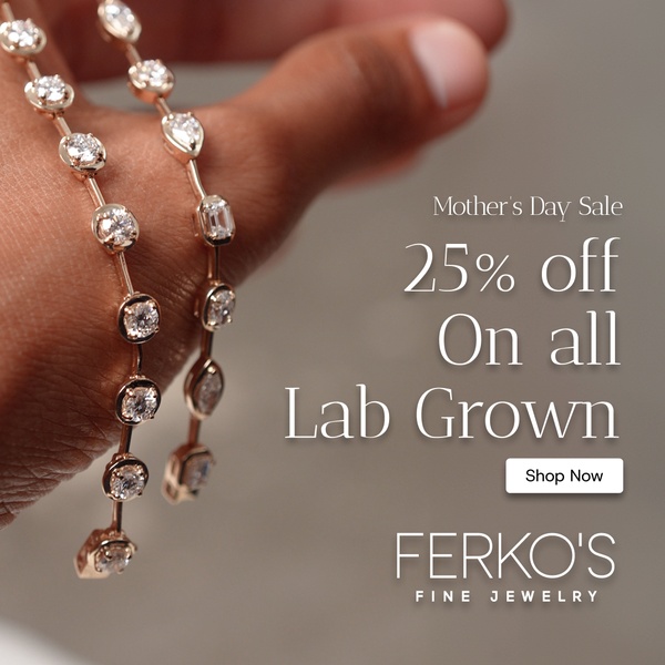
Promer helps you find the pattern, adapt it to your product, and create your own version in minutes.






