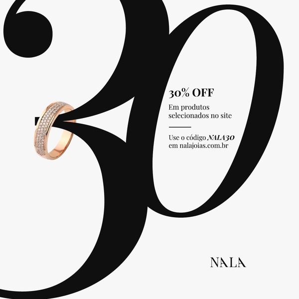
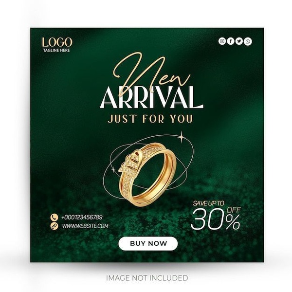
A clean, minimalist promotion graphic featuring a diamond ring set against a large, bold typographic design to highlight a site-wide discount.
Free credits included. No card required
This ad relies on high-contrast, minimalist design to showcase a single ring as the clear hero of the campaign. The bold use of a massive typographic '30' as the primary background element forces immediate attention to the value proposition, while the ring product is positioned as the secondary point of interest. By integrating a specific discount code and a clear call to action, the ad removes friction for the customer, keeping the design uncluttered and focused.
For most jewelry brands, this approach works because it avoids the visual noise that often plagues social feeds, allowing the Promer AI platform to help teams test similar clean structures. The balance of negative space and large-scale imagery creates a premium feel that aligns with high-end accessories. Because it relies on clarity rather than complex animations, this format is highly repeatable and effective for driving quick conversions during a sale event.
A minimalist approach to promotions relies on visual hierarchy to make your product the most important element on the screen.
Pro tip
When using bold typography as a background, ensure that the product image has a transparent background to avoid visual clashing. This allows the ring to sit 'on top' of the design, maintaining a premium, editorial feel that keeps viewers engaged longer.

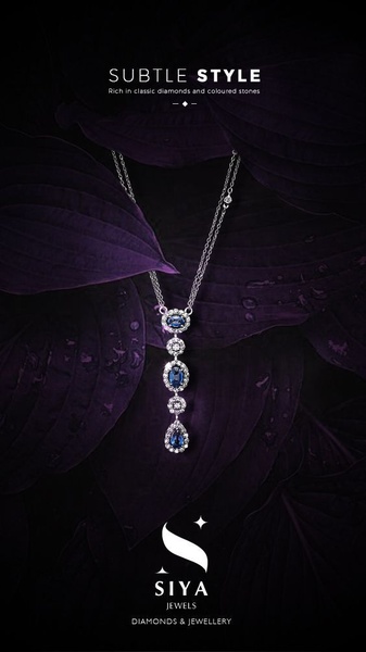
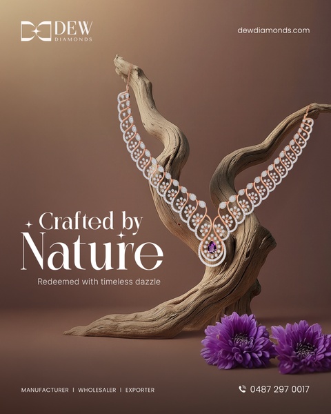
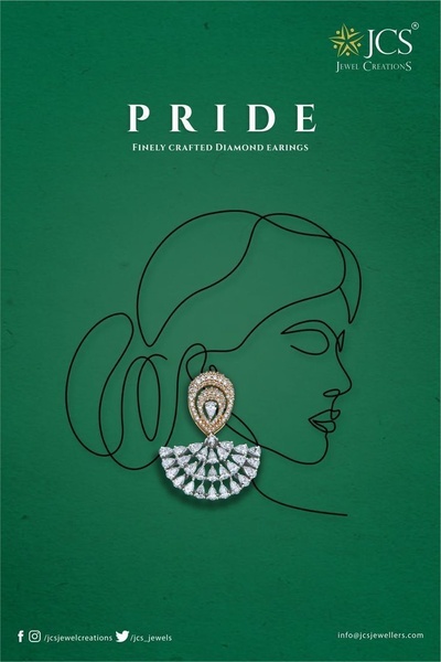
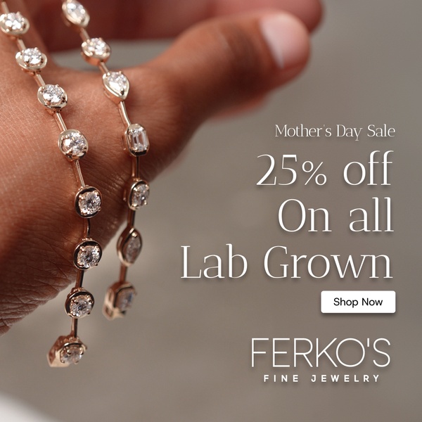
Promer helps you find the pattern, adapt it to your product, and create your own version in minutes.






