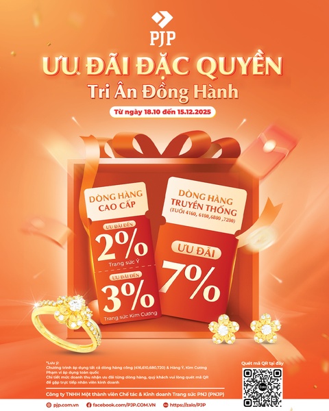
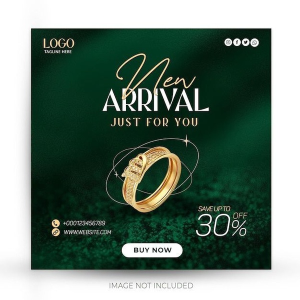
A promotional graphic for jewelry featuring clear discount tiers for different product lines, presented with a vibrant orange background and festive ribbon imagery.
Free credits included. No card required
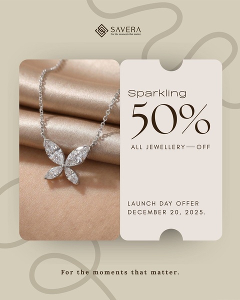
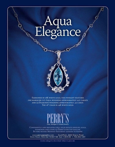
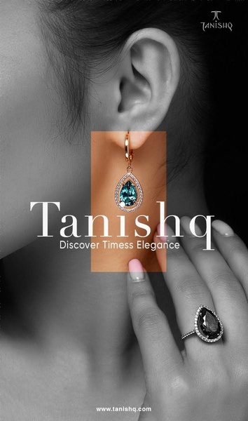
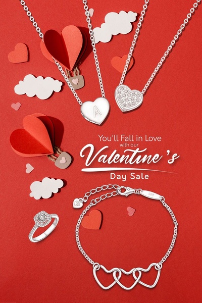
This jewelry ad leverages a clear, high-contrast visual hierarchy to make specific discount tiers immediately readable. By placing the savings percentages in large, bold typography against a warm orange backdrop, the design creates an instant sense of exclusivity and urgency that keeps the viewer from scrolling past. The use of gift-oriented iconography reinforces the emotional appeal of the purchase, effectively aligning the product with the concept of a reward or special occasion. Utilizing Promer AI to maintain this structured clarity allows your brand to highlight different promotional incentives without cluttering the visual field, which is critical for maintaining high engagement in competitive categories.
A great promotional design uses hierarchy to ensure your discount is the first thing a customer perceives, rather than a secondary thought.
Pro tip
When running tiered discounts, ensure your visual callouts match the actual perceived value of the product being promoted. A larger discount on a lower-margin item might dilute your brand, so align your offer tiers with your specific profit margins.
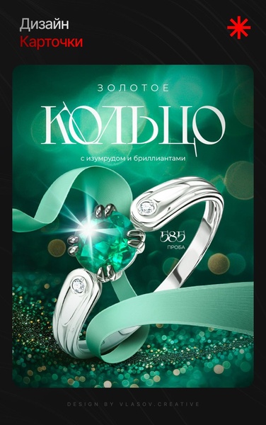
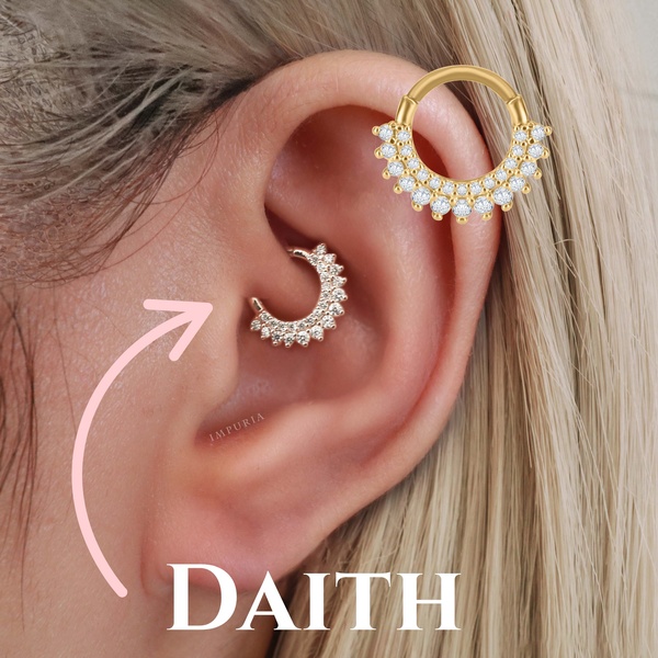
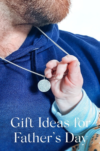
Promer helps you find the pattern, adapt it to your product, and create your own version in minutes.






