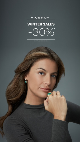
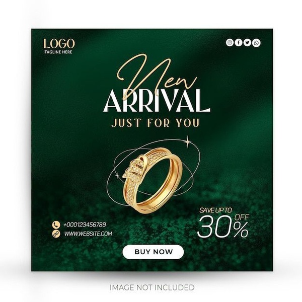
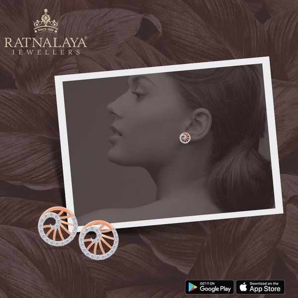
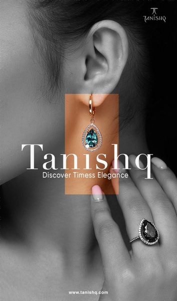
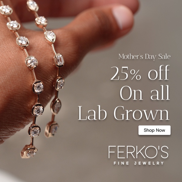
A high-end portrait of a woman modeling jewelry to announce a seasonal discount of up to 30 percent.
Free credits included. No card required
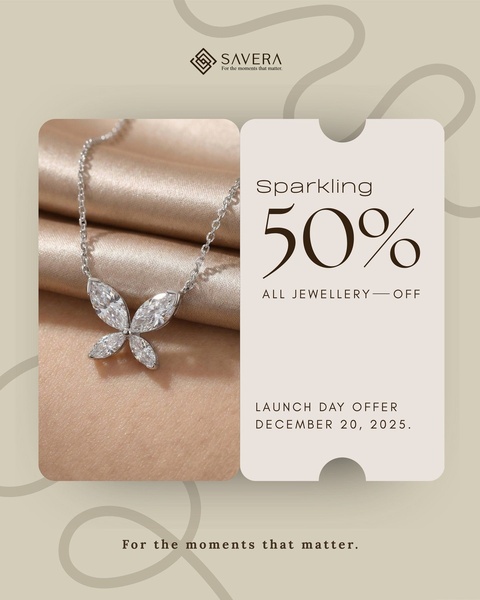
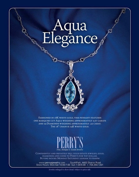
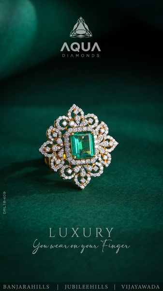
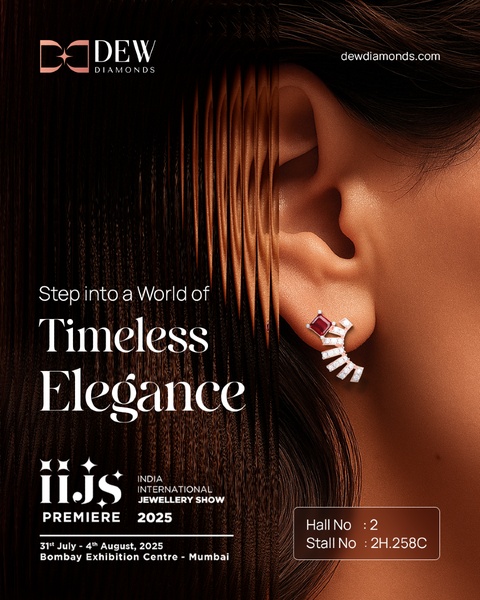
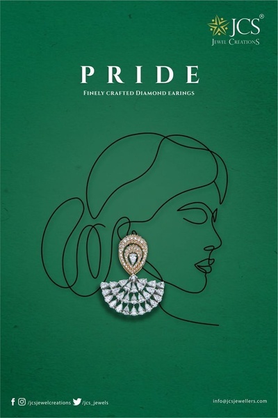
This jewelry ad relies on a clean, high-contrast visual hierarchy to prioritize both the promotional offer and the product details. The combination of a professional, model-centric portrait and clear, minimalist typography effectively stops the scroll by framing the product as an aspirational accessory. By placing the discount front and center, the brand leverages the shopper's immediate desire for value without sacrificing the premium aesthetic of the collection.
For most ecommerce brands, this pattern works because it establishes trust and brand identity before driving the call to action, which is a core strategy taught by Promer AI. In most cases, keeping the background muted ensures the jewelry pieces remain the focal point, preventing visual clutter while the clear sale percentage signals urgency to potential customers.
Great ads start from an idea, a feeling, or a structure, not a blank design.
Pro tip
When using a direct offer hook, ensure the color of the text contrasts sharply with your background for instant readability on mobile. If your product is ornate, like this jewelry, keep your typography extremely sparse to maintain a premium feel.



Promer helps you find the pattern, adapt it to your product, and create your own version in minutes.






