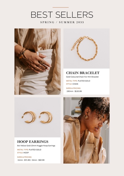
A clean, minimalist product catalog-style layout showcasing a gold chain bracelet and gold hoop earrings. The design uses a neutral palette to highlight product details and pricing.
Free credits included. No card required
This seasonal jewelry collection display uses a clean, editorial layout to establish brand authority and product desire. By grouping related items together, the design provides a comprehensive view of the best-selling pieces, making it easy for customers to browse and select their favorites at a glance. This structured approach effectively simplifies the shopping experience by highlighting key product details like material and price immediately.
Performance marketers can replicate this high-converting format on Promer AI to ensure their brand assets maintain a cohesive, professional aesthetic. Using a consistent, minimalist grid allows for rapid testing of different product combinations, which in most cases keeps creative fatigue low while keeping the focus on your catalog's core value proposition.
Great ads start from a clear structure and a cohesive aesthetic that makes shopping feel like a curated experience.
Pro tip
When testing catalog-style ads, use the same layout but rotate which items you feature as 'best sellers'. This allows you to identify which specific pieces drive the highest click-through rate without changing your entire ad design.


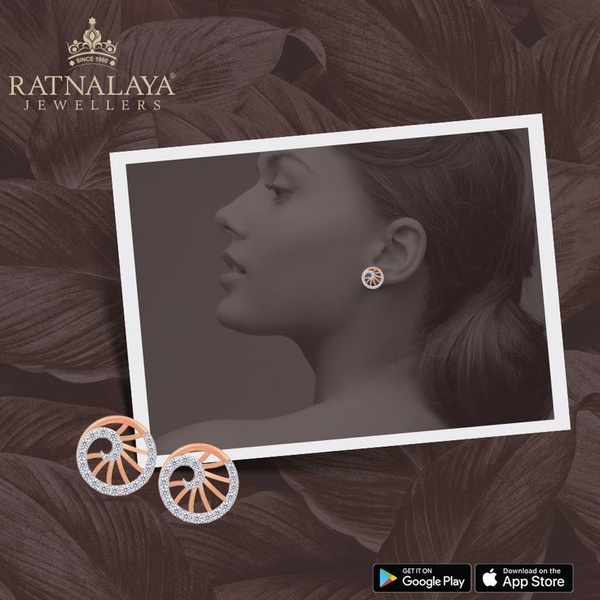

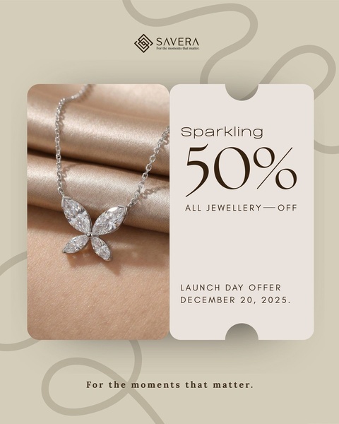
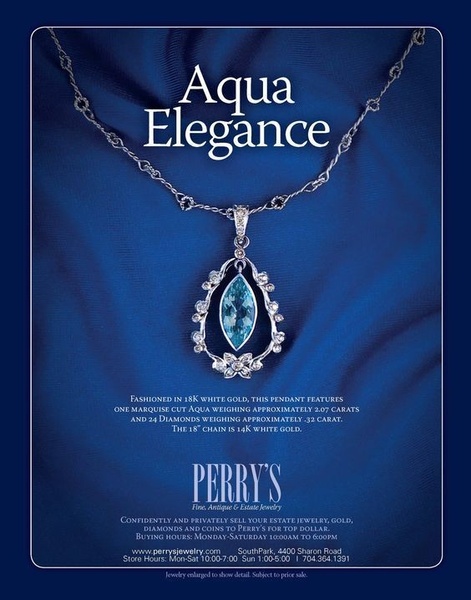





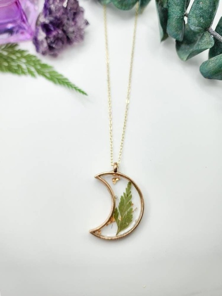



Promer helps you find the pattern, adapt it to your product, and create your own version in minutes.






