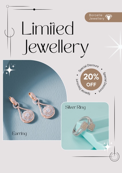
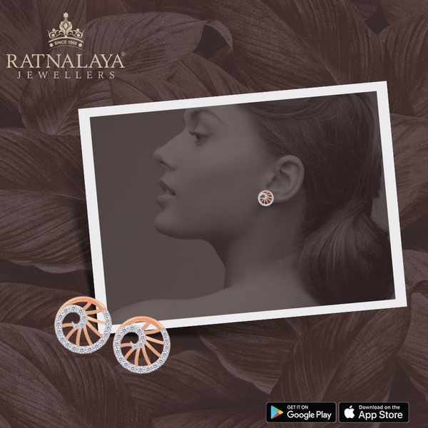
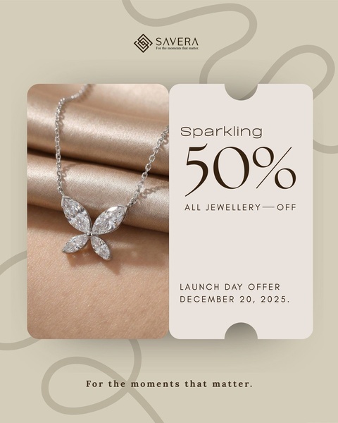
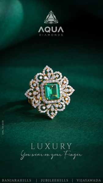
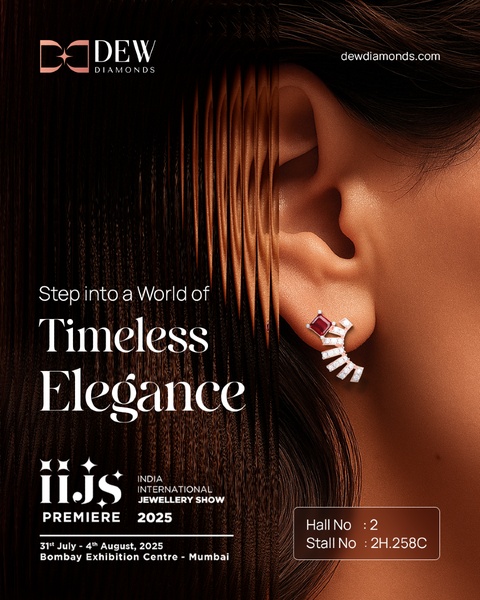
A clean, split-screen product layout showcasing earrings and a ring with a prominent percentage discount tag.
Free credits included. No card required
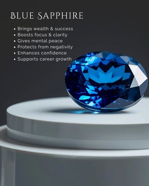
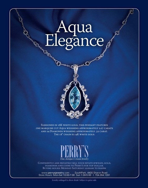
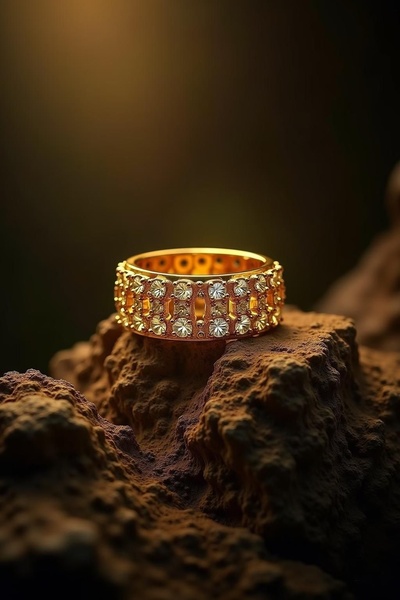
This jewellery creative leverages a clean, split-screen layout that allows multiple items to share the spotlight while maintaining visual balance. By anchoring the composition with a bold percentage discount tag, the ad quickly establishes a value proposition without cluttering the screen or overwhelming the viewer with too much information.
Adopting this structured visual hierarchy is a reliable way to drive conversions for premium items because it frames the product as a special acquisition. You can achieve this same high-performing structural balance using Promer AI to maintain consistent branding while highlighting specific product variations.
Great ads start from a balanced visual structure that allows the offer and the product to tell a cohesive story together.
Pro tip
When using a split layout for multiple items, ensure the background colors of your product images complement each other as seen here. This creates a cohesive look that prevents the creative from feeling disjointed, even when displaying entirely different jewellery styles.

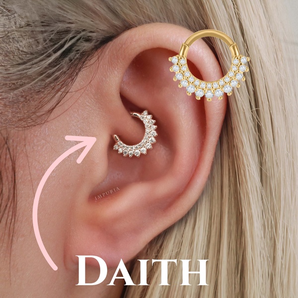
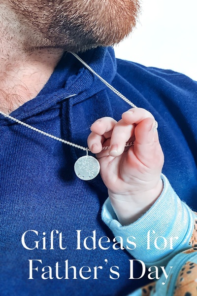

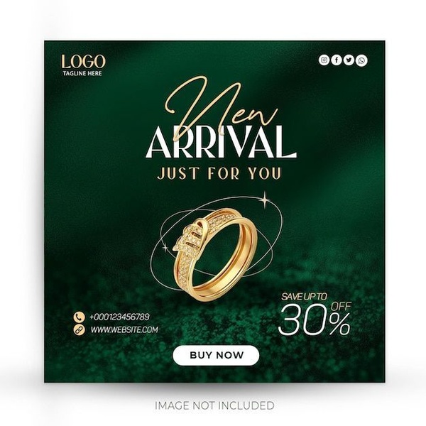



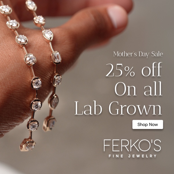
Promer helps you find the pattern, adapt it to your product, and create your own version in minutes.






