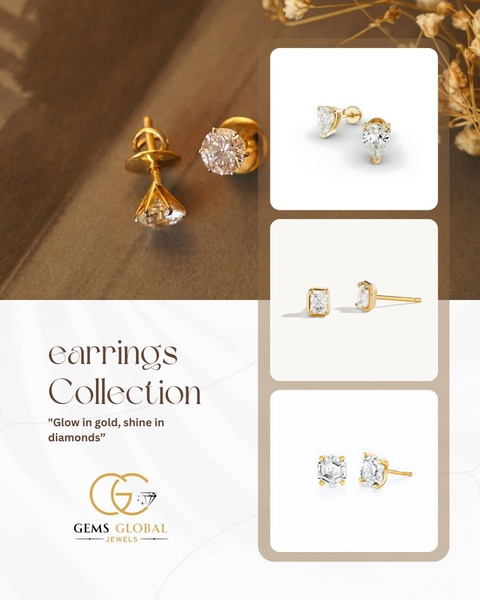
This ad features a curated grid layout showcasing three distinct styles of gold earrings, combining a high-end editorial feel with clean product photography.
Free credits included. No card required
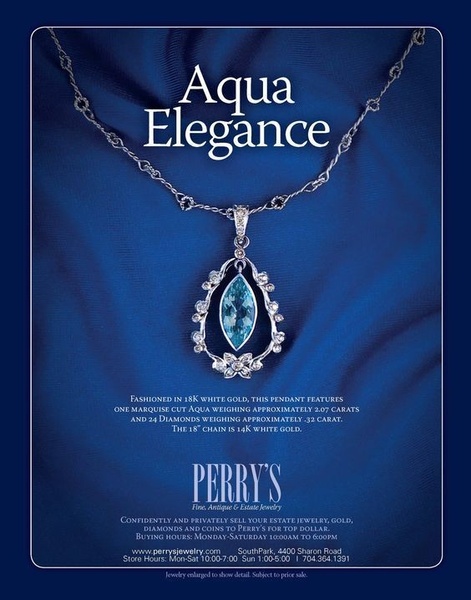
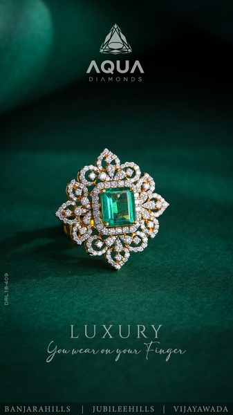
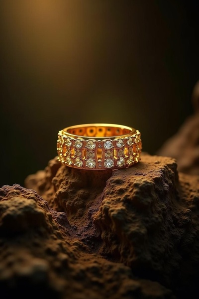
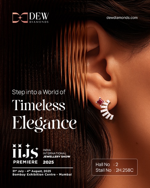
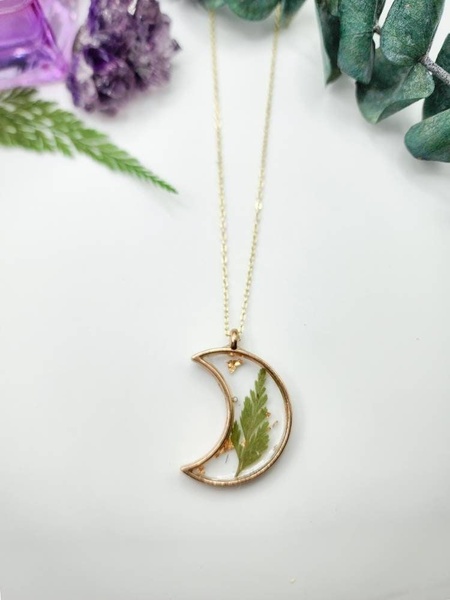
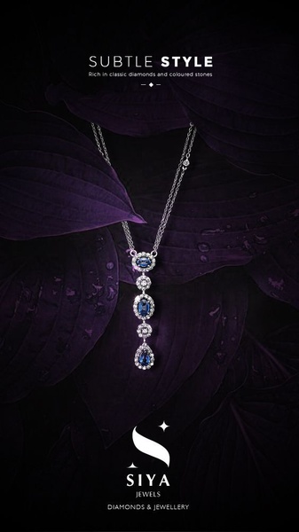
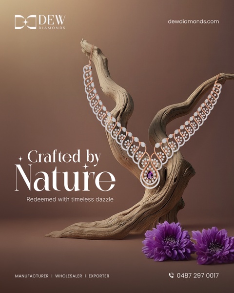
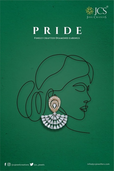
The use of a clean grid layout effectively organizes multiple items from the earrings collection into a single, cohesive visual statement. By pairing a warm-toned hero image with three distinct, well-lit product shots, the creative creates a sense of variety while maintaining a premium brand aesthetic that appeals directly to fashion-conscious audiences. This structure works because it removes the cognitive load of browsing, providing immediate visual proof of the collection variety without requiring the viewer to click through every single product page.
For jewelry brands, this approach is often the most efficient way to increase the perceived value of a catalog in a single scroll. Utilizing Promer AI allows you to rapidly replicate this sophisticated, organized aesthetic by applying your own product photography to the existing high-performing layout template. Maintaining consistency in lighting and background tones across your product grid is essential for ensuring your ad feels like a high-end editorial spread rather than a cluttered product catalog.
Great ads start from an idea, a feeling, or a structure, not a blank design.
Pro tip
When using a grid layout, ensure your product shots have consistent lighting and color temperatures to avoid visual friction. You can use AI Photoshoot to normalize your product images before importing them into your ad layout to ensure the final result looks seamless.




Promer helps you find the pattern, adapt it to your product, and create your own version in minutes.






