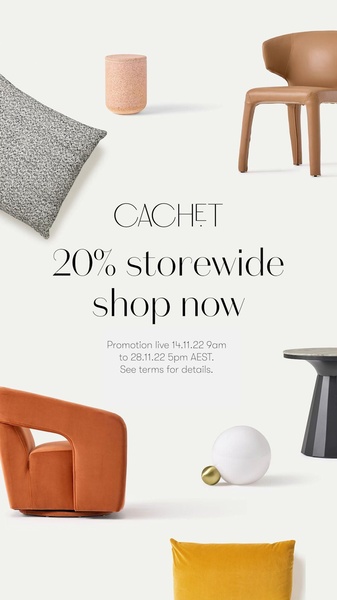
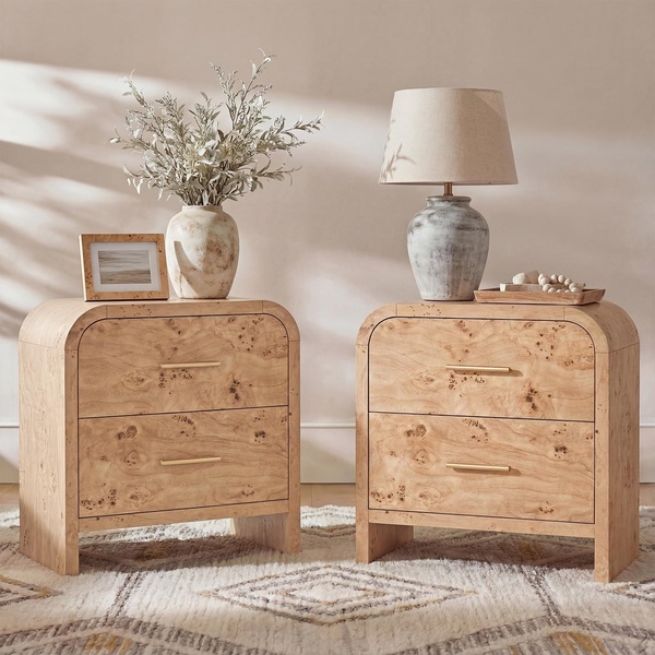
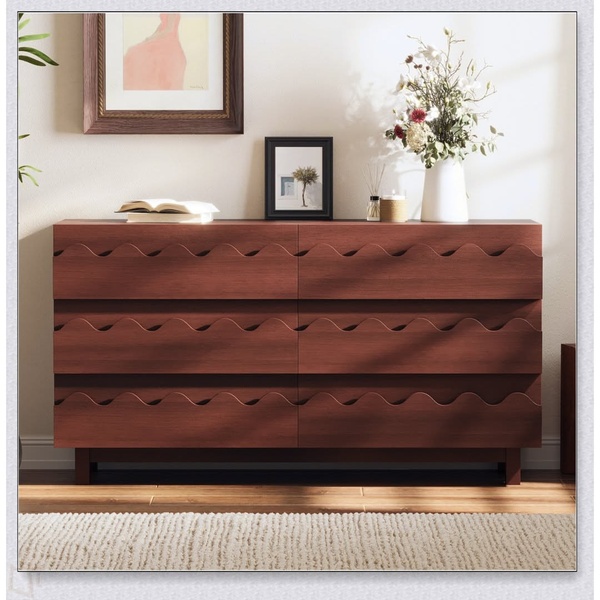
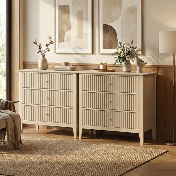
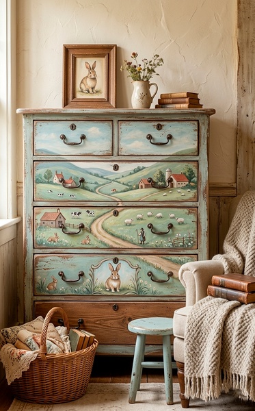
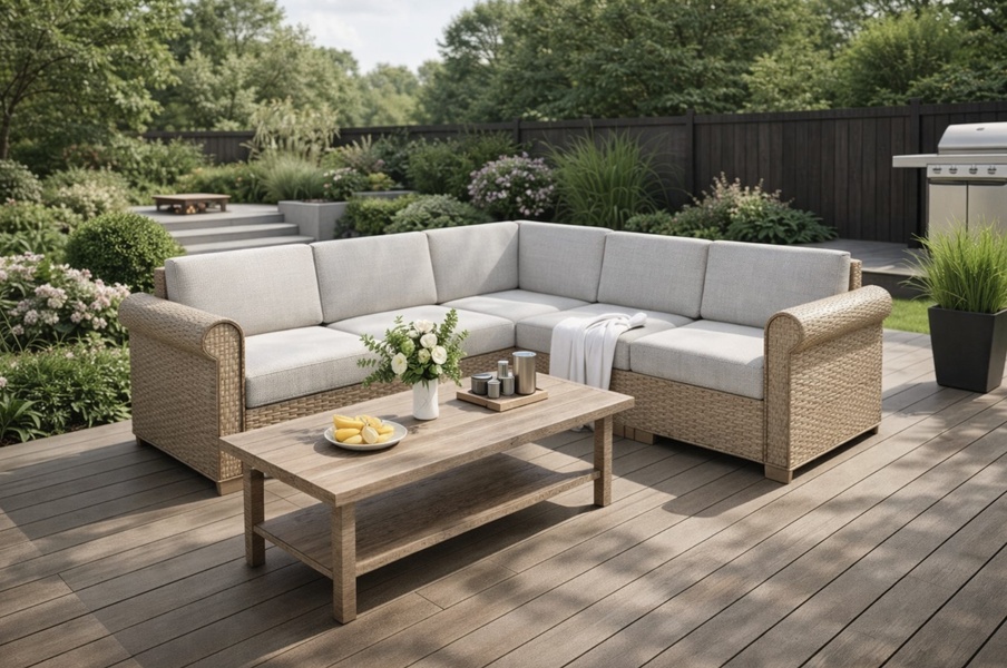
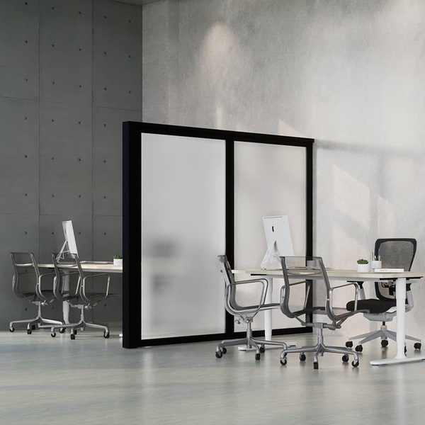
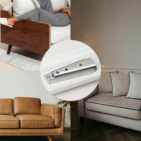
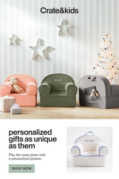
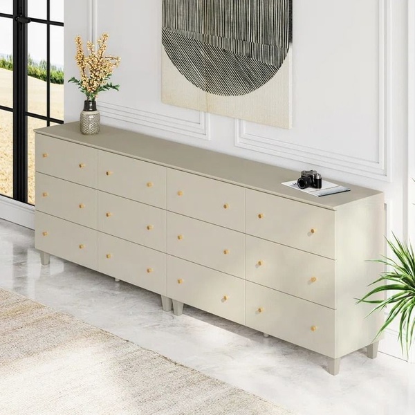
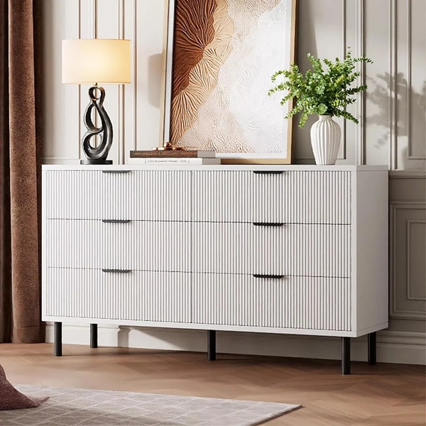
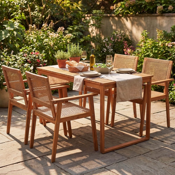
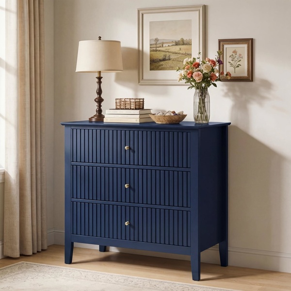
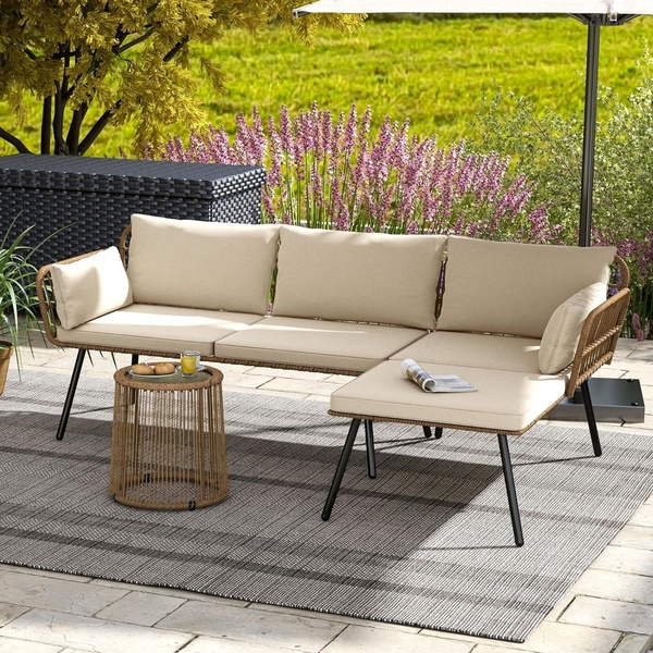
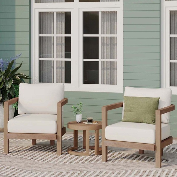
A clean, minimalist 9:16 vertical layout featuring various home furniture pieces floating in white space with a clear 20% discount offer.
Free credits included. No card required
This furniture ad creative utilizes a highly organized, airy visual structure to communicate an offer clearly without cluttering the viewer's feed. By floating diverse products against an expansive white background, the brand keeps the visual focus entirely on the aesthetic quality of the collection while anchoring the core 20% off message in the center of the vertical composition.
For most home goods brands, this minimalist approach works because it allows the products to stand as luxury items rather than mass-market commodity goods. Promer AI often sees this 'floating product' pattern perform well for high-end aesthetics because it mimics editorial magazine layouts, reducing the feeling of traditional interruption in a social feed.
Great ads start from an idea, a feeling, or a structure, not a blank design.
Pro tip
For furniture brands using this layout, ensure your background color perfectly matches your brand's style guide to maintain the 'floating' effect. If the background looks flat, try adding a very subtle drop shadow beneath the furniture items to create depth while keeping the minimalist aesthetic intact.
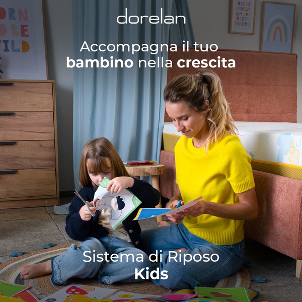

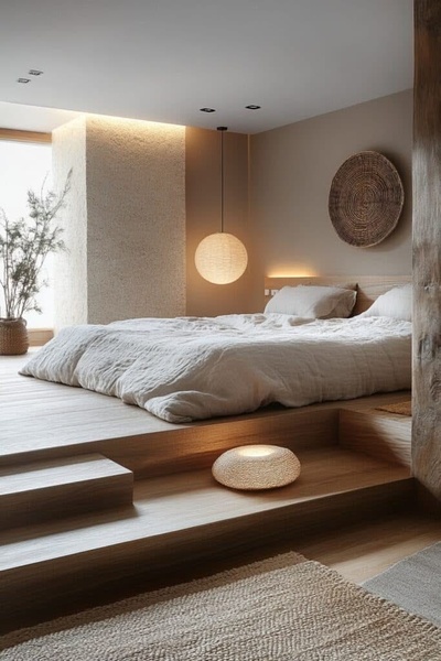
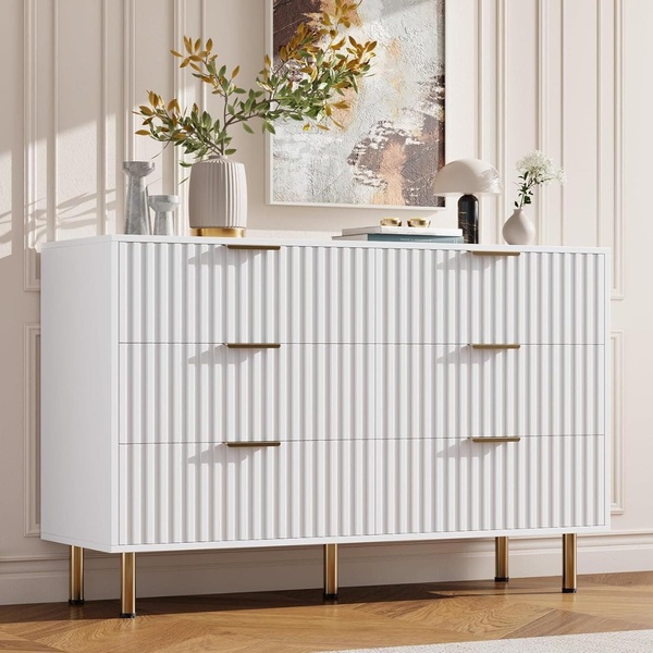

Promer helps you find the pattern, adapt it to your product, and create your own version in minutes.






