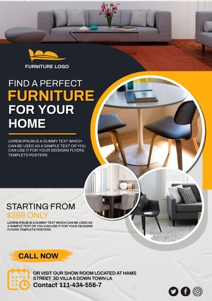
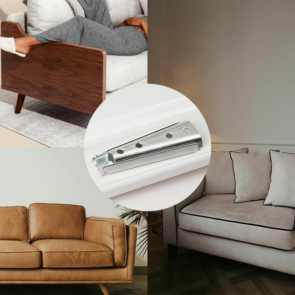
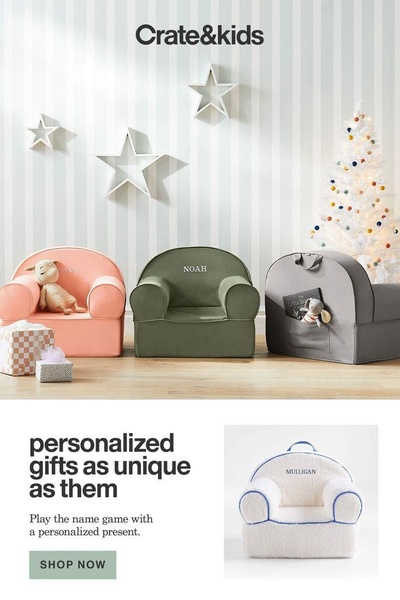
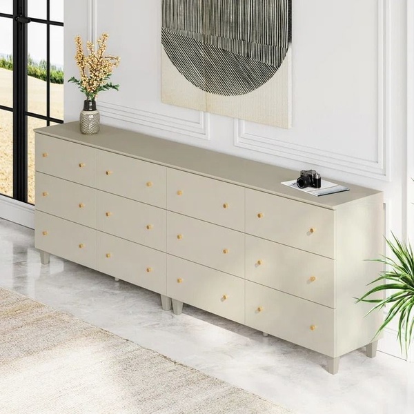
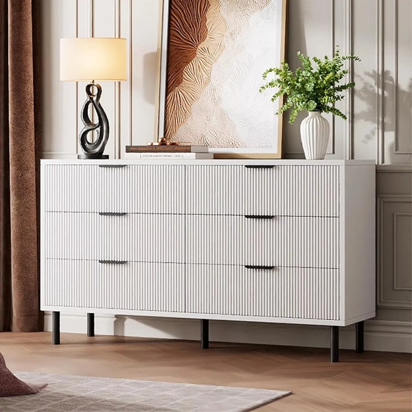
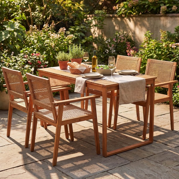
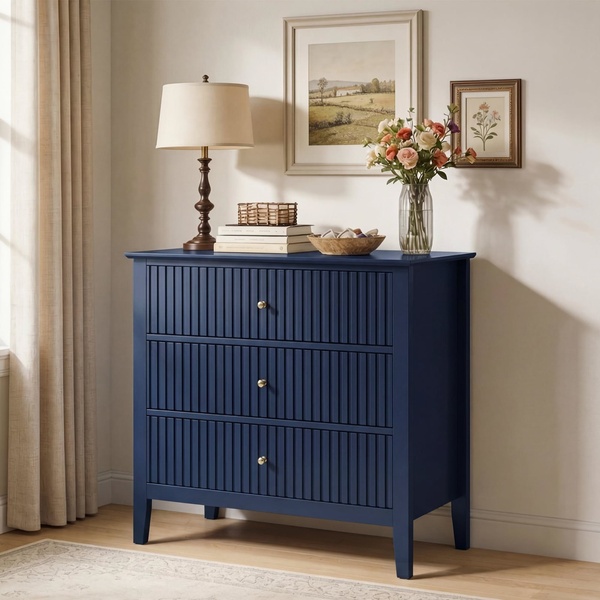
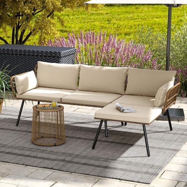
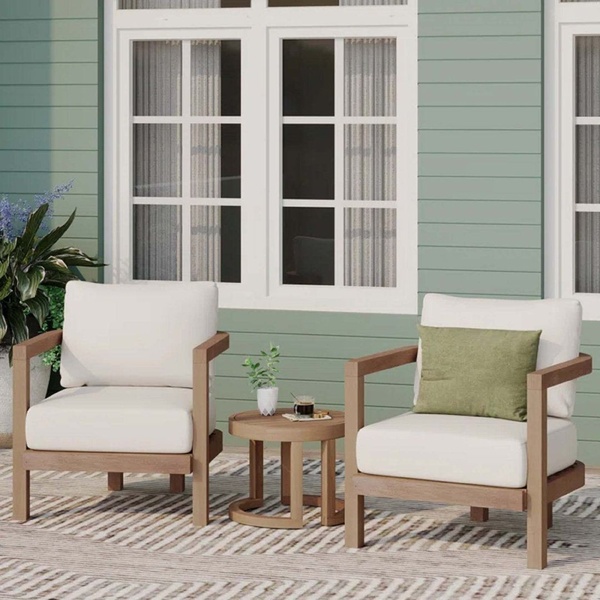
A clean, grid-based flyer for a furniture store featuring interior room shots and a clear starting price offer.
Free credits included. No card required
This modern furniture ad creative uses a high-contrast grid layout to guide the viewer from an aspirational room image directly to a clear price-point hook. By combining professional interior photography with a bold yellow and dark grey color palette, the ad establishes an immediate sense of quality while maintaining a clean, clutter-free look that stops the scroll for users interested in home decor.
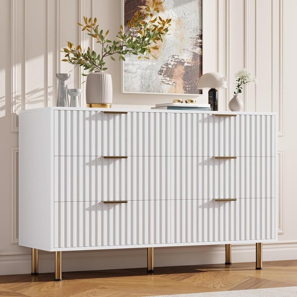
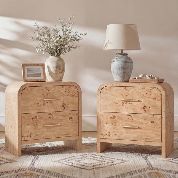
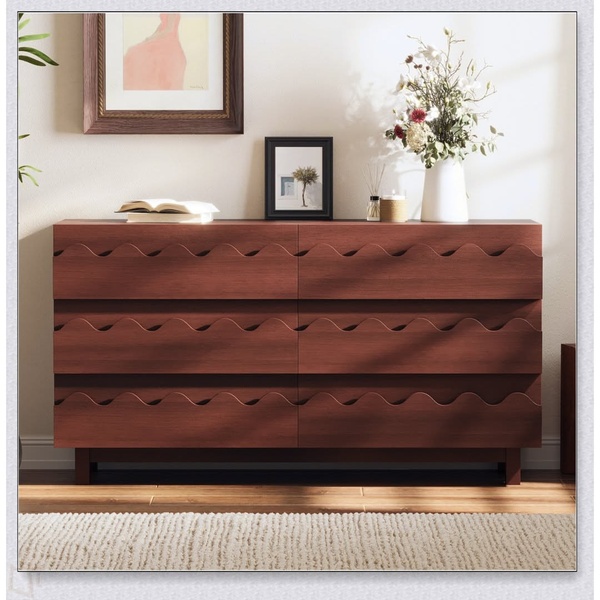
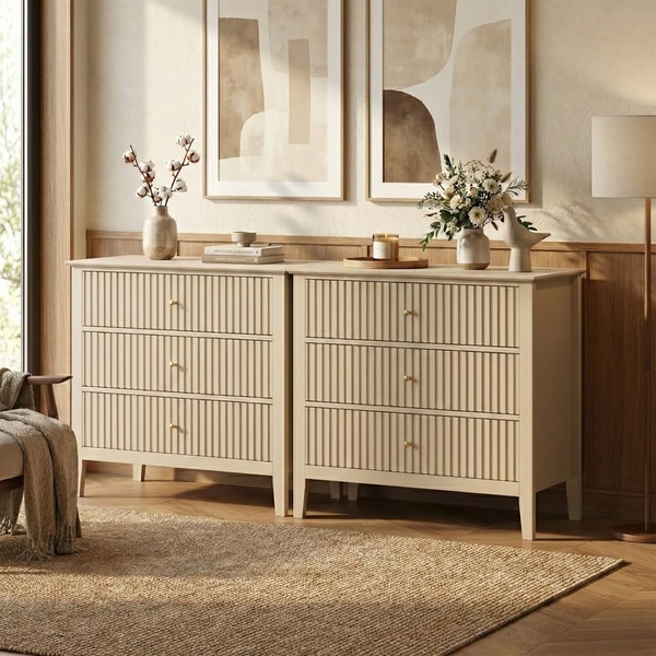
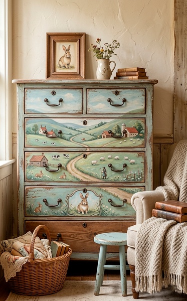
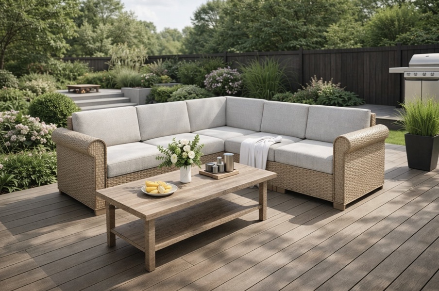
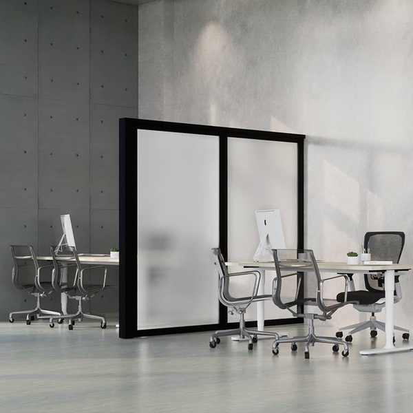
The primary driver of success here is the visual anchor provided by the circular product inserts, which allows the brand to showcase multiple interior pieces in one view without overwhelming the reader. When you are looking to replicate this layout for your own catalog, Promer AI provides a way to map your own product shots onto these structured templates while automatically adjusting for brand color consistency.
Great ads start from an intentional structure that allows your product imagery to lead the conversation with the customer.
Pro tip
When using a grid-style layout, ensure your product images follow a consistent lighting style, such as natural light, to prevent visual fatigue. A diverse, inconsistent product set can clash with the clean, minimalist theme of the ad and distract the user from the primary call to action.
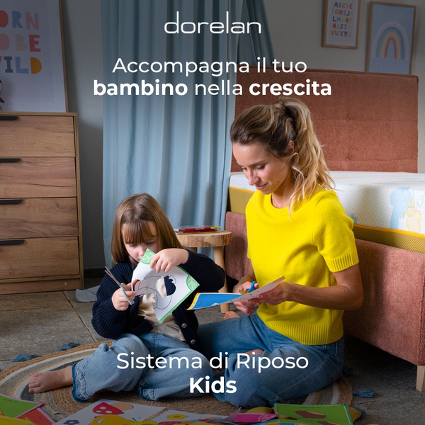
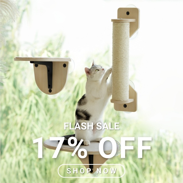
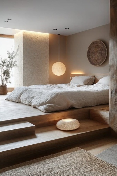


Promer helps you find the pattern, adapt it to your product, and create your own version in minutes.






