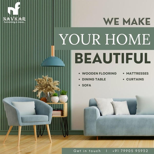
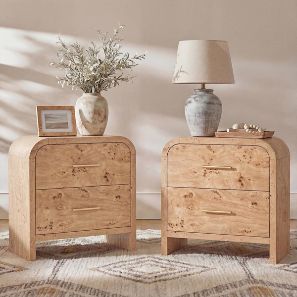
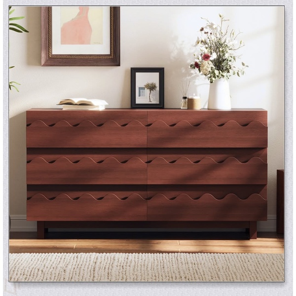
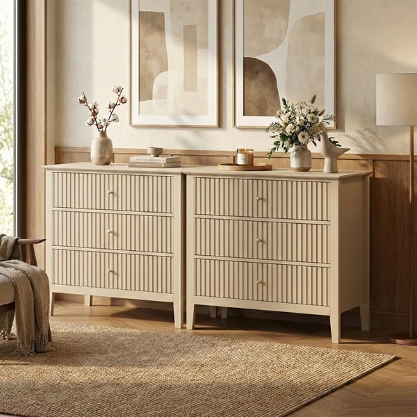
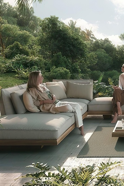
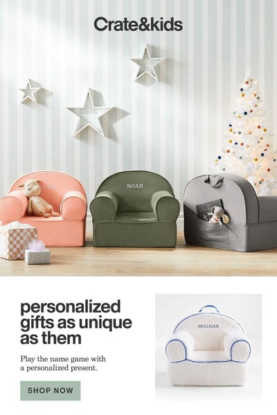
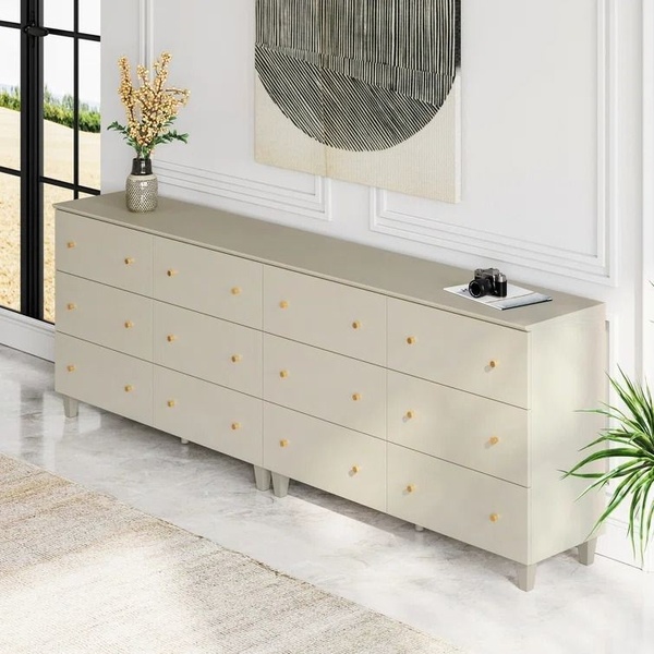
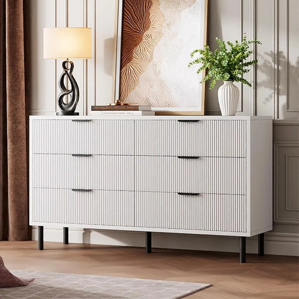
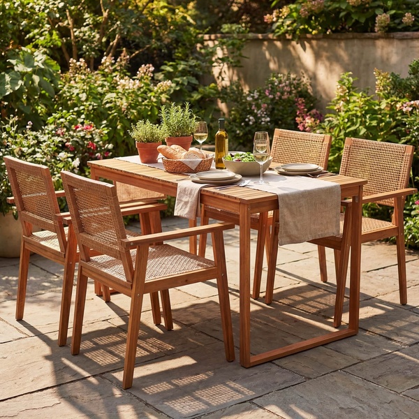
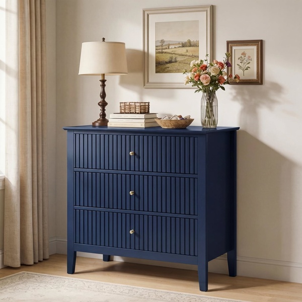
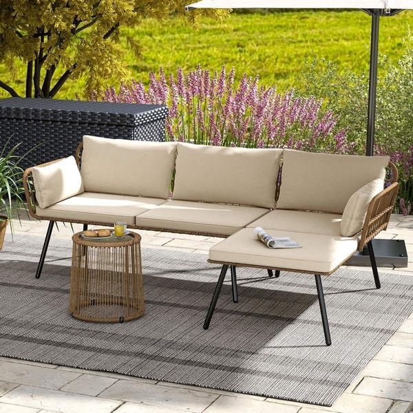
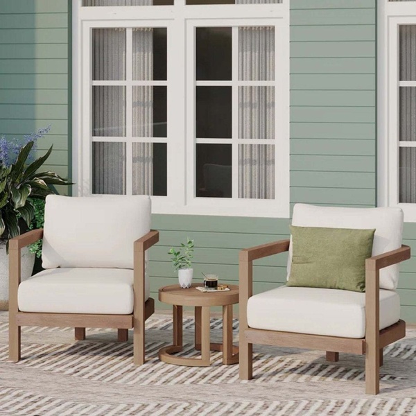
A high-end furniture ad featuring a clean, balanced layout with a clear list of product offerings and a soft, professional color palette.
Free credits included. No card required
This Home Furniture ad creative succeeds by pairing a clean, minimalist aesthetic with a direct value proposition that highlights product variety. The use of a symmetrical, split-screen layout effectively anchors the brand's visual identity while placing the product list in high-contrast negative space to ensure immediate legibility. By maintaining a consistent color palette across the imagery and text, the ad fosters a sense of professional trust and sophisticated lifestyle appeal.
Such structured layouts typically work well for established collections as they organize information without overwhelming the viewer. You can replicate this professional presentation using Promer AI to maintain high visual standards across your catalog. In most cases, keeping the design clean ensures your product highlights remain the focal point while driving brand recognition rather than cluttered sales noise.
A high-performing aesthetic ad relies on the balance between inviting visual context and clear, legible information architecture.
Pro tip
When using a direct value proposition hook, ensure the text does not obscure the key design details of your furniture. Use a consistent accent color for your text that mirrors a tone found in your lifestyle photography to keep the ad feeling like an organic part of a premium design feed.
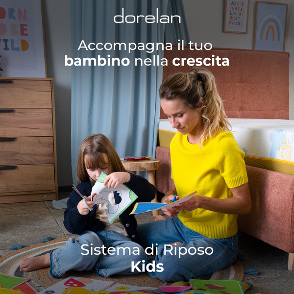

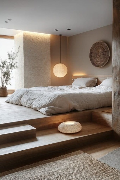
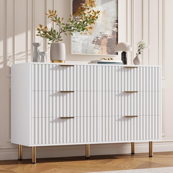
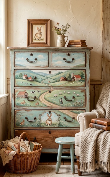
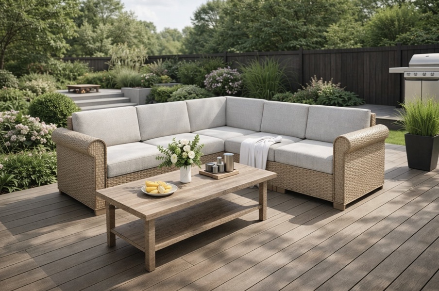

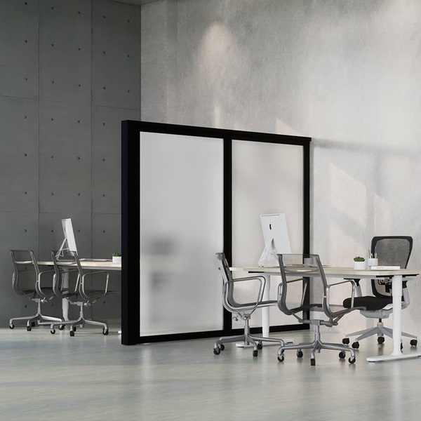
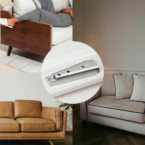
Promer helps you find the pattern, adapt it to your product, and create your own version in minutes.






