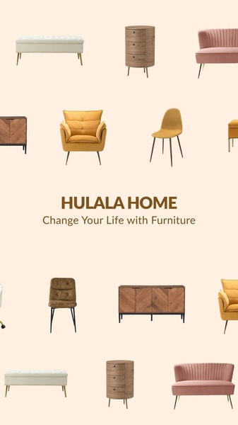
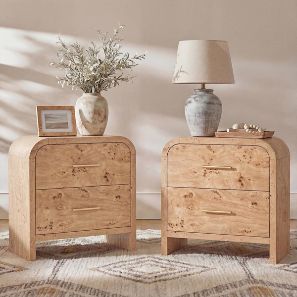
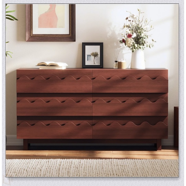
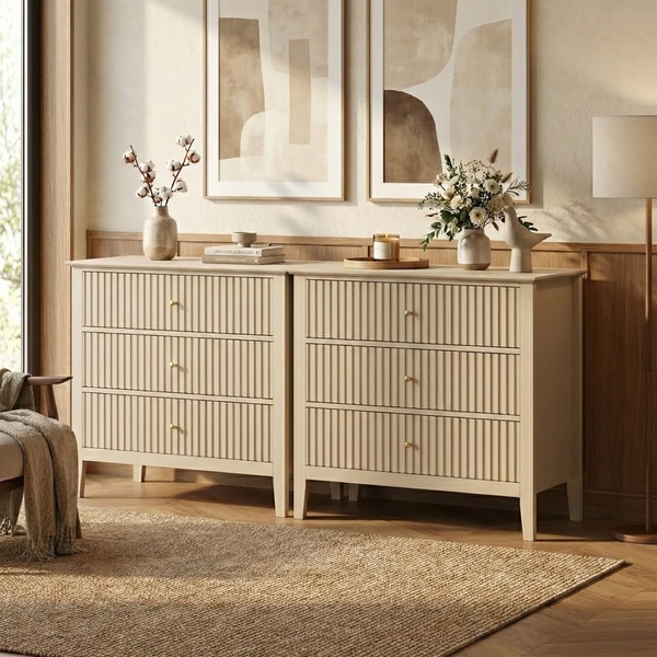
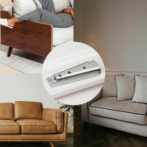
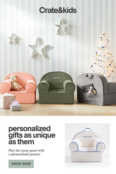
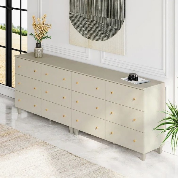
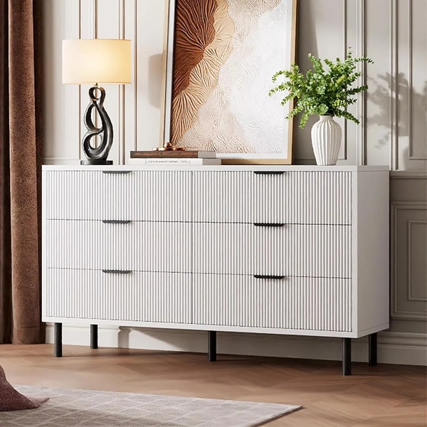
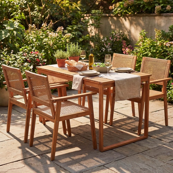
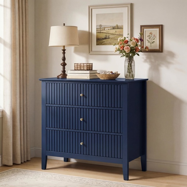
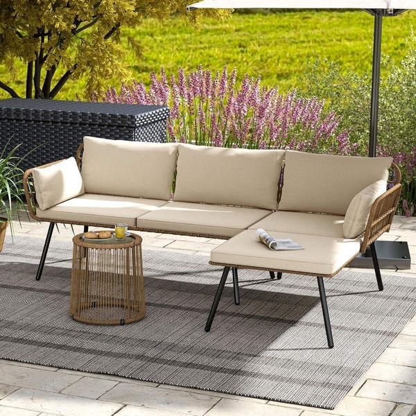
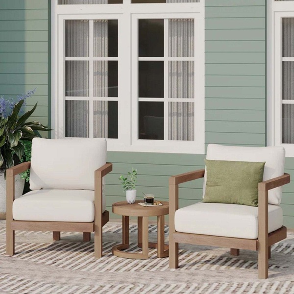
A clean, minimalist 9:16 layout featuring a curated selection of home furniture pieces against a neutral background.
Free credits included. No card required
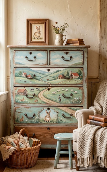
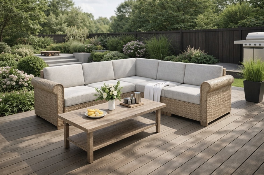
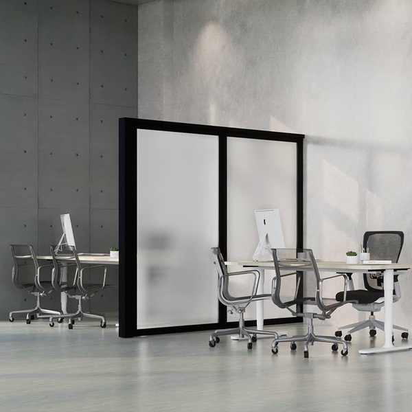
This furniture ad creative utilizes a balanced grid layout to present a wide range of products without overwhelming the viewer. By organizing diverse furniture items into a uniform, neutral-toned display, the ad creates a cohesive brand identity that feels both high-end and accessible.
This structural approach works because it allows potential customers to scan multiple product categories in seconds, making it ideal for mobile feeds where attention spans are limited. You can replicate this organizational pattern for your own catalog using Promer AI to ensure your product photography maintains a consistent aesthetic across all assets.
A clean grid layout turns your individual products into a cohesive lifestyle collection that stops the mobile scroll.
Pro tip
When using a grid layout, ensure your product images have consistent lighting and angles to prevent the creative from feeling disjointed. Focus on color harmony between items to make the grid feel like a singular collection rather than a random assortment.
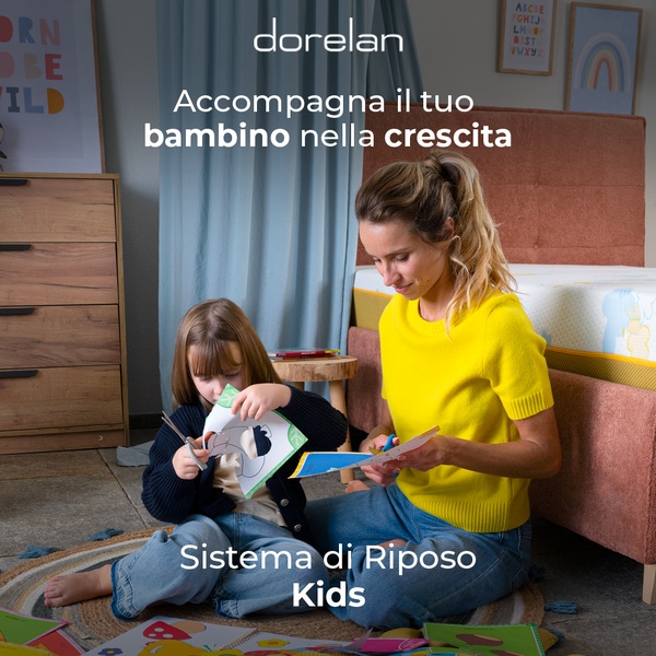

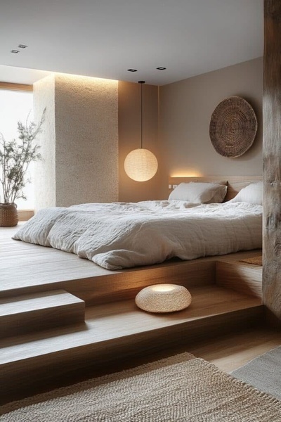
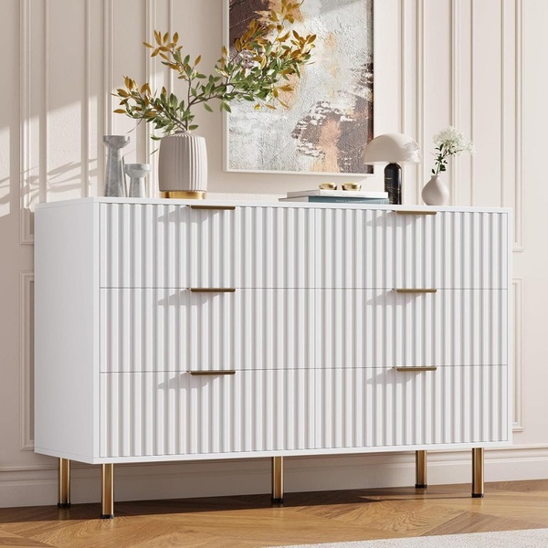

Promer helps you find the pattern, adapt it to your product, and create your own version in minutes.






