
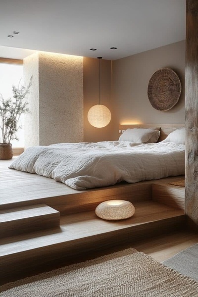
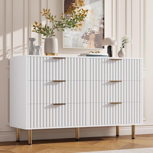
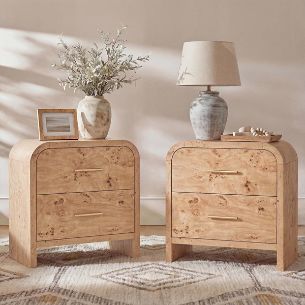
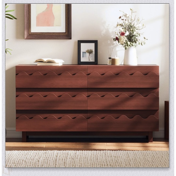
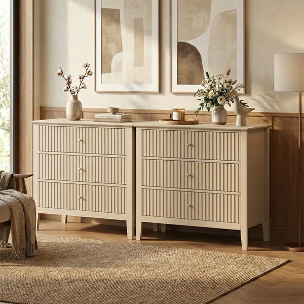
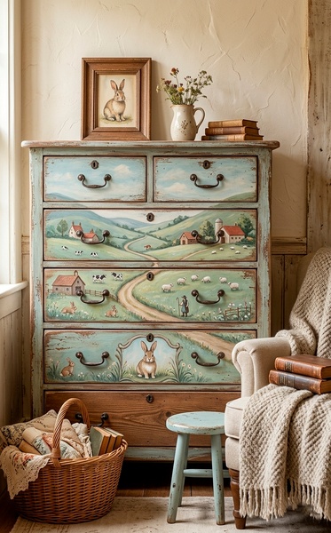
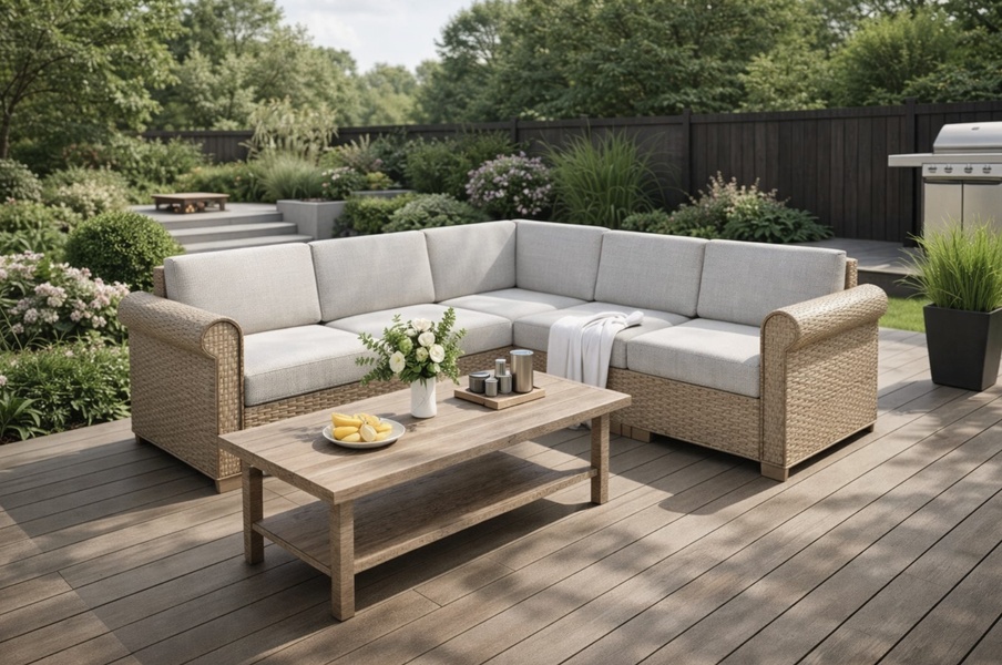
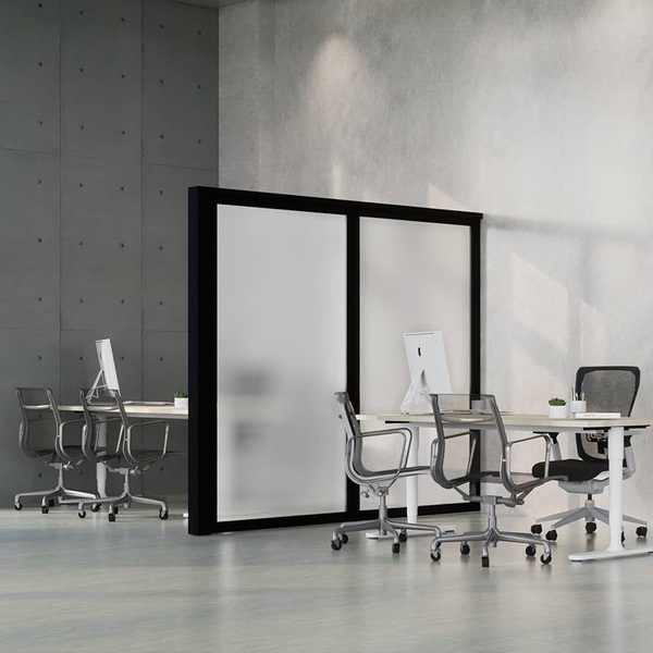
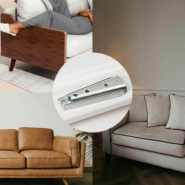
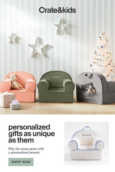
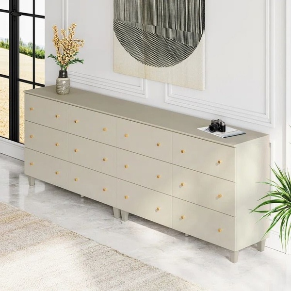
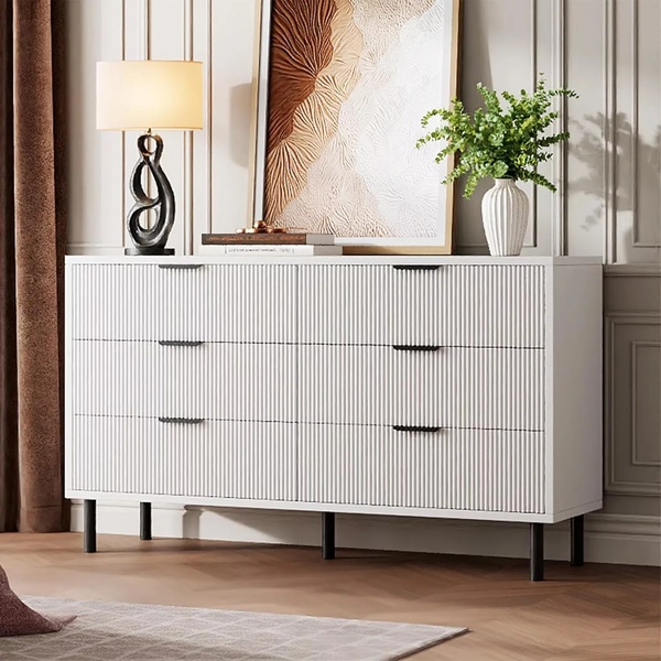
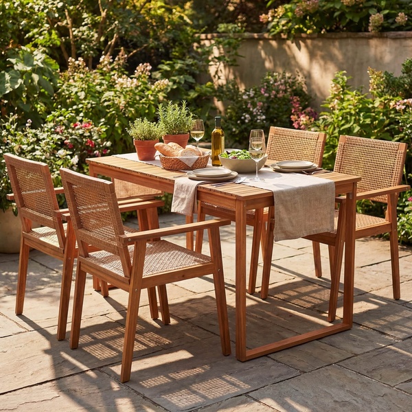
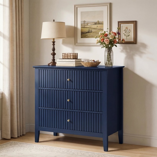
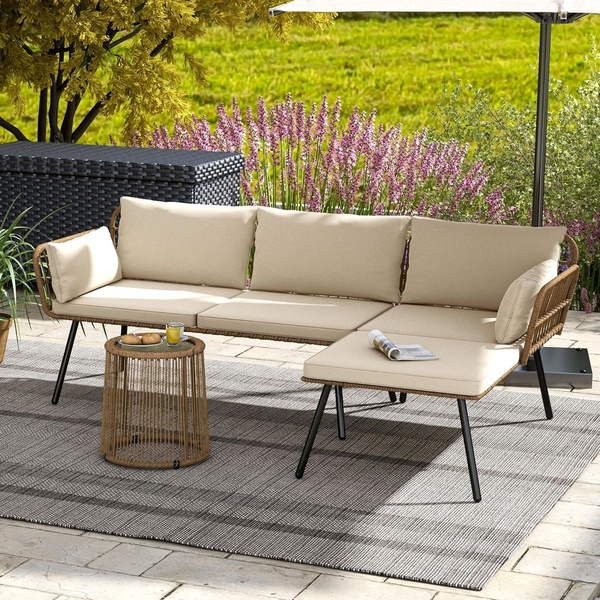
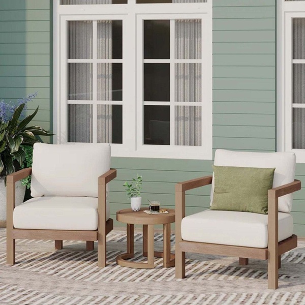
A clean, catalogue-style furniture sale advertisement featuring multiple home products with a clear 20% discount badge.
Free credits included. No card required
This furniture ad creative utilizes a classic catalogue-style layout that instantly organizes multiple products into a single, cohesive offer. The core strength of this strategy is using a bold, high-contrast starburst icon to anchor the 20% discount, forcing the viewer's eye to bridge the gap between the product variety and the monetary value. By maintaining a clean white background, the brand ensures the individual furniture pieces remain the clear focus, avoiding visual clutter that typically creates friction in mobile feeds.
For most ecommerce brands, this structured approach builds immediate trust and clarity, especially when promoting a broad sale event. Promer AI enables performance marketers to replicate this high-conversion layout for any product category. By focusing on legible typography and clear value communication, advertisers can create professional-grade assets that effectively reduce consumer decision fatigue.
Great ads start from a structured layout that prioritizes offer clarity over excessive design elements.
Pro tip
When using a multi-product layout, ensure the largest image is your highest-margin or best-selling item. This anchors the viewer's attention and creates a psychological hierarchy that guides the customer toward your most profitable products.




Promer helps you find the pattern, adapt it to your product, and create your own version in minutes.






