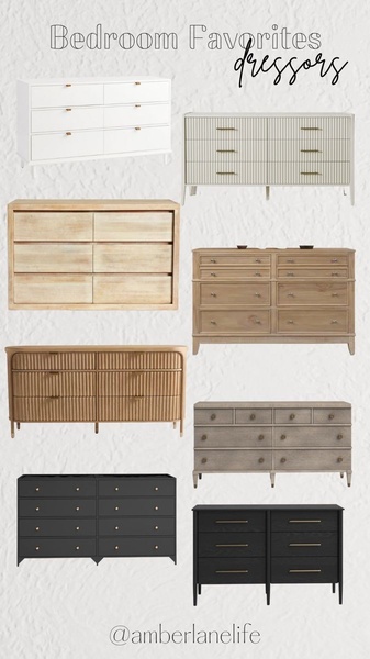
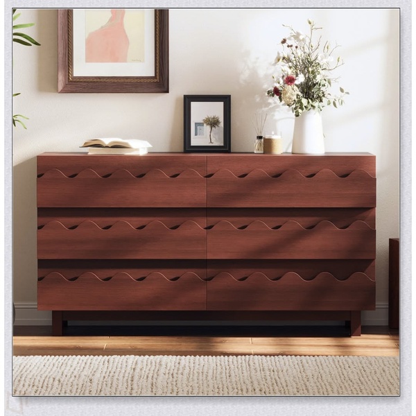
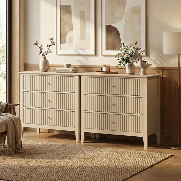
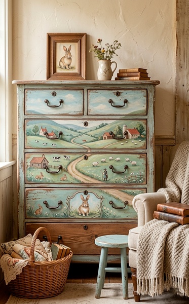
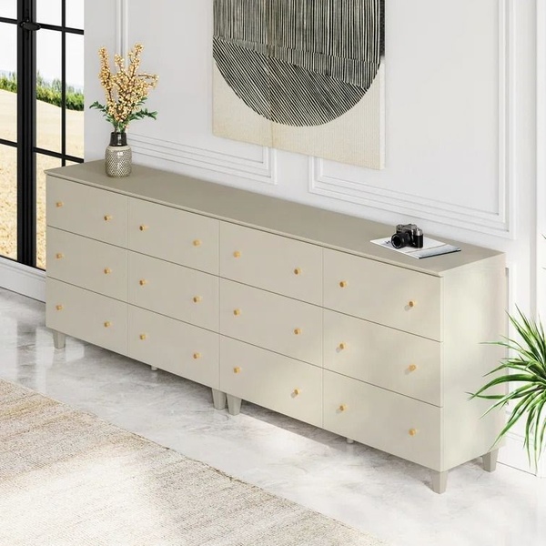
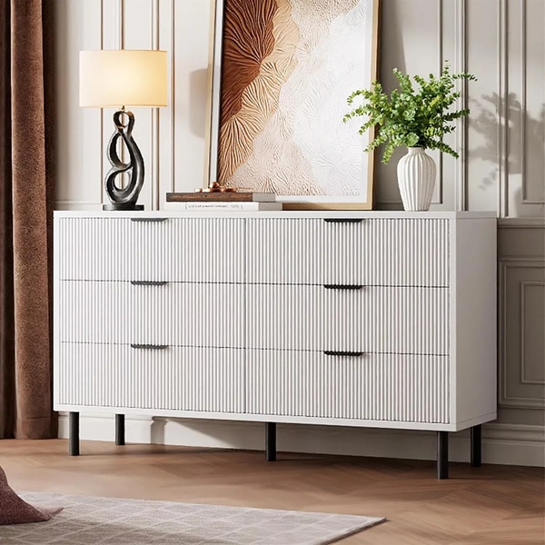
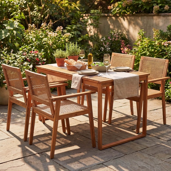
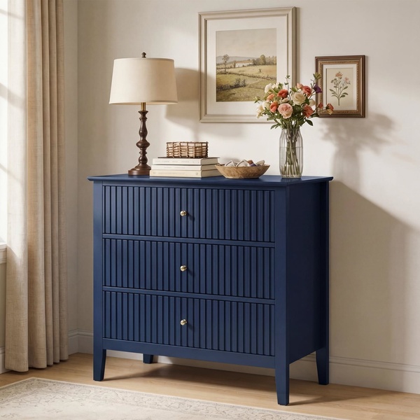
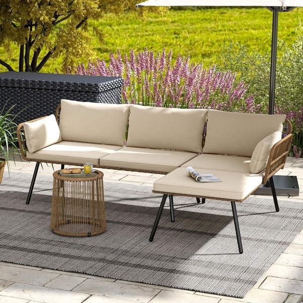
A curated 9:16 grid layout displaying eight diverse dresser styles in neutral tones, designed to appeal to varied aesthetic preferences.
Free credits included. No card required
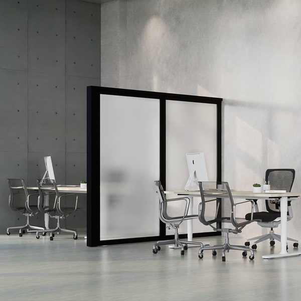
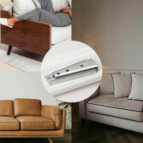
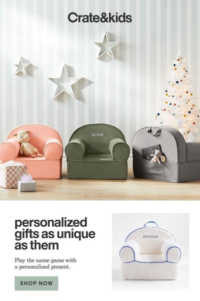
This dresser ad creative leverages a clean, high-contrast grid layout to provide a high-value shopping experience for the viewer. By organizing a variety of styles into a single, cohesive visual, the brand effectively positions itself as a curator of taste rather than just a furniture retailer, lowering the friction of product discovery.
For most ecommerce teams, this pattern excels because it offers immediate variety for the consumer without needing multiple ad iterations to test. By using a platform like Promer AI, you can replicate this structured, multi-product layout to highlight your own catalog, ensuring the creative remains balanced and professional in appearance while driving higher engagement across mobile placements.
Great ads start from an idea, a feeling, or a structure, not a blank design.
Pro tip
When using a grid-based approach for furniture, ensure the products share a consistent lighting or shadow profile to make the collage feel cohesive. Even minor lighting mismatches can distract the eye and weaken the perceived quality of the collection.




Promer helps you find the pattern, adapt it to your product, and create your own version in minutes.






