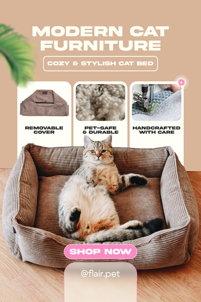
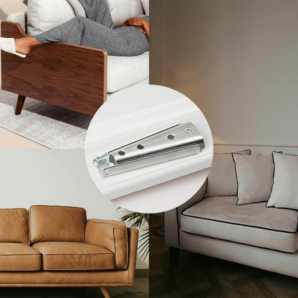
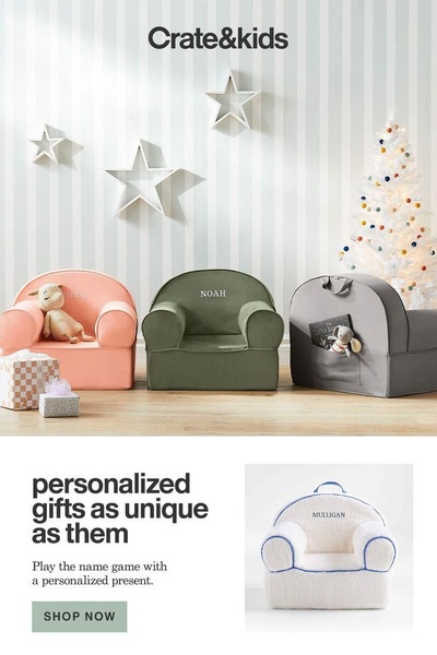
This vertical ad uses a three-part grid to highlight product features like the removable cover, material quality, and handcrafted care.
Free credits included. No card required
This cat bed ad creative leverages a minimalist, feature-driven grid layout to quickly communicate value. By segmenting the ad into three distinct areas, the viewer is presented with an immediate, logical flow of information—from the aesthetic appeal of the bed to its practical benefits. This approach of organizing product details into a scannable grid is effective because it reduces cognitive load for the pet owner who is evaluating a purchase.
Adopting this structure for your own product ads often helps in establishing trust through transparency. Using Promer AI, you can replicate this clean, informative layout for any physical item in your catalog. By prioritizing high-quality visuals over dense text, this pattern helps capture attention on mobile platforms where users scroll quickly.
A high-converting ad is a conversation between your product's strengths and your customer's immediate need for quality.
Pro tip
When using a grid layout, ensure the center image remains your highest-quality lifestyle shot to pull the eye immediately. Use the surrounding panels to explain the 'why' behind the design, ensuring each caption is brief enough to be read in under two seconds.
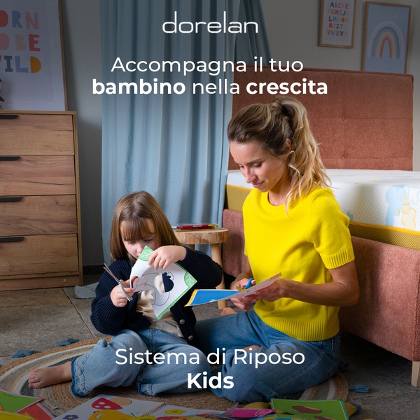
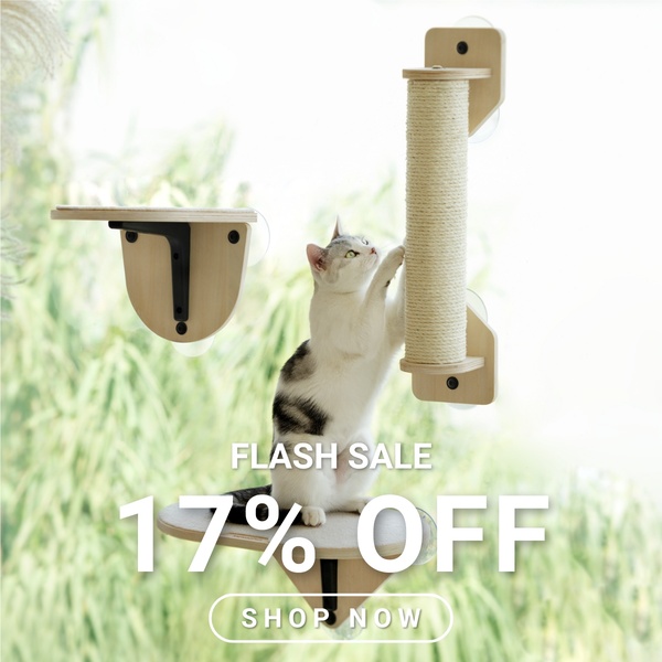


Promer helps you find the pattern, adapt it to your product, and create your own version in minutes.






