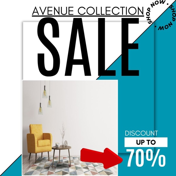
A square-format furniture sale advertisement featuring a minimalist product shot paired with bold, high-contrast typography and a clear directional call-to-action.
Free credits included. No card required
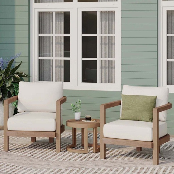
This armchair ad creative utilizes a split-layout design to separate high-end product photography from clear, actionable offer text. By combining a minimalist interior aesthetic with an aggressive, high-contrast red directional element, the creative forces the user's eye directly toward the discount percentage.
This structure performs well for most ecommerce brands because it removes visual friction, allowing the product to speak for itself while clearly communicating the value proposition. When you use Promer AI to analyze such layouts, you can ensure your product is always the hero while your promotional messaging maintains the necessary visual hierarchy to capture attention on busy mobile feeds.
Effective advertising starts by bridging the gap between your product's aesthetic and a clear, urgent customer benefit.
Pro tip
When using high-contrast directional cues like the red arrow in this creative, ensure the color you choose complements or intentionally clashes with your brand palette. If the arrow blends too much with your background, it loses its ability to guide the viewer's eye to the call-to-action.


Promer helps you find the pattern, adapt it to your product, and create your own version in minutes.






